A little humor never hurt anyone, and the same can be said for design. A light-handed approach needs to be taken when injecting whimsy into a design scheme. Too much and it might look like you live in a fun house. With this in mind, here are a few fun finds that combine humor and style!
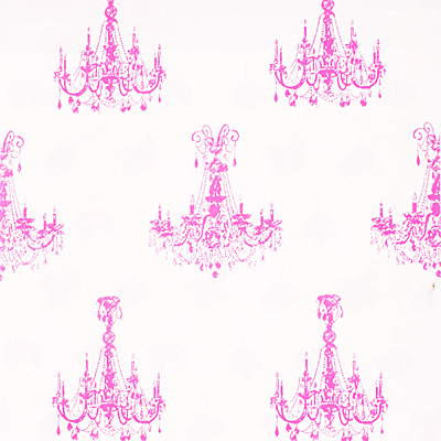
"Spangle" fabric in pink, from Andrew Martin at Lee Jofa
"Family Silver" fabric from Lee Jofa
"Bulldog on Pillow", Meissen, available at Moss
Four Panel Screen with monkeys, c. 1950, available at J.F. Chen
Image at top: "Sans Souci" lamp from Brunschwig & Fils
Thursday, August 02, 2007
A Whimsical Approach to Design
Labels:
Accessories,
fabric
Subscribe to:
Post Comments (Atom)


I couldn't agree with you more! Every room needs a touch of humor.
ReplyDeleteRonda- Yes, too much seriousness is a little boring!
ReplyDeleteI agree completely...a touch of humor can really make the difference between a inviting or stuffy place. Love all these finds!
ReplyDelete~Kate
Thanks Kate!
ReplyDeleteA little humour... yes,needed abolutely. But it is difficult to achieve. Do you know of designers who have tried humour in their decor? do let us know , if you come across one.
ReplyDeleteDesignflute- It is difficult to achieve. Diamond Baratta are two designers who come to mind- they achieve humor through their use of bright colors and bold, crazy prints. If I think of any others I'll let you know!
ReplyDeleteI am in total agreement with you.
ReplyDeleteWhimsy and fun are essential. Love the Lee Jofa fabric!!!
Yes a touch of humour is great in a room but it has to be "a touch" or it becomes "try hard" or somewhat kitsch looking. Keep that lamp fabric away from the monkeys and that bulldog in one room! LOL
ReplyDeleteI've seen that pink chandelier fabric used in a newly single womans apartment - in drapes and dining chair slipcovers and it looked great. Very whimsical and very girly.
ReplyDeleteWhat fun! I agree about the sense of humor. You have found some really fun peices!
ReplyDeleteI love the Spangle fabric. I have been wanting a teapot with a similar motif from Wandrlust for a while. Your post might have finally inspired me to buy it today! thanks!
ReplyDeleteAs for designers -- I believe Diamond & Barratta (forgive me if thats not the exact names!) and their use of fresh bold patterns and designs might qualify as fun designers! Yes -- a sense of joy, fun and even the "odd" might add a bit of a smile to the whole room. Its a tough balance! I believe there is a term for the "slightly tacky" which they call "twee" I collect old Ouija boards -- I wonder if that qualifies me as "twee" or merely odd?
ReplyDeleteJan at Rosemary Cottage
Jan- A touch balance indeed, but I like that you collect Ouija boards! How great!
ReplyDeleteBon Vivant- That teapot sounds divine! Let us know if you get it! :)
ReplyDeleteBon Vivant- That teapot sounds divine! Let us know if you get it! :)
ReplyDeleteWallpaper is Brunschwig and Fils
ReplyDelete"Gallaudet Diamond"
In my opinion, whimsy really works when it isn't obvious at first and then you 'get it'. I love that kind of discovery. Little suggestions and subtle humour. That's fun.
ReplyDeleteLiberty Post- Exactly! You don't want it to knock you over the head! :)
ReplyDelete