

Unless you've been a recluse over the past week, you have likely seen photos of last week's Met Gala. I'm not going to get into too much detail about it except to say that my picks for the three best-dressed guests were Lauren Santo Domingo, Vanessa Traina, and Plum Sykes, all of whom work in the fashion world. Plum Sykes's decision to wear scarlet satin Manolo Blahniks with her pale pink column dress especially captured my attention because the color combination was a bit unexpected. And yet, it was really quite smashing, with Sykes's red shoes making her prim gown sing. It also reminded me of how much I love this color pairing. (I did not want to fool with obtaining permission from Getty Images to use their photo of Sykes, so you'll have to click here to see her stepping out to the Gala.)
Rarely do you see pink and red used together within the same room. In fashion layouts, however, you do. When standing alone, pink can appear slightly (or sometimes sticky) sweet. But when dashes of red are thrown in for flavor, the effect can be sophisticated and effervescent. Could this be why Babe Paley wore pink and red for her Round Hill, Jamaica portrait?
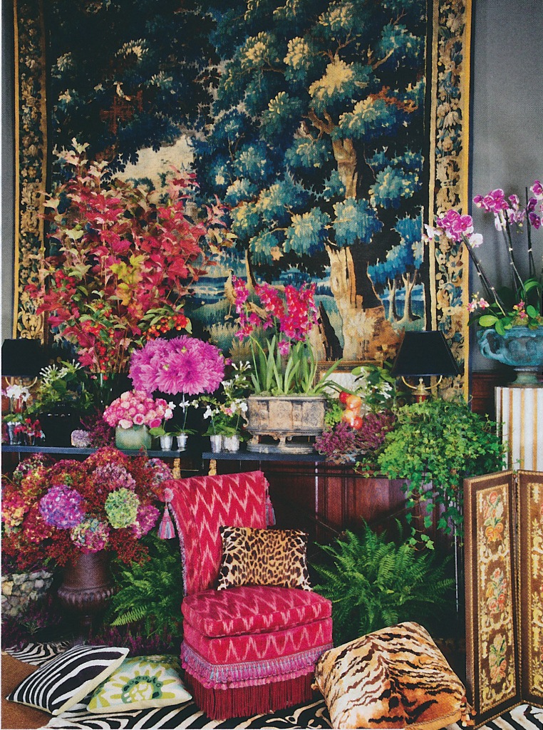
One interior designer who did mix the two colors together to great effect was David Hicks. Hicks, however, took a brash approach to the pairing, using pinks that had vigor and swagger. Cerises, scarlets, and magentas mingled to create rooms of bravado, fit for even the most manly of men. If all of this sounds too swashbuckling, you could take your cue from Hicks (or even Mark Hampton, whose 1970s-era Manhattan apartment included a red and pink bedroom) but tone it down for more feminine sensibilities. Paint a room's walls in lacquered aubergine and upholster its furnishings in pink silk and red damask. I think that such a room would like really pretty...or, to use a phrase that gets on my nerves, such a room would look "very gala."


The early Manhattan apartment of Mark and Duane Hampton. Their bedroom was decorated in shades of magenta and pink with some red thrown in for good measure.

Serge Obolensky photographed by Slim Aarons at the St. Regis Roof, New York. I can't really tell if the room was mostly pink or if there was some red somewhere (perhaps the ceiling?)
Photo of Paley and Obolensky from A Wonderful Time: An Intimate Portrait of the Good Life by Slim Aarons; Hicks and Hampton photos from David Hicks: Designer; Maharaja of Jaipur photo from The World in Vogue 1893-1963.


I am so into pinks and peaches now! Love this so much!
ReplyDeleteNice post.
ReplyDeleteI think that it's important to note that Hicks, and others who used reds in interiors successfully, almost always had the relief of white, either in majestic architecture or furnishings, to offset the red. The one possible exception I can think of is Hicks' own Albany digs, but even there, the refined moldings of the space and the sheet of mirror over the mantlepiece gave interest and relief.
I have a friend who is a redaholic and unfortunately, none of his forays into having a red room over the years had been a success, even one by a designer. Low NYC apt. ceilings and non-existent architectural features left the room looking womb-like, and not in a good way. Very often, the problems were also the reds chosen, either too "blue" or too muddy. I stepped in recently when a repainting was in the offing and suggested a true red, in this case, Ralph Lauren's "Stadium Red" and that it be used on only two of the four walls in the room. The longest wall behind the sofa and the attached window wall were painted the red, and ivory was used for the remaining two walls, with snow white for the ceiling (he did not like the idea of using the snow white on the walls, so ivory was the compromise). This way, when guests entered the room, the room read as "red", yet while seated, most of the red was behind them, visually. The art looked great against the red and the red highlights around the room referenced the predominant wall colour and made sense, without the claustrophobic effect he had earlier. No way would he have tried pink (nor I, for that matter), but one lady of our acquaintance almost always wears pink, so she usually provides that spot of pink in the room during his parties...
I have to say, I did not think this up myself; this use of two colours in the two different "corners" of a room was taught to me by an old woman, Mrs. Sophie Reid, who I went to the store for as a boy. Mrs. Reid explained that the use of colour in this way visually pulled a room open, making it feel dynamic and yet spacious and airy. She also advised using the more "challenging" colour behind the main seating area, so it was not so "in your face".
Quatorze, Good point about the inclusion of white in Hicks's red interiors. The color gave one's eyes a place to rest. Also, I never thought of using two colors in the way you describe, but it makes sense...especially using the stronger color behind the main seating area.
DeleteLove this post and love Quatorze's remarks as well. Reds are tricky. One I used not long ago in a rather dingy hallway lit by those dreadful new lights was Benjamin Moore's Burnt Peanut. Not too warm, not too cool. Photo of it in a post here: http://www.francesschultz.com/7655 It is a silly post about moving, but scroll down to the 7th photo and there is the red hall.
ReplyDeleteGreat color choice Frances! Looks terrific! That is a nice shade of red. Love the name, too.
DeleteA note on the fabulous Veruschka photo- The necklace is from Bulgari - It separated into several combinations of bracelets and necklaces- It was- is (because it's still around) the epitome of what I call "Rich Hippie Jewelry" and that big "jelly bean" in the pendant? it is an antique Indian carved emerald-
ReplyDeleteWhat I would give for that Bulgari necklace!!! It's beyond fabulous.
DeleteOne decorator who has regularly and successfully combined reds and pinks in her work is the glorious Tessa Kennedy. She's finally got a new website that does justice to her work and there are some good examples of red and pink combinations in her sections on private residence and on palaces that she has decorated. One has to love the fact that she has a whole section dedicated to palaces she has decorated. It's her use of texture which allows her to get away with colour combinations that would result in tragedy in the hands of a lesser decorator. http://www.tessakennedyinteriordesign.com/our-workprivate-residential.html
ReplyDelete