Thursday, March 17, 2016
The Ultimate in High-Rise Living
I love the high-rise in which I live. It's located on the most prominent street in Atlanta. All kinds of interesting people live here. And, important to me, it's been around since the late Sixties, meaning it reminds me of the old Atlanta in which I grew up. But the building's one annoying deficiency is that it lacks a restaurant to provide room-service dining. Thirty-plus years ago, there was a high-style restaurant in the lobby called "Tango", but sadly, those days are long gone. If it were still around, I would likely never cook for guests again. Instead, I'd simply call down and order dinner. How great- and easy- would that be?
My fixation on having a downstairs restaurant might be why I was so taken with this 1990s House Beautiful article about designer William Hodgins' three-room apartment, which was located in the residential tower at Boston's Ritz-Carlton Hotel. Without a doubt, Hodgins' great taste and beautiful possessions are really the reason why I clipped this article, but the photo of a waiter pushing the room-service dining table into Hodgins' apartment hooked me, too.
You might remember Hodgins' earlier home, which I featured on my blog a few months ago. That apartment was located in an 1887 building. So, why would a traditionalist like Hodgins choose to live in a modern building? For its conveniences, of course, which included room service provided by the hotel's dining room. Rather than create an old-world backdrop for his "old things," Hodgins wisely chose instead to play up the modern aspects of his apartment, eschewing curtains on some windows, painting walls bright white, and laying faux-concrete tile on the floor. Said Hodgins, "Trying to make a new apartment look old never works." So true. And Hodgins' preferred neutral color-palette meant that his antiques adapted quite nicely to their modern surroundings, making the age discrepancies between possessions and architecture seem minimal.
But back to room service. Despite the fact that Hodgins claimed to rarely order it, he certainly knew how to personalize a room-service meal: with place settings of antique creamware. Now I want a restaurant in my building even more.
All photos from House Beautiful, Oberto Gili photographer
Subscribe to:
Post Comments (Atom)


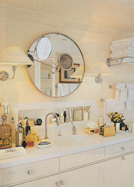
What a pretty bathroom!
ReplyDeleteI agree! So light, bright, and clean-looking.
DeleteMr. Hodgins is one of my favorite designers. I have his book on his design projects, and his rooms are just timeless and elegant, as is his lovely apartment above. I believe some of the above photos are in his book (I just have one, I don't know if he has published any others). And yes, his bathroom is fantastic!!
ReplyDeleteI believe that he has only published one book, which I really need to read. Quite right- his rooms are timeless.
DeleteJennifer,
ReplyDeleteI used to hang out at Tango ! Remember the tortoise shell wall decorations?
I thought that Stan decorated it?
Dean
I'm fairly certain that another designer decorated it. I'll see what I can find out.
DeleteWhy not just start a restaurant in your building darling? You'd have the pleasure of designing it yourself and making sure that all your favourites are on the menu. There must be a bunch of other people in the building who would join you in getting it started. Get the tango going again darling. I'd swing-by if the martinis were half-decent.
ReplyDeleteThe residents of my building know a thing or two about mixing martinis and most other cocktails, for that matter.
DeleteHad the pleasure of working with Mr. Hodgins on the Rohatyn's job in Paris; I superintending the move of the family's art collection. He was gracious and humourous, and his talent immense. I love his style, elegant yet comfortable. He is a master of beautiful and light-filled spaces. Thanks for this post - great to see his beautiful things transposed into a new flat without losing one jot of their handsome elegance.
ReplyDeleteIt seems that those who know him are in agreement- not only does he have great style, but he's a nice person, too.
DeleteI tore this article out of the magazine back when it came out and still have it -in the very front of my clipping files (I was a strange teenager) - I loved everything about this article and apartment and still do! Years later I was in Boston over spring break and found the building just to see it from the outside (seriously) because thats how obsessed I was with it! haha. Love seeing this here.
ReplyDeleteStefan, I love it!
DeleteThank you Jennifer for this delightful article. This apartment was an early inspiration for me too. The gray column with the parcel gilt edge is exceptional. Gustavian and masculine. The toile de Jouy on the daybed, the REAL fur, the sculptures all point to a rarified eye. What a visual treat!
ReplyDeleteSo happy to hear that you enjoyed it. It's nice to know that twenty years later, this apartment still inspires.
DeleteGreat antiques, though I don't like putting(even that beautiful one)a mirror over a sofa and artistic books & clutter help the space greatly.
ReplyDeleteHave you seen the film Bell Book and Candle-think you'd love the sets and costumes even if some of the acting and sub-plot is rather dated
Best, Herts
Herts, I have seen the movie a number of times, and I agree that the sets and costumes are a treat. On the whole, the movie is a little dated but entertaining nonetheless.
DeleteA wonderfully layered canvas. Living in a modern box myself, I absolutely agree about not trying to create a faux period interior, and utilising white walls and lightly covered furniture; my sitting rooms sofas are covered in mint green silk from Jim Thompson, which over the 13 years they've been exposed to sunlight, (even though I have shades), have become lighter too. Luckily in tandem!
ReplyDelete