Friday, July 31, 2015
The Art of Gainage
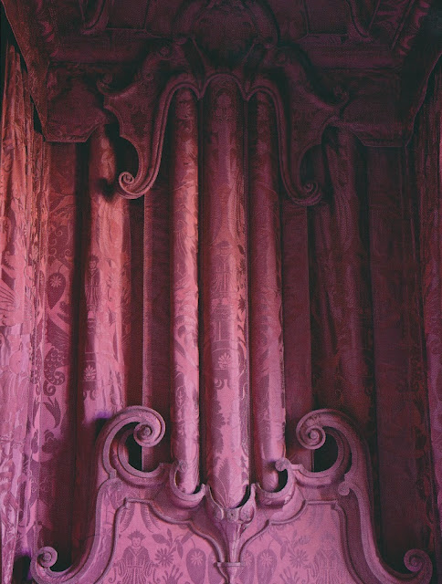
Gainage. No, it's not what happens to your body after, say, a holiday season spent eating fattening foods. Rather, it's the term for the French style of upholstery in which fabric is applied to hard surfaces, such as moldings (see above) and furniture. Although I've known about this type of intricate upholstery for years, I never knew what to call it. But thanks to the July-August issue of Veranda, I can now put a proper name to a technique that must take great skill, not to mention great patience. According to Veranda, one of the leading firms that specializes in gainage is that of Charles Jouffre, a master upholsterer with workshops in Paris, Lyon, and New York. One of Jouffre's notable clients is Chilean designer Juan Pablo Molyneux, whose work sometimes features gainage beds. Can you imagine how luxurious it must be to sleep in a velvet-covered, four-poster bed?
I don't know if the late designer Alberto Pinto was a client of Charles Jouffre, but I do know that his green velvet-drenched dining room is a prime example of gainage. Look closely at the photos below, and you'll see that his dining room's shell corner niche was completely covered in the same velvet that was applied to the walls. And gainage beds can be found in a number of country houses in the U.K., including Dumfries House and Houghton Hall. (I'm not sure if British craftsmen refer to this type of upholstery as gainage. Perhaps they have an English term for it.)
Of course, not all gainage is as elaborate as fabric-wrapped state beds or corner niches. Look at those David Hicks wall brackets, below, that were covered in the same claret-colored velvet that graced the room's walls. Fabric-covered brackets are perhaps a more manageable way to indulge in the art of gainage. (I know a clever New York designer who executed his own gainage brackets, which are most becoming.) Or, you could simply hunt for an antique or vintage gainage table or cabinet. The beauty of an old fabric-wrapped piece is that its fabric, likely velvet or silk, has patina, which only adds to the allure of gainage.
Two different examples of gainage beds, which were designed by Juan Pablo Molyneux.
Two views of Alberto Pinto's dining room. This has to be one of design history's most memorable dining rooms.
Both the walls and molding in this Georges Geffroy-decorated room were covered in green velvet.
Dumfries House's famous Chippendale bed, whose canopy cresting is covered entirely in blue damask.
An early eighteenth-century tester bed in the Wentworth Bedroom of Milton, a country house in Cambridgeshire. Recently restored, the bed is covered in a silk damask that is based on the bed's original fabric.
This William Kent-designed bed is located in the aptly-named Green Velvet Bedchamber at Houghton Hall. The double-shell motif is a reference to Venus.
In this David Hicks-designed room, claret-colored velvet brackets match the room's walls.
Images #1 and #2 from Veranda, July-August issue; #7 from Town & Country, Harry Cory Wright photographer; #8 from The English Country House; #9 from English Country House Interiors; #10 from David Hicks Style and Design
Monday, July 27, 2015
Revisiting David Hicks Carpet
Around the time I started blogging, David Hicks's carpet designs were all the rage, just as they had been when first introduced decades ago. Everywhere I looked, I saw hexagons, octagons, and the rest of Hicks's favored geometric shapes and patterns. But because Mr. Hicks's designs were all anyone seemed to talk and blog about, I lost interest, choosing instead to focus on other topics that had not yet reached critical mass.
Almost ten years later, though, David Hicks carpet is back on my mind. I was recently looking at photos of Hicks's later work, and I was reminded of the range of his carpet designs, many of which are no longer in production. Take, for example, the carpet sample in the photo, seen above. According to Suzanne Trocme's Influential Interiors, this Brussels weave carpet was produced by Avena carpets. Like most of Hicks's floor-coverings, this carpet boasts a geometric pattern, but because it is small-scaled, it appears much less bold than some of his more famous designs . The colorway is quite attractive, too.
Then take a look at the carpet in Hicks's Oxfordshire home, which can be seen in both the second and third photos, below. This particular Hicks carpet possesses the verve for which the designer was so well-known, but its neutral tones help to tone down the swagger. In fact, look how well the carpet works with those voluminous- and fetching- curtains. And speaking of fetching, what about that carpet in the blue bathroom, also seen below? Hicks originally created this carpet for the Prince of Wales, which explains the inclusion of the feather-motif within the overall octagonal pattern. If you look at the fifth photo, a scrapbook of David Hicks's carpet designs, you'll see a rendering of this Prince of Wales pattern, minus the feathers.
I've included a few additional photos that show other Hicksonian carpets and rugs, all of which I think are ripe for reissue. To me, these examples have the flair and pizzazz that people still desire, but they're not quite as brazen as those designs that were all the rage almost a decade ago.
The Art of Reprotique
I recently learned of Reprotique, a line of art-inspired home accessories. Based in Virginia, Reprotique was founded by Susan Stanley Sprinkle, who specializes in reproduction 17th and 18th-century art. Sprinkle recently expanded her line to include, among other things, coasters, sconces, and light-switch plates, many of which incorporate images of centuries-old paintings and maps. I'm especially taken with the shield sconce, seen above, which features a leaping stag, as well as the sets of hunting-themed coasters. For something more modern, there are coasters emblazoned with patterns, such as blue agate or tortoise, as well as whimsically-shaped, clear acrylic sconces and switch plates, which allow wallpaper to show through. And the great thing about this line is that it's all hand-made in Virginia.
For information, please visit the Reprotique website.
All images courtesy of Reprotique
Tuesday, July 21, 2015
The Work of Diamond Baratta
I was saddened by the recent news of designer William Diamond's death. With partner Anthony Baratta, Diamond founded Diamond Baratta, one of America's most dynamic, not to mention colorful, design firms. Known for their unabashed love of vibrant hues and bold pattern, Diamond Baratta produced work that was transformative- and not just in the decorative sense. Brimming with exuberance, a Diamond Baratta interior could also serve as a mood-enhancer, capable of uplifting one's spirits.
In honor of Diamond, I'm featuring a home that the design duo decorated in the early 2000s. Located in New Jersey, the house contains an intriguing mix of Asian antiques, contemporary art, and English furniture, all of which the clients brought with them. Armed with their clients' collections, and with the wife's favored pink-and-green palette in mind, Diamond Baratta managed to synthesize these diverse elements under one roof, doing so in their colorful, inimitable way.
All photos from House & Garden, October 2002, Jason Schmidt photographer.
Tuesday, July 14, 2015
Winterthur's Chinese Parlor
Of the many images that I have filed away in my head, two images in particular have made the greatest impressions on me: those of the Chinese Parlor at Winterthur. Specifically, detail photos of the Chinese Parlor's magnificent Chinese paper mingling with damask furnishings.
Found for Henry Francis du Pont by Nancy McClelland, the parlor's superb Chinese paper needs no decorative assistance, but when photographed partnered with that yellow damask, camelback sofa, seen above, or those vivacious green damask curtains, below, the paper appears to brim with color and vibrancy. And to the series I can now add a third image, which I recently found in American Elegance: Classic and Contemporary Menus from Celebrated Hosts and Hostesses: a table set for an imagined "Before the Theater" dinner, which was conceived by Mario Buatta. Placed in the Chinese Parlor with a green damask sofa and chair providing seating, the setting seems to blur the line between decoration and reality. It's as if this elegant dinner is but one of the paper's myriad scenes, playing out as Chinese figures merrily go about their business in the background.
By the way, if you're wondering why some photos show yellow damask while others capture green versions, it has to do with the seasons. The room's curtains and slipcovers are changed out seasonally, with some seasons ushering in yellow damask or silk taffeta, while other seasons are heralded by the color green.
Image #1: House & Garden, October 2002, Simon Watson photographer; #2: House & Garden's Complete Guide to Interior Decoration, 1960; #3: American Elegance.
Catesby Engravings at Auction
I know that a few of you collect Catesby engravings, which is why I want to bring an upcoming auction to your attention. This Saturday, Case Antiques of Knoxville will be auctioning off a pair of my family's Catesby prints (see above) as well as a wonderful boxed set of Catesby's Natural History of Carolina, Florida, and The Bahama Islands , which includes color plates and a bound catalogue. (It had been my plan to frame and hang many of the color plates from the boxed set, but sadly, I couldn't find the space in my home to do so.)
The auction takes place this Saturday, July 18 at 9 a.m. with live, phone, online, and absentee bidding possible. For more information, please visit the Case Antiques website.
Subscribe to:
Posts (Atom)