To each and every one of you, a very Merry Christmas. I hope your holiday is full of happiness and joy!
And I look forward to seeing you later next week!
(Christmas greeting above courtesy of Bernard Maisner)

To each and every one of you, a very Merry Christmas. I hope your holiday is full of happiness and joy!
And I look forward to seeing you later next week!
(Christmas greeting above courtesy of Bernard Maisner)

Clarence House has long been known for its gorgeous fabric and wallcovering, but some of the line's most inventive prints over the past twenty years have been designed by Kazumi Yoshida. A renowned textile designer and multimedia artist, Yoshida also serves as design director for this venerable textile firm. Yoshida's prints, most of which incorporate bold and unusual colors, have a charming, painterly quality to them. And while many of the prints are quite contemporary, some of them have an Art Deco feel to them. Yoshida is also the mastermind behind the print "Flowering Quince", a much loved print that has been a hit in the blogosphere.
If you're an avid Kazumi Yoshida fan, you might be interested to know that he has designed a limited edition bottle for Estee Lauder Pleasures which will be available in January 2008.
"Flowering Quince"
"Las Palmas"
"Pot de Fleurs"


The holidays are the perfect time to forget calorie-counting, and I can't think of a better way to do so than by indulging in some decadent chocolate cake from Chocolate Cake Charleston. Baked by owner Christen Reese, the chocolate cakes are truly some of the best that I have ever had. And if you're afraid of the temptation of having a whole cake on your counter, Reese also bakes mini-cakes too. Yum!

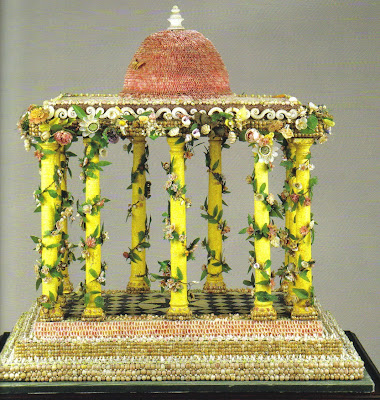
I have loved shells for as long as I can remember. During my childhood summer beach trips, I remember religiously checking the tide report in the newspaper so that I could plan my daily shell hunting (sounds a little nerdy, no?).
If you're like me, then you must check out the beautiful new book The Shell: A World of Decoration and Ornament by Ingrid Thomas. This highly informative book covers the history of shells and the shell motif in art and decorative art through the ages. Chapters include shells in jewelry, art, architecture, furniture, and porcelain, to name a few.
What I find most fascinating are the objects that were created using actual shells. Some of the most amazing images (at least to me) are the rooms and grottos that are decorated entirely in shells! Can you imagine the time and labor that went into these rooms? The craftsmanship in all of the objects featured in the book are just remarkable. Of course, after reading the book I have all types of fanciful ideas about what to do with my collection of shells. But in reality? Perhaps I should stick to something simple like a small mirror!
Shell Gallery at Rosendael Castle, Netherlands, c. 1730.
"The Sharpham Shellwork", c. 1770. Created by Jane Pownoll with shells collected in the West Indies by her privateer husband, the work is a replica of Sharpham House.
A carved mother-of-pearl and tortoise shell jewelry casket, 19th c. English.
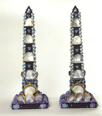
Shell obelisks by Tess Morley, 1999
Pair of Olympic torches created by Peter Coke, 2001
Arcimboldesque Shell-Head Fountain in the garden of Petit Chateau, Parc de Sceaux, Hauts-de-Seine, France.

Many of you know that one of my design icons is the late Van Day Truex- designer, Parsons instructor, and Tiffany & Co. design director. An authority on all matters of design, Truex wrote an article in a 1946 issue of House & Garden about framing and hanging pictures (apparently something which confounded people back then as it does today).
Truex, whose living room is seen above, wrote that one should frame and hang a picture so that will "enhance, embellish, complement, and emphasize the picture". I agree. Truex preferred gold leaf and gilt frames for both modern and traditional pictures, although plain black or wooden frames were also acceptable. I think he would have approved of Kenneth Jay Lane's choice of frames for his Orientalist art:
Of course, not every picture is a fine work of art. For artwork that is more decorative, Truex said that framing could be as "entertaining and spirited as one wishes". I would say that these prints in a room by Roger Banks-Pye are definitely spirited- the geometric-patterned frames are quite striking.
Another treatment that I find quite charming is hanging pictures with decorative cord (although Truex, who was more of a purist, might not have agreed with me). You could use a simple cord, like that used by John Fowler:
Or you could go a bit more elaborate like Elsie de Wolfe did at Villa Trianon (although, to be quite honest, I can't tell if the cord is real or faux-painted):
Regarding placement of pictures, Truex advises one to hang or display the art in close proximity to one's furniture rather than up towards the ceiling. I think this vignette by Miles Redd sums up this idea perfectly:
And for a quirky spin on picture hanging, you could hang your artwork like Horst P. Horst did here, "like steps up the wall" according to H&G.

How fun are these porcelain pea pods from Michael Devine Home? I could see placing one on top of a stack of books, or grouping a few of them together for a festive Spring tablesetting!

In last week's post "Fun with Books", I showed a few examples of book-themed treatments of jib doors. A reader suggested that I devote a post to the subject of these doors, which seem to be more prevalent in Europe than they are here in the States (although there are jib doors in the Oval Office).
For those of you who may not be familiar with them, jib doors are basically disguised or concealed doors. The doors tend to be flush with the walls around them and lack any surrounding architecture, thereby creating a continuous plane. Many times the doors even have concealed hinges to further add to the disguise. Jib doors are usually given the same treatment as the rest of the walls in a room- paper, fabric, mirror, etc.
John Fowler was a designer who incorporated jib doors into many of his projects. In one of the images below, you will see that Fowler papered both the walls and the jib door with a Chinoiserie paper. But Fowler could also be quite inventive with his treatment of concealed doors. In David and Evangeline Bruce's Albany set, Fowler gave the jib door the same molding as the rest of the wall but added a trompe l'oeil painting to both the door and the wall. When one opened the jib door, the painting was revealed to be faux.
Even if you have never heard of the term "jib door", I'm sure you've seen them before. In fact, I think one of the most famous photos of a jib door has to be that above of Pauline de Rothschild opening the door in her Paris bedroom. And with beautiful wallpaper like that, who would want to mess it up with a clunky door!
This jib door at Colefax & Fowler in Mayair was cut into a large painted panel- the door became part of the artwork, so to speak.
The Bruce's dining room with the trompe l'oeil painting on the jib door.
A classic treatment of jib doors- papering both the walls and the door (located to the right of the bed). Design by John Fowler (Sudeley Castle.)
David Hicks was also a fan of jib doors. Here, he papered both the walls and the door with a marblelized paper. However, he also added a little lit vitrine that, according to Hicks' son, moved with the door. Now that's clever!
I once saw an interview with Albert Hadley in which, if I remember correctly, he discussed the concealed door in his gorgeous red hallway that led to his powder room (I believe he said that his guests usually had trouble finding the powder room!). I couldn't find any images of this, but did find a jib closet door in Hadley's guest room. Look closely- it's on the left-hand side of the room.
Jib doors in the Oval Office- a rather blah treatment of the concealed doors during Eisenhower's administration.

What about a painting by John Matthew Moore, a Southern artist who resides in Washington D.C.? A favorite of designers throughout the country, Moore's work is incredibly striking. I had the opportunity to meet Matthew at one of his shows recently, and not only is his work even more beautiful in person, but he is also one of the nicest people you will meet. If you're not ready to commit to a big piece, perhaps you might be interested in his prints that are available through Trowbridge Gallery. I'm partial to the silver leaf prints (below) myself. (Note: Trowbridge is to the trade only. If you're not a designer, get a "in the trade" friend to help you purchase one)

Have you ever wanted to get inside the head of your favorite designer? Or wanted to know specifically what inspires them and influences their design? If so, Inspired Styles is sure to answer these questions for you.
Featuring a group of designers who have designed fabric collections for Kravet and Lee Jofa (including Eric Cohler, Alexa Hampton, Barbara Barry, Suzanne Rheinstein, Allegra and Ashley Hicks, and Kelly Wearstler), the book focuses on each designer's style (as explained in their own words) as well as the colors, places, and things that inspire them. Each designer has also answered a Q&A on what they deem as their favorites. Did you know that Wearstler's favorite ice cream is Baskin Robbins Peanut Butter 'n Chocolate? Or that Suzanne Rheinstein loves Mish New York jewelry? Or that Alexa Hampton's favorite hotel is the Gritti Palace in Venice (I agree!).
And with images of the designers' work and artful vignettes of inspiration, the reader can't helped but be inspired too!


What about these crazy vintage lamps from Lum Lighting of New Orleans? There are plenty of other fun vintage lamps on Lum's site, so make sure to check out the others!

You know the feeling you get when you see a room that speaks to you? A room that perfectly represents the way you want to live? Well, this is how I feel about these garden pavilions at the Parisian home of Pierre Bergé, business partner of Yves Saint Laurent. Designed to accommodate a study and a dining room, each pavilion is a glorious mix of glass and antique mirrored walls, priceless Louis XVI antiques, non-pedigreed pieces, and stylish bibelots. In lesser hands this mélange could come across as a hodge-podge, but here the look is chic, timeless, and comfortable. Now wouldn't having a study like this make work seem much less taxing?
(Image at top: the dining pavilion with a table and chairs by Gilbert Poillerat.)
My favorite pavilion- the study. The 18th c. black console by Adam Weisweiller holds a Sèvres tea service. The portrait is of Jean Cocteau.
The veranda which connects the two pavilions. The cafe table and chairs are by Diego Giacometti. And what's more classic than a striped awning?
(Images from House & Garden, Nov. 2001; photographer Pascal Chevallier)
