Wednesday, November 29, 2006

Nifty Needlepoint


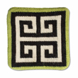
I have always had a yen for all things needlepoint- pillows, coasters, ottomans. The problem has been that the so many of the needlepoint designs on the market have been saccharine sweet- puppies, rainbows, and the like. It took a lot of searching to find sophisticated designs. When I took up needlepoint a few years back, the one design that caught my eye was a geometric design (see above) by needlepoint doyenne Erica Wilson. I loved the bright colors and graphic design. I'm still working on it, but I know that once it's complete, it will add a major splash of color to my home.

Fortunately, it seems that needlepoint may be making a bit of a comeback, and I think some of its popularity is due to Jonathan Adler and his crazy pillows and accessories. For a modern and fun touch, check out his greek key coasters and bargello pillows.


Should your tastes run towards the traditional, Anthropologie has a beautiful ottoman with scenes of birds and flowers. The scenes depicted, though, are anything but cute. I think they would look great as accent pieces in a den or by the fireplace.


Animal prints are about my favorite prints in the world (with the possible exception of chinoiserie!). These zebra pillows from Neiman Marcus would certainly add some zing to a neutral design palette.


And, for anyone with a wicked sense of humor, there are multitudes of pillows with witty sayings on them- in fact, these seem to be a hallmark of the work of Mario Buatta. He even used one in his room at the Kips Bay Showhouse:


Saturday, November 25, 2006

Marc Jacobs for Waterford


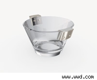
Yet another prominent clothing designer is trying his hand at home decor. Waterford recently announced that Marc Jacobs will be designing a tabletop line for the crystal maker. The line is set to debut this winter. Unfortunately, there are no pictures posted yet on the Waterford website, but I was able to find a few floating around on the internet.

Wednesday, November 22, 2006

More Classic Design Books

Here are a few suggestions for classic books that would be great additions to any design library:


"Decorating is Fun!" and "Entertaining is Fun!" by Dorothy Draper. What can I say? Draper was the consummate cheerleader of decorating- one who taught women (and I'm sure many men too) that a lovely home was accessible to everyone. All it took was ingenuity and enthusiasm. In addition to the witty prose, there is also a lot of practical advice that is still pertinent today.


"The Finest Rooms by America's Greatest Decorators" edited by Katherine Tweed. First published in 1964, this book contains essays by the top decorators of that time- Billy Baldwin, Mcmillen Inc., Rose Cumming, and Michael Taylor. Great photos too!


"Tiffany Table Settings", published in 1960. I love this book, especially as it was the book that started my collection. There are photos of table settings designed by socialites and decorators. Included are tables designed by Billy Baldwin, Van Day Truex, and Valerian Rybar.

Saturday, November 18, 2006

Winter Wow


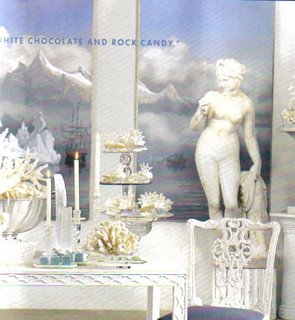
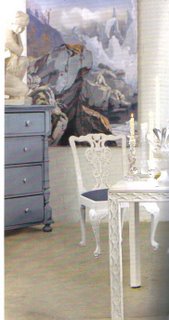
For those of you who love hand-painted wallpaper, you must check out the new issue of Veranda magazine. In it, there is a spread on Dallas decorator Michelle Nussbaumer's winter tablescapes. While the tablescapes are beautiful, they absolutely cannot compare to the panels of Zuber wallpaper which depict a wintry scene of a ship passing through massive icebergs. The detail is absolutely stunning. Owning these would definitely not leave me cold!

Thursday, November 16, 2006

Silver Screen

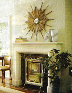
Fire screens can add a touch of dash to a room, but it seems that a good fire screen is hard to find. I have seen many striking ones in magazines and would love to have a screen of my own. Here are a few of my favorites:

This mirrored and chrome screen, designed by Jan Showers, exudes glamour and deco chic. How great would it look in a coolly elegant living room?


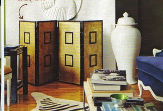
Another screen that caught my eye is this bamboo one. You could create a similar look by applying metallic teapaper to hinged wooden panels and adding bamboo trim.


Wednesday, November 15, 2006

Fun Fabric


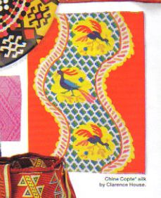
Brightly colored and boldly patterned fabric can make a drab room fab. Used sparingly, it can serve as an exclamation point to the overall decorative scheme of a room. One pattern that I've recently become taken with is Clarence House "Chine Copte", a colorful silk with a somewhat primitive looking peacock.

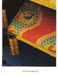
I first spotted the fabric in Nick Olsen's apartment, featured in last month's Domino. He used "Chine Copte" to upholster two vintage bamboo stools.


A few days later, I found the same fabric again, this time in Elle Decor (seen above). The fabric was featured in the Trend Alert column on ethnic prints.

I love the vivid colors against the red background, and the pattern adds a lot of wow. I would probably use it for cushions, a stool, or an ottoman. I think using it on a small scale would keep the pattern from overwhelming the room.

Tuesday, November 14, 2006

Talkin' Turkey

I know that at this time of year we are inundated with images of turkeys (the living, not the cooked, type). Unfortunately, this much maligned bird is usually portrayed in a kitschy and at times tacky way. I personally love the turkey motif and find that the poor bird is not as ugly as many think. In fact, turkey motif items can be quite chic, believe it or not.

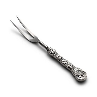
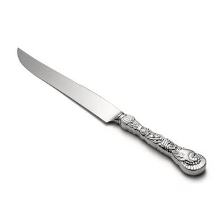
Tiffany & Co. has a few turkey related items that would set a stylish tone to any Thanksgiving tablesetting (they can be used for any fall or winter tablesetting, for that matter). My favorite is the sterling silver turkey carving set, of which I am lucky enough to own. Who wouldn't want to carve the holiday turkey, roast, or ham using these?


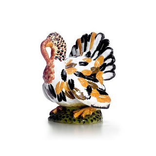
Tiffany has also designed a marvelous earthenware turkey that could be used as a table centerpiece or on the sideboard. I think it would look best in a slightly more casual environment.


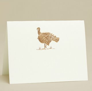
For an elegant note to the Thanksgiving table, Mrs. John L. Strong has bronze-embossed turkey place cards. These would look great with guests' names written in calligraphy.


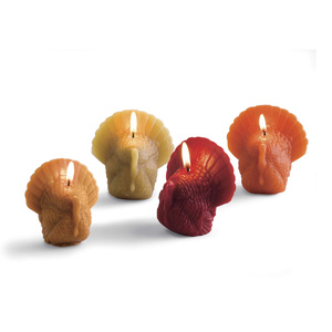
And for a touch of Tom Turkey at a reasonable price, why not buy some of these turkey candles from Gump's?

Monday, November 13, 2006

In Tents


Interior tents- current design trend?

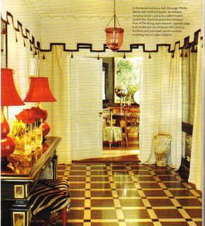
In two recent magazine articles on two different New York apartments, tents have made prominent appearances. Jeff Pfeifle, president of J. Crew, tented the entrance hall in his formal apartment. Instead of concealing the ceiling with its beautiful molding, Pfeifle tented the walls only using a Greek Key motif with tassel trim. He covered the walls with tent like curtains, but thankfully chose to leave much of the antiqued mirrored walls unobscured. I think the tent is a nice contrast against the geometric design of the terrazzo floor, and the red gourd lamps with red lamp shades really pop against the cream colored fabric of the tent.

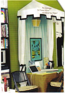
Another tent, albeit one much smaller in scale, was created by Nick Olsen, assistant to decorator Miles Redd. In order to create some visual interest, Olsen designed one which is attached to one of his walls. The exterior fabric is white, and the lining looks like a robin's egg blue. At the top of the tent, Olsen created a small tent-like awning that protudes from the wall. This was a very clever way to delineate his work/dining area within the confines of a small apartment.


Perhaps these designs will inspire you to create your own oasis within your home.

Sunday, November 12, 2006

McMillen Chic

McMillen, Inc. is considered to be one of the most influential and celebrated decorating firms of the 20th century. During the latter part of last century, the firm was led by Betty Sherrill, one of decorating's grande dames. Mrs. Sherrill is still with the firm today and is joined by her daughter, Ann Pyne. In the November issue of House and Garden, there is a great story and photospread of the apartment of Elizabeth Pyne, daughter of Ann and granddaughter of Betty. All three generations joined forces to create a feminine and fun first apartment for Elizabeth.


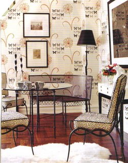
The dining room is an interesting mix of iron furniture- a Mathieu Mategot bench and table and Rene Prou chairs. The classic modern furniture provides a crisp counterpoint to the traditional butterfly and floral wall covering.


The three women have also combined both traditional and contemporary furniture to create a living room that is both youthful and sophisticated. I like the Louis XV chairs with the solid green velvet upholstery next to the punchy fabrics of the curtains and the chrome bench.

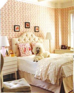
And truly, what woman would not like a pink bedroom with Rose Cumming coral wallpaper and feminine linens?