It's Decorator Showhouse season again! Currently underway is one of the top showhouses in the country, the San Francisco Decorator Showcase. Benjamin Dhong, an interior designer who is designing for his very first showhouse, has created a really serene and elegant bathroom. Dhong was inspired by a trip through Sweden last summer where he saw rooms that were "a dazzling mix of high and low end furniture." Wanting to achieve a mix of traditional and contemporary, Dhong covered the walls in a very soothing, soft faux bois. But there's nothing rustic about this bathroom. I love the tailored shower curtain, table skirt, and curtain. And don't you just love the mirror and the smart little Saarinen stools? I think it's safe to say that Benjamin Dhong is definitely a designer to watch!


Monday, April 28, 2008
Benjamin Dhong Interiors
Sunday, April 27, 2008
Los Angeles Antiques Show

The Los Angeles Antiques Show is wrapping up today, and from everything I've heard it sounded like a stellar event. A friend of mine was kind enough to take photos of some exhibitors' booths, which I'm sharing with you today. Looks like we missed a great show!

All I can say is "Wow!" I love this booth designed by Joe Nye. So chic! And notice the stylish use of Nye's beloved carnations.

Those clever owners of Downtown are always ahead of the curve. This year they featured a few pieces by the late Mexican designer Arturo Pani. I believe they are reproducing Pani's designs, including the small scroll table in the second photo.
The very elegant booth of Hollyhock. Notice how the exquisite furniture takes center stage.
Monday, April 21, 2008
Marjorie Skouras Design

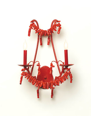
Much of my summer jewelry is heavy on the coral and turquoise beads- it's a great way to add some color to your wardrobe. And perhaps the same could be said for your lighting too. What about some turquoise and coral on your chandeliers and sconces? I think that the designs below by Los Angeles interior designer Marjorie Skouras are so striking, especially the turquoise bead chandelier. While Skouras' lighting line would be perfect for beach homes, I can actually see them working quite well in interiors in colder climates too. In addition to lighting, Skouras also designs accessories such as tiebacks, hardware, and candlesticks, not to mention furniture too. I've included a few of her pieces here as well as some photos from her design portfolio. Enjoy! 
An eclectic room designed by Marjorie Skouras
Turquoise Empire Chandelier
Red Coral Sconce
Coral Tieback
Image at top: A Skouras designed room filled with pretty shades of pink, blue, and greens.
See You Soon!
Friday, April 18, 2008
Chic Events Underway at Winterthur

Exciting things are happening at Winterthur, that glorious Delaware estate of the late Henry Frances du Pont. And for all of us who are interested in design and decorative arts, the events should be right up our alley!
First up is the Double Vision exhibit (March 8-May 18, 2008) which focuses on the design of Winterthur during the 1930's. Why is it named "Double Vision" you ask? Well, Winterthur has an amazing collection of stereographs (three-dimensional images) that were taken of the rooms at Winterthur in 1935 and 1938. Visitors will be able to wear special 3-D glasses to view the stereographs, which I can only imagine will make one feel as if he were actually in the room. Some of the rooms remain the same today, while others have changed over the years. It should be interesting to see how 1930's trends may have influenced du Pont's design choices.
And for even more on 1930's design, you should consider attending the "Chic It Up!" design conference, to be held at Winterthur on May 16-17, 2008. Frances Elkins, 1930's textiles, and Delano & Aldrich are just a few of the topics that will be covered. Speakers include Peter Pennoyer, Stephen Salny, R. Louis Bofferding, J. Thomas Savage, and Eric Cohler. Sounds like a stellar line-up to me!
For more information, visit Winterthur's website.

Chinese Parlor: In this large room guests would gather to play bridge or for drinks before dinner. Chinese hand-painted wallpaper was the height of exotic fashion in the 1930s. The room was always filled with flowers selected to complement the colors of the wallpaper. (Photo: Courtesy, Winterthur Archives)

White Parlor (Empire Parlor): Long before he discovered Americana, H.F. du Pont admired and collected French furniture and decorative arts. Many of the furnishings in this view came from the family's New York apartment. Perhaps as a nod to the family's ancestry, The White Parlor at Winterthur remained furnished in the French taste until the space became the Empire Parlor in 1940. (Photo: Courtesy, Winterthur Archives)

Port Royal Parlor: The 18th century furniture and paneling in this room, which served as the reception room for guests, is meant to suggest the colonial era. However, the abundance of notable pieces and the expanded size of the room taken from a house near Philadelphia are more in the 30s mode. This large room demonstrates du Pont's preference for symmetry and careful placement of furniture. (Photo: Courtesy, Winterthur Archives)

The Enclosed Porch: Many country houses featured an open loggia or arcade overlooking a terrace or garden. They provided a shady refuge on a warm, sunny day, or shelter on a slightly chilly one. The checkerboard patterned floor, the pale blue iron chairs and yellow bamboo, the urns and bright accent of the flowers all reflect popular 1930s style. (Photo: Courtesy, Winterthur Archives)
Image at top: Henry Francis du Pont was photographed in front of the Montmorenci staircase, the centerpoint of his revision of the house. (Photo by André Kertész; Courtesy, Winterthur Archives).
Wednesday, April 16, 2008
A Flair for Living

I've just finished reading Charlotte Moss' new book A Flair for Living- for the second time. I've long been a fan of both Moss and her beautiful books, and this new release did not disappoint.
In "A Flair for Living", Moss gives us a room by room tour of her gorgeous home (and the homes of a few of her clients). For each room, Moss shares with us her views on creating environments that are beautiful, comfortable, and most importantly functional. And while design and decoration are important, Moss emphasizes "Living". After all, a well-designed room with no life is really rather empty, isn't it?
In the introduction, Moss writes of her admiration for Nancy Lancaster and John Fowler, two designers who possessed the ability and skill to "humanize" a room. In my opinion, Moss has taken up the mantle of these two design legends, and quite successfully I might add. In "A Flair for Living", Moss discusses the importance of getting the bones of the room right. Furniture placement is obviously quite critical- you have to create a room that is conducive to daily living and entertaining. But Moss does not stop here. She discusses ways to imbue warmth into a room through objects, personal mementos, and books. Many times it's the details that can bring one so much joy. I won't spoil the book for you, but I do encourage you to read it. The text is certainly very inspiring, but I think once you see the gorgeous photographs in the book you will be anxious to hone your own flair for living.
Moss was kind enough to spend some time chatting with me about her new book and design in general. I asked her how her views on design and living have changed in the last twenty years. Moss said that she came to realize that interior design is not just about decoration- it's about making sure that the clients have what they need to "live" after the design project is over. Moss encourages her clients to relax and enjoy their home, and she gives them the tools they need to do so. Fortunately for us, "A Flair for Living" gives us the same sage advice that Moss doles out to her clients.
We also discussed gracious living and whether this concept is dying out (something which I very much fear). Moss believes that if you give people the history behind traditions- whether it be traditions involving entertaining, flatware, or books, for example- that you make these things relevant. People will understand these traditions and might in fact start to seek out the comfort of the past.
Of course, anytime we read books by designers, we inevitably want to know about specifics. I asked Moss to name the items that really make a room come alive. Among them are books that one actually reads (Amen!), flowers, people, a good fire, fragrance, personal objects, and a floor plan that is conducive to conversation. But most importantly, she feels a room needs people to come alive. So true.
Knowing that Moss has traveled extensively, I was curious as to the kind of homes that made the biggest impression on her. Moss mentioned her fascination with grand homes because of their level of detail and because that type of grandeur is incomprehensible. But the type of home that speaks most to Moss is one that is classically French- something simple and constructed of stucco and limestone. But most of all, Moss' favorite kind of home is one that is warm and layered.
Finally, I just had to dish on The Townhouse with Moss. The shop is just so beautiful that you feel as if you've been transported to an incredibly beautiful, elegant, glamorous, and spunky home. I asked Moss who she saw as the fictional homeowner of The Townhouse. To Moss, it would be someone who has lots of interests and a great deal of energy, a person who is spirited and curious, a traveler, a people gatherer, and someone who entertains all of the time. I think that this fictitious chatelaine of The Townhouse and Charlotte Moss have a great deal in common!
(To purchase "A Flair for Living", click here. And check back tomorrow for Charlotte Moss' Top Ten Book List.)

How gorgeous is this bedroom? This is just one of the many sumptuous photographs in Moss' book.
Tuesday, April 15, 2008
John Stefanidis and his Terrific Table Settings

John Stefanidis is truly a master of design. What appeals to me about his work is that he mixes the traditional with the contemporary with aplomb. But what you may or may know is that he is also quite skilled at setting a beautiful and gracious table. With an eye for detail, Stefanidis can create sophisticated table settings for a home in Belgravia as well as charming, casual tableaux for lunch at a farmhouse (a chic farmhouse, mind you).
Stefanidis was kind enough to share with us some photos of his various table settings. He also listed information pertaining to the flatware, glassware, fabrics, etc. I know that this is very helpful to me as I tend to study photos like these- with my magnifying glass of course!
And just to see if you're on your toes, John thought it would be fun to present us with a quiz on the image at top. Well, I failed the quiz. I only answered two questions correctly. Hopefully, you'll fare better than I. (And I won't make you wait until tomorrow for the answers. I've included them at the very end of the post.)
Quiz:
Q: What is the base of the table made of?
Q: What is the table top made of?
Q: What are the cushions on the ballroom chairs called?
Q: Where are the lettuce leaf centrepiece and matching plates made?
Q: Where was the silver woven bread basket made?
Q: Who made the champagne and white spiral water glasses?
Q: Walls- marble or faux?
Dramatic Dining on the East Coast
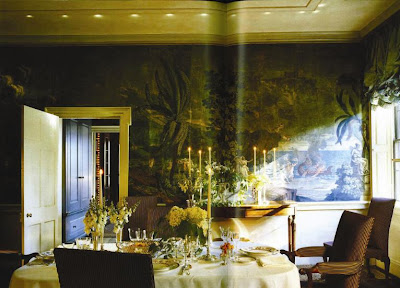
Original 19th c. Dufour wallpaper depicting Telemachus on the island of Calypso
Fibre optic lighting illuminates the walls
Pull-up blinds in unlined eau-de-nil taffeta with knife-pleated frills
Chairs covered in raised velvet stripe
Antique silver candlesticks
English silver cutlery and china
18th Century House in London
John Stefanidis designed round table painted to look like parchment
Cy Twombly Painting. *Stefanidis writes that "one should not turn away from contemporary art in all its manifestations but incorporate it in one's life"
Rug: pink Spanish with Arabic inscription
Centrepiece: Indonesian bowl- container for rice and condiments used for taking offerings to a temple
Glasses: 19th c. French with gilt decoration
Plates: Wedgwood
Boxes: Indian
Dual Purpose Area
Stefanidis designed table: low oak side table is hydraulically controlled so that it can be raised for eating. Geometrical veneer patterns.
Banquette seating stretches across and fills the alcove to maximise the seating area.
Table set with chop sticks and china spoons for a Japanese meal. Black and red place settings reinforce the oriental theme.
Silver shells.
Country Breakfast in Dorset
Tablecloth- blue and white striped ticking
Blue and white Spode table setting
Polished cherrywood top on slatted radiator cover used as sideboard
Silver coffee pots
Blue and white Chinese plates and bowls in bookcase
Venetian glasses with blue spiral design
Stefanidis designed chair with "Scritch-Scratch" fabric loose covers
Farmhouse Lunch
Crisp white linen tablecloth with pulled thread work design
Plates- bespoke designed by Millington-Drake
Stefanidis designed chair with "Scritch-Scratch" fabric loose covers
Venetian glassware
Brick flooring
19th c. nursery clock
Tall storage cupboard for china and glass
Antique straw beehive
Stylish Dining in Belgravia
Stefanidis designed oval terracotta red lacquer dining table; the oval shape allows an additional two guests to be seated than if the table was circular.
Antique silver candlesticks
Stencilled walls with design inspired by the pattern on a Japanese kimono
Stefanidis candlestick lamp
Antique glassware
Silk beige and brown striped curtains with attached fringe pelmets
Lacquered sideboard with display of Chinese plates
Caribbean Dining Pavilion
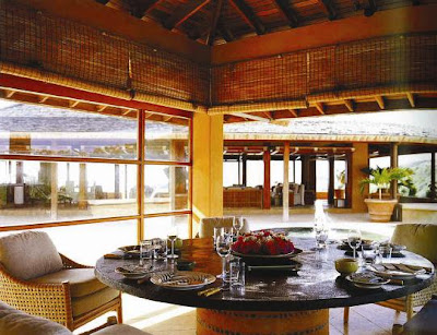
Glass sliding doors and pinoleum blinds to protect guests from the wind and sun.
Table top made of cement hammered to look like jet black slate. The base is a cement drum with a pebble inlay.
Cane chairs with braided rawhide
Centrepiece with bougainvillea and jasmine flowers
Plates: Leaf design from Tiffany
Cutlery: Bamboo design
Al Fresco Dining
Circular table covered in Stefanidis designed fabric- "Stripes"
Brown terracotta plates from Este in Italy
Venetian glassware with red spiral design
Centrepiece: pink pelargonium 'Milden'
Canvas umbrella
Garden seats: Stefanidis design in naturally weathered iroko
Basket weave tiled terrace
Answers to the quiz:
A: Rusticated cement and pebbles
A: Polished Purbeck stone
A: Buttoned squabs
A: Florida
A: Mexico
A: Venini
A: Faux- invented marble in tones of grey and lilac
Monday, April 14, 2008
David Hicks- On Flower Arranging

Some of you may not realize that David Hicks was not just an accomplished decorator; he was in fact a keen gardener too. Hicks was an authority on many matters pertaining to design and decoration (perhaps at times a self-proclaimed authority?), so it's no surprise that Hicks had strong opinions on flower arranging. In fact, he wrote a book on the subject: The David Hicks Book of Flower Arranging.
In the book , Hicks suggests arranging flowers in a bit of a haphazard way. That way, it keeps the arrangement from looking too hard or forced. In terms of color, Hicks liked to use bright pink and orange flowers in a beige or neutral room. And should you choose to create a dried arrangement, make sure to use a mass of dried flowers rather than a few stems. Just a few tidbits of David Hicks wisdom.
But really, when it comes to flowers, a picture is worth a thousand words. Here are a few of the more striking images from the book.


Friday, April 11, 2008
A Little Friday Eye Candy

Let's face it- there are times when all we want to do is look at photographs of handsome rooms. So, seeing as it's Friday, I thought I would just show a few images from Ashley Whittaker's portfolio. I believe her website is still being updated, but in the meantime, I thought this might be a snazzy sendoff to the weekend! Enjoy!


Added bonus: Here are a few pics of Whittaker's apartment from the domino website.

(Images from Domino; photographer Justin Bernhaut)
Thursday, April 10, 2008
Echoes of a Glamorous Era

These nesting tables are reminiscent of those designed by Jean-Michel Frank. In order to create a parchment-like look (remember, Frank used parchment often), craftsmen have antiqued and lacquered abaca paper, giving the tables an aged patina. Love these!

We all know the inspiration behind this bench! It's the classic Serge Roche mirrored bench, used by Elsie de Wolfe in various installations.

This hand-wrought iron table is based on a similar design from Diego Giacometti.

Again, another Roche-esque design. Both the mirror and the pedestal are gesso-finished.
Image at top: Syrie Maugham was an enthusiastic fan of plaster palms.


