Friday, May 27, 2016
A Bucolic Virginia Residence
If you read the May issue of British House & Garden, you'll likely remember the article about Anne Massie's historic Virginia house, whose master bedroom, with its striking pink-and-white print curtains, was featured on the cover. The house was memorable to me, and not just because of its Virginia setting. What pleased me most is how personal-looking the home's interiors are. It seems strange to write that, because houses are supposed to reflect their owners' interests and personalities. But how often do we see interiors that offer not a clue as to who lives there?
Anne purchased the late-eighteenth-century house decades ago with her brother, Will, who is also her business partner; the two siblings are founders and owners of McKinnon and Harris, the outdoor furniture maker. After a restoration of the house, Will bought out his sister's share of the house and lived there with his family. But in 2004, the house was purchased back by Anne, who now resides in the house with her husband.
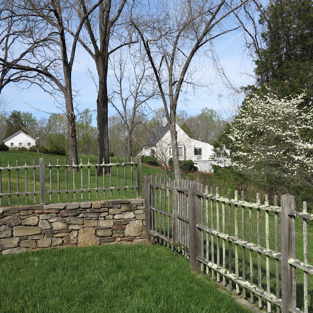
I thought you might enjoy seeing additional shots of the home's interiors, which seem to capture Anne's creativity (she is a painter, too,) and reflect her collector's eye. I'm also including photos of the grounds, which look like the ideal spot to celebrate the Memorial Day weekend. How nice it must be to relax by the pool or on the terrace, especially if lounging in that enviable McKinnon and Harris furniture.
All photos courtesy of Anne Massie
A Billy Baldwin Bonus
And one more interior that seems oh-so-right for the summer: this Nantucket living room, which was decorated around 1980 by Billy Baldwin. The house belonged to Michael Gardine, the writer behind Baldwin's memoir, Billy Baldwin: An Autobiography. Gardine lived in the house with his partner, the makeup artist Way Bandy, while their friend Baldwin lived out his last years in a small cottage on the property.
I'm not bothering to show you the rest of Gardine's house, because Baldwin did not seem to be involved with decorating the other rooms. And if you saw the other rooms, you would have wished that he had been. Still, this room is so quintessential Billy Baldwin that I couldn't resist showing it to you.
Wednesday, May 25, 2016
My Idea of Real Comfort Is...
I recently found a fun 1980 House & Garden article in which top designers were asked to define comfort. Not surprisingly, most designers linked comfort to comfortable seating, including Billy Baldwin, whose Nantucket bed-sitting room, seen above, exemplified the designer's notion that comfort is "a first-class upholstered chair and everything within easy reach."
Designer Robert Lewis, with whom I'm not familiar, also believed comfort involved a well-upholstered chair, but comfort was atmospheric, too: "Wonderful fabric, herbs, flowers, good music- a place to unwind."
For Michael Taylor, comfort was "a seating arrangement that really works." One such successful arrangement can be seen here, on Taylor's own terrace. The wicker furniture was also designed by Taylor.
I agree wholeheartedly with William Hodgins' thoughts on comfort: "A casual stuffed sofa and a good mystery book." I could easily relax- and read mystery novels- in this room designed by Hodgins.
No surprise that Denning and Fourcade showed rather elaborate upholstered chairs to illustrate comfort. For Denning, it was "a chair where you can slump, put your feet up and make a telephone call," while Fourcade called for "a chair that you can sink into so that it completely enfolds you."
"Easy-to-move extra chairs that make your furniture arrangement flexible," said designer John Dickinson. Such an important design consideration, and one that Dickinson acknowledged in his San Francisco home, above.
For Mario Buatta, comfort was linked with scent. "A good piece of furniture, with pillows to rest your feet on- and a wonderful fragrance in the air." In this photo of Buatta's home, you will find Freesia, potpourri, and pomander balls on the table next to the fireplace.
For Bob Patino, comfort was a soak in a "large deep tub full of hot water."
And finally, for Sister Parish, comfort meant "a room where one can relax and have tea with friends," something which, by the looks of it, she could do easily in her bedroom.
All photos from House & Garden, February 1980.
Monday, May 23, 2016
Veere Grenney for Schumacher
London-based designer Veere Grenney recently visited Atlanta to introduce his second collection for Schumacher. While I knew that he was immensely talented (I've long been an admirer of his work), I was delighted to discover that he is immensely charming as well.
Grenney's latest collection of linen fabrics and wallcoverings comes in such a pleasing color palette: soft shades of sage, straw, and lilac, for example, joined by more robust hues of burnt orange, berber brown, and peacock blue. But, hands down, my favorite color in the collection is Temple Pink, which has to be the most perfect shade of pink. Not too sweet nor feminine, this mature version of pink also graces the drawing room walls of Grenney's eighteenth-century, Palladian-style temple folly, which has garnered accolades far and wide because of its architecture, its decor, and those splendid Temple Pink drawing room walls.
Equally as enticing are the collection's sophisticated prints. In a world where screaming for attention has become the norm, it's refreshing to see a collection of small-scaled prints that are subtle yet striking. But, should you wish to make a bold statement, you can do so thanks to the fact that some of the prints, such as Belvedere and Kiosk, are available in coordinating fabrics and wallcoverings.
To see the entire range of this collection, please visit the Schumacher website. And the next time you're in a Schumacher showroom, make sure to peruse the collection in person. I think you'll be as impressed with it as I am.
Folly linen fabric in Burnt Orange
Folly linen fabric in Temple Pink
Folly wallcovering in Orpington Blue
Temple wallcovering in Berber Brown
Belvedere linen fabric in Peacock Blue
Belvedere wallcovering in Berber Brown
Belvedere wallcovering in Lilac
Berrydown wallcovering in Berber Brown
Burley wallcovering in Peacock Blue
Burley wallcovering in Straw
Ferne Park wallcovering in Sage
Kiosk linen fabric in Orpington Blue
Kiosk linen fabric in Temple Pink
Kiosk wallcovering in Peacock Blue
Pavillion linen fabric in Peacock Blue
Thursday, May 19, 2016
The Goodrum House
If you live in Atlanta or have spent any time here, then you're likely familiar with the Goodrum House. Fondly known as the "Peacock House" (or, at least, it was when I was a child), the 1929 house, located at the corner of West Paces Ferry and Habersham Road, was designed by architect Philip Shutze. You might remember that I wrote about the house in 2008, when the house was on the market and uncertainty about the house's future ensued. But, thankfully, the house was purchased by the Watson-Brown Foundation, which has embarked on a major restoration of the house and its gardens.
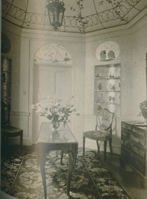
A few weeks ago, I found these black-and-white photos of the house and its gardens in some 1932 and 1933 issues of House & Garden. The house was originally decorated by Porter and Porter, which was Atlanta's prominent decorating firm of the day. Although the house looked more pulled together in 1932 than it did in the 2008 photos, below (taken when the house was on the market after having served as headquarters for the Southern Center for International Studies), you can see that what made the home's interiors so enchanting- the Chinese red Chippendale banister, the dining room's Chinoiserie mural that was painted by Allyn Cox, and the exquisite breakfast room that was painted by Athos Menaboni to resemble a bird cage- have remained intact.
I don't know how the gardens fared over the years, although, like the house, the gardens are currently being restored. However, I'm really taken with the serpentine walls that appear in the 1933 photos, above. But really strikes me (and will likely strike those of you who grew up or currently live in the area) is how uninhabited the neighborhood looked back in 1933. Just look at the road beyond the garden walls; there are no other houses lining this section of the street. Needless to say, the neighborhood has been heavily developed since that time.
As it appeared in 2008 photos:
Subscribe to:
Comments (Atom)


