Monday, August 18, 2008
See You in a Few!
Thursday, August 14, 2008
Valentino and his London Abode

That Valentino. His keen sense of style goes beyond his couture creations. I've never seen one of his homes that was not beautiful, tasteful, and elegant. (Unfortunately, I can't say that I've seen these homes in person. My impressions are based strictly on photographs!).
I think what I admire most about his homes is that they are entirely appropriate for their locations. His Capri home circa 1971 was a sea of vibrant blue and white prints- perfect for living la dolce vita. His London home, featured here, is veddy English. Now, I know this might all seem a bit predictable, but if you're going to have a home in London, don't you want to feel like you're in England rather than in the Mediterranean, for example? Personally, I don't get that maverick approach to design where a home is supposed to look the antithesis of its location- it seems a bit contrived to me.
But let's get back to Val's London home. Does it come as any shock that Colefax & Fowler designed it? Tom Parr of C&F was responsible for much of the interiors. According to a 1992 House & Garden article (from which these photographs are taken), Valentino felt it important to use a British decorator. But while Valentino wanted an English look for his home, he also wanted it to be "more aggressive". I'm a bit stumped about the aggressive part- perhaps it's the use of color? The mix of prints? Perhaps it's a more masculine version of the English look.
I wonder if the home still has Parr's imprint? Or, has it been redecorated? Does anyone know?


(All images from the September 1992 issue of House & Garden; Alexandre Bailhache photographer)
Wednesday, August 13, 2008
A Great Opportunity!

Attention Christopher Spitzmiller fans! Chris is having a sale of seconds- lamps that have slight imperfections in the ceramic form. Prices are approximately 55% off list price. This is a great opportunity for you Spitzmiller fans to add to your collection... or, if you're like me, a great way to start your collection.
The sale runs next week, so get ready to make your decision. Call (212) 563-1144 for more information. And click on the image at top to read the details.
Valentino : Themes and Variations
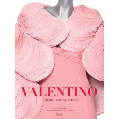
Valentino has always been one of my favorite designers. To me, he is one of only a few designers who creates pretty clothing. And no, pretty is not a dirty word. Oh sure there are those fashion mavens who prefer clothing that is esoteric, architectural, conceptual, and the like. And yes, sometimes that clothing can be interesting to look at. But at the end of the day, don't women want to look beautiful and feminine?
I always felt that Valentino put his clients first; he seemed to intuitively understand how to make them look their best. His color palette was sure to make a woman look vibrant and alive: that sizzling Valentino red; pinks and corals; ice blue; black. There were dressmaker details- rosettes, pleats, and embroidery- that took a dress from being merely a dress to an exquisite piece of art. And never was the female figure obscured by extraneous bits and pieces.
I was excited to get a sneak peek at the new Rizzoli publication Valentino: Themes and Variations by Pamela Golbin (Rizzoli; publication date September 9, 2008). The designer, who took his final runway bow earlier this year, is certainly deserving of this lavish treatment of his work and his career. First, the photos are stunning- but with those beautiful dresses and ensembles, how could they not be? The book has minimal text, which is entirely appropriate as the clothing speaks for itself. (For those of you who are not entirely familiar with Valentino, there is an interesting biography provided.) I also thought the designer's work was organized in a very clever way, with pieces being featured in chapters entitled "Themes" (Ornamentation; Technique) and "Variations" (Line; Volume).
What struck me is how many of his designs from the 1950s and 60s look so current, proving that classic, feminine design never goes out of style. I also loved the vintage photos and advertisements which showed Valentino's designs through the years. How fun to see the progression from the swinging 60s to the exotic vibe of the 1970s, the exuberance of the 1980s (I don't care what anyone says- it was a great era for fashion!) to the minimalist 90s.
So why should we devotees of interior design discuss a fashion designer? Because, we have much to learn from the likes of Valentino. At the end of the day, it's about details, craftsmanship, and timeless design. Had Valentino's career been marked by tricks and trends, I don't think he would have survived in the fickle world of fashion for as long as he did. As Valentino said: "I think a couturier must establish his style and stick to it. The mistake of many couturiers is that they try to change their line with every collection. I change a little each time, but never too much, so as not to lose my identity." Perhaps this sentiment might apply to interior design too?
(Just to prove that Valentino's style is not limited to his couture creations, I'll post some images from his London home tomorrow.)
Now, for the important part.... the clothes!
Behind the scenes preparation for Valentino's last collection, January 2008 Paris.
Satin evening gowns with a delft print from Valentino's Fall/Winter 1968 collection. (Photographer was Henry Clarke)
Left: Giraffe print ensemble from Spring/Summer 1966; at right Fall/Winter 1967.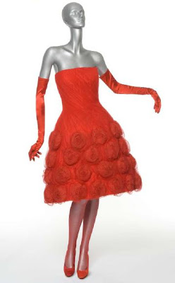
This dress, "Fiesta", was from Valentino's 1959 collection. I'd jump at the chance to wear this dress today- minus the gloves, though.
This orange silk jacket and trousers were designed in 1969. It still looks rather glamorous almost forty years later.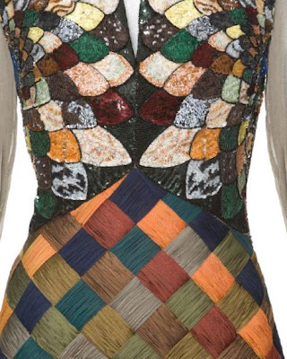
Look at the amazing detail and workmanship of this dress' bodice. Woven silk voile and iridescent sequins in a polychrome marble mosaic motif (Fall/Winter 1990)
You see, the love of coral has been around for a long time. This silk serge gown with handpainted coral motif is from the Spring/Summer 1968 collection. (Photographer Ruven Afanador)
OK, so the dresses and the hair circa 1968 look a tad dated. But that interior certainly doesn't. I also think Marisa Berenson looks fantastic in this photo. (Photographer Henry Clarke)
An ad campaign from Fall/Winter 2007. While Valentino's clothes certainly don't need any help from the model's surroundings, it certainly enhances the dress, don't you think?
A young Valentino in his salon at 54 Via Gregoriana, Rome . This photo makes me want a studio just like this... perhaps the Peak of Chic salon of blog writing?
Valentino surrounded by his models in the courtyard of the Palazzo Mignanelli (where Valentino's fashion house resides), c. 2000. Note the models are dressed in his signature shade of Valentino red.
(All images from Valentino: Themes and Variations by Pamela Golbin. Rizzoli publisher.)
Tuesday, August 12, 2008
Frederick P. Victoria & Son and the Famous Billy Baldwin Bookcase

Last week I posted about Ventry Ltd. and their Billy Baldwin Collection. I mentioned the Porter étagères- those famous brass bookcases that Billy Baldwin designed for Cole Porter's Waldorf apartment.
Tony Victoria of Frederick P. Victoria & Son was kind enough to provide me with the history of this piece. The brass étagère originated in the workshop of F.P. Victoria as a collaboration between Baldwin and the venerable furniture studio. The piece was inspired by an English Regency shelf unit that was owned by F.P. Victoria (the Baldwin étagère was obviously designed on a larger scale than the shelf unit). According to Victoria, what made the design of the étagère unusual was the fact that "in order to give the structure the maximum rigidity, there were half round moldings that formed an “X” attached to the underside of the shelves AND soldered to the leg post knuckles. This was no mean feat, requiring a specially tooled and conforming element to be made in order to permit the crossing member to get over the other one without a break. This design factor is, by the way, how one can tell originals from later copies: the latter just have moldings that butt up against each other on the underside and that are not soldered to the posts (if they have anything underneath the shelves at all), it being much too costly to do that work in more recent times."
The bookshelves were handmade in the F.P. Victoria studio by a craftsman named Julius DaSilva. Owing to the retirement of DaSilva , F.P. Victoria decided to give the patterns to Guerin, of which the owner was a close personal friend. And now in 2008, you can buy this design (or some semblance of it) from Frederick P. Victoria & Son, Inc., Guerin or Ventry Ltd .
Tony also emailed me various images and sketches of the original Regency piece and variations of the Porter étagère. If you didn't already want one of these before seeing these images, I think you will become a convert now!
(Image at top: Photo of the famous Billy Baldwin brass étagères in the apartment of Baldwin)

The piece that started it all: English Regency dumbwaiter that had been in the collection of F.P. Victoria and which inspired the Baldwin/Porter étagère. The shelves are made of rosewood.

A variation of the standard Porter étagère that was taller and held more shelves.

Another variation, this time made for Gary Stephenson, a noted antiques dealer. Victoria notes that this photo shows the versatility of the étagères.

A reference sketch of the Regency piece in the files of F.P. Victoria & Son, Ltd.
(All images were provided by and are in the collection of Frederick P. Victoria & Son, Ltd.)
Monday, August 11, 2008
Declercq Passementiers
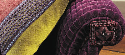
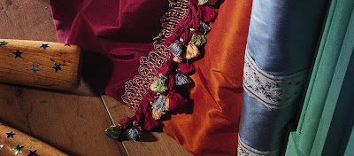
Houlès. Samuel & Sons. Now I have new name to add to my list of favorite passementiers- Declercq. The Parisian firm, in business since 1852, makes stunning tassels and trim. To be quite frank, I prefer simple trims on my furniture and pillows, and my curtains tend to be panels that don't require elaborate tiebacks. But I still love elaborate passementerie; it's truly a work of art. In design, it's kind of like the cherry on top.
The great thing about these little jewels is that you don't have to use them for their original purpose. Who hasn't used a little tassel on a drawer key? Declercq shows one tassel below that can be used as a napkin ring- very clever. Or, you can simply tack one of their trims or tassels onto your inspiration board. I know I could get inspired by looking at one of these daily! What about you?
Rêve de soie used as a napkin ring.
Voyage au Tibet
Justine (a bit boudoir looking, no?)
Nautilus - a collaboration with Thomas Boog.
Manhattan -Though I don't live in New York, I'm tempted to get one of these for my home. But where to put it??
There is nothing old and fusty about this trim (part of the Il Palio collection)
Opium . Ravishing... enough said.
Friday, August 08, 2008
Dining à Deux
Why are these small dining vignettes so charming? Perhaps it's the intimacy of the setting. What a perfect way to dine with a paramour, a good friend, or a dear relative. It's suitable for a ladies lunch for two, a light supper with a neighbor, or a post-theater snack. (Many cookbooks and entertaining books include recipes and menus for a post-theater supper. What I want to know is how many people actually do this? It sounds quite civilized, but Atlantans don't really go to the theater. Do you think this is a New York thing?)
These small table settings just beg for the good stuff. When you've only got cleanup for two, why not put out the good flatware, the crystal, and the salt cellars? I also think these intimate meals call for something rich to eat.
So, with that in mind, here are some inspiring little tables and a good souffle recipe to boot:
Bill Blass' Sour Cream Souffle (perfect for a supper for two- or more!)
1/2 cup freshly grated Parmesan cheese
1 1/2 cups sour cream
1/2 cup all-purpose flour
5 large egg yolks
1 1/2 teaspoons salt
1/4 to 1/2 teaspoon cayenne pepper
2 tablespoons chopped chives
7 large egg whites
Preheat the oven to 350 degrees and set the oven rack at the lower middle level. Butter a 2-quart souffle dish and coat it with the Parmesan cheese, knocking out the excess and reserving it.
In a large mixing bowl, whip the sour cream and flour together with a whisk or electric mixer. Add the egg yolks one at a time while continuously beating. Stir in the salt, cayenne, chives and remaining Parmesan.
In a separate bowl, beat the egg whites until they reach firm, shiny peaks. Fold the whites into the batter with a rubber spatula until no streaks remain. Pour gently into souffle dish and bake for about 35 minutes. Serves 6.

A fantasy table set for Mme. de Pompadour and Louix XV (from Tiffany Taste

An elegant table set for two in the home of Marilyn Evins (c. 1971; House & Garden magazine) (Evins is a relative by marriage of a fellow blogger. Guess who? You'll find out on her blog soon enough.)

Tea for Two, set outdoors in Bermuda (photo from Tiffany Taste)

Would you have guessed that John Saladino set this table? The table is set for an imaginary breakfast between Saladino and the Doge of Venice. (Tiffany Taste)

Rhapsody in Pink. A little retro dining for your pleasure... (image from House & Garden)

Breakfast set for two in San Antonio (Tiffany Taste)
Image at top: Would you expect anything less from the uber-stylish Babe Paley? Note the copy of Breakfast at Tiffany's .... this was obviously before the falling out with Capote.
Wednesday, August 06, 2008
Artaissance: A New Source for Prints

I get emails quite often from readers who are looking for affordable prints and paintings. Original and one of a kind artwork is certainly nice and desirable, but sometimes you need to fill in the gaps on walls with art that is budget friendly and pleasing to the eyes. (I think this is why so many of us have framed notecards and book pages from Chinoiseries by Dams and Zega.)
I recently learned about Artaissance, a company that has launched an art publishing website called "Art My Style". Original works are available in any number of genres, and each work can be printed on either canvas or paper.
The works that caught my eye were those in the New York Botanical Garden collection. How pretty would these look grouped en masse in a sunroom, a kitchen, or a conservatory? In fact, some of the prints are a bit reminiscent of those antique German botanical prints that were all the rage a few years back. (You remember those prints- the ones that looked like they came right out of a Botany class?)
There are a lot of works on the site, but today I'm featuring those from the NYBG collection.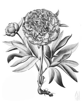
"Peony #1"
"Flore d'Amerique #3"
"Merian Annanas #2"
"Merian Still-Life #2"
"Lima Romana", Blue
"Martagon #3"
"Aronzo de fior doppio"
Image at top: "Pompelmus", Copper


