I get emails quite often from readers who are looking for affordable prints and paintings. Original and one of a kind artwork is certainly nice and desirable, but sometimes you need to fill in the gaps on walls with art that is budget friendly and pleasing to the eyes. (I think this is why so many of us have framed notecards and book pages from Chinoiseries by Dams and Zega.)
I recently learned about Artaissance, a company that has launched an art publishing website called "Art My Style". Original works are available in any number of genres, and each work can be printed on either canvas or paper.
The works that caught my eye were those in the New York Botanical Garden collection. How pretty would these look grouped en masse in a sunroom, a kitchen, or a conservatory? In fact, some of the prints are a bit reminiscent of those antique German botanical prints that were all the rage a few years back. (You remember those prints- the ones that looked like they came right out of a Botany class?)
There are a lot of works on the site, but today I'm featuring those from the NYBG collection.
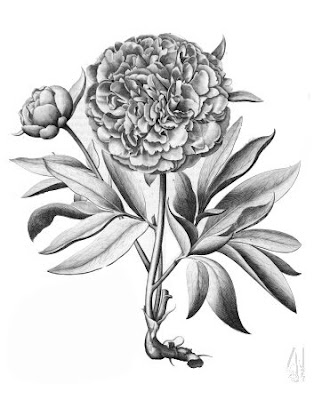
"Peony #1"
"Flore d'Amerique #3"
"Merian Annanas #2"
"Merian Still-Life #2"
"Lima Romana", Blue
"Martagon #3"
"Aronzo de fior doppio"
Image at top: "Pompelmus", Copper
Wednesday, August 06, 2008
Artaissance: A New Source for Prints
Labels:
art
Subscribe to:
Post Comments (Atom)


Peony #1 is wonderful. I love your idea for a large grouping.
ReplyDeleteGreat resource - thanks for sharing! The last one, "Aronzo de fior doppio" somewhat reminds me of a 17th century french emblem...love it.
ReplyDeleteCourtney- I like the Peony too :)
ReplyDeleteAlex- I think my two favorites are "Aronzo..." and "Pompelmus". I would love to know the history behind the Aronzo etching- it's really charming. Glad you like it too!
ReplyDeleteI'm the Art Manager for Artaissance and I think it's great that you chose several NYBG images to feature! As requested, here is a little background scoop on the Aranzo image:
ReplyDeletePUB: Nürnbergische Hesperides 1708–1714
ARTIST: Johann Christoph Volkamer (1644–1720)
Johann Christoph Volkamer, son of a German botanist and gardener, was a wealthy Nuremberg merchant and lover of plants. He spent many years as a young man visiting the gardens of Italy, where he took a special interest in citrus fruits. Upon his return to Germany, he created his own garden, which included a magnificent orangery filled with rare varieties of oranges, lemons, and pomegranates.
Volkamer spent several decades collecting drawings of citrus fruit by the finest German artists for Nürnbergische Hesperides, a two-volume work that he published in installments between 1708 and 1714. Unlike other 18th-century botanical engravings, in which the plants are set against plain backgrounds, its beautiful engravings include views of baroque palaces and gardens in Germany and northern Italy.
ENJOY!
I'm drawn to the black and white - but the colored backgrounds are a fabulous change.
ReplyDeleteFabulous, fabulous, fabulous. The brown background is pretty wonderful. Wouldn't any of these look great blown up to enormous proportions and used as a mural or framed panel? Especially Aronzo de fior doppio? Awesome post. Very fresh images in an genre where the botanicals often seem same-old.
ReplyDeleteAesthete- Aronzo blown up to panel size would be amazing. Great idea. I like botanicals but so many of them seem dowdy- I like the composition of these prints as well as the colors.
ReplyDeleteLove A.L's idea!!!! these are beautiful!!!
ReplyDeleteAnd peak, I still adore the artist you profiled - harrison howard - I drool over his chinoiseries.
How do you find all these great art works????
Now I want a huge mural,
great post, as usual.
This is so great, thanks for sharing these. I am definitely one of those readers looking for affordable prints and they are not always easy to find!!
ReplyDelete~Kate
These are great! Thanks for sharing! Jen R
ReplyDeleteVery handy source. I think I tended towards the black and white, or the sepia, but there is great potential with the blocks of colours such as reds, or blues, depending on your colour schemes.
ReplyDeleteMy apologies for not publishing your recent comments, but I didn't realise I had to moderate and approve, (even though I installed that facility). How dizzy can one be? Rectified now. Do come back soon!
An excellent post. I love these illustrations.
ReplyDelete