

William "Billy" McCarty was once a bright young thing in the world of decorating. Hailing from Miami, McCarty's career as a designer took off in Swinging Sixties' London, where, after briefly working for the great David Hicks, he opened his own design firm and landed such high-profile clients as the Marquess of Londonderry, Kenneth Tynan, and Vidal Sassoon Salons. It was also in London where McCarty began affecting a British accent- at least, according to what I have read.
In 1971, McCarty raised his profile further- especially in America- thanks to both his first-prize win in the Burlington House Young Designer competition and his debut collection of fabrics and wallcoverings for Kirk-Brummel. Titled "Noble Savage", the collection, which you can see above- that's McCarty standing among his designs- was a modern riff on American Indian motifs. With names such as "Hopi", "Geronimo", "Shawnee", and "Seminole", the prints were McCarty's attempt to "give people another viewpoint into Indian designs. I think one's eye has been dazzled by the super-plastic pop art thing, which is a definite chore to live with. The idea here was a softer, more fluid look." Looking at these designs forty-plus years after their debut, I'm not really sure that I would call these prints soft and fluid. However, I suppose that if one compares them to the riotous patterns that were so popular in the late Sixties and early Seventies, one could say that McCarty's designs were not quite as harsh.
Whether McCarty designed subsequent collections, I'm not sure. But McCarty's design work was featured often in Architectural Digest during the Seventies and Eighties. Take, for example, the London flat seen below. Published in 1976, the home displayed a sophistication and a maturity that refrained from appearing too serious thanks to a profusion of patterned walls and ceilings. But as he did with the rest of the décor, McCarty took a disciplined approach to pattern, choosing more or less one printed fabric per room. The result is a home that is spirited, yet dignified, too.
As compelling as much of McCarty's work was, it was his personal life that also gained the designer attention. As a young man in London, McCarty embarked on a relationship with the wealthy art collector, Douglas Cooper, who had previously been involved with Picasso biographer John Richardson. Cooper eventually adopted McCarty as his son, a move meant to ensure that the designer would inherit Cooper's vast estate. It also resulted in the designer changing his name to Billy McCarty-Cooper. Sadly, around the time of Cooper's death in 1984, McCarty-Cooper learned that he had contracted AIDS, a disease to which the designer eventually succumbed in 1991. Fortunately, his work lives on, at least in the pages of decades-old issues of Architectural Digest.
*Click here to see a previous blog post that features McCarty's work during his David Hicks days.


McCarty/Kirk-Brummel photo and quotation from House Beautiful, June 1971; London flat photos from Architectural Digest, March/April 1976, Michael Nicholson photographer.


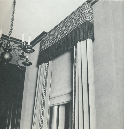
 yesterday and read the chapter on a London townhouse decorated by Billy McCarty, an American designer residing in England who, the book noted, had once worked for David Hicks. There was an accompanying photo of the home's entrance hall in which the walls were lined in beige wide-wale corduroy (fabulous.) The chapter's text also mentioned that McCarty used the same corduroy for matching draperies that boasted 14 inch wool fringe. My first thought was "Where is the photo of the curtains? I want to see the curtains! Why do articles and books mention something intriguing in a room, and then they don't include a photo of it!" But then it came to me. Hadn't I seen a photo of wide-wale corduroy draperies in one of David Hicks' books? I consulted
  , and voilá, there they were. Too bad the photos aren't in color, but you still get the idea. And that 14-inch bullion trim? While I'm not so crazy about it, I know that I'll never forget it.


 ; #5 from
  by Minn Hogg; #6 from
  ; #7 and #8 from
  ; #9 from
  .
.


