

One fall book release that I have anxiously been awaiting is David Hicks: A Life of Design
First, this book has much more biographical information than the previous Ashley Hicks project. That book gave you a glimpse into the life of David Hicks, but this tome really fleshes out the story of how Hicks got his start and created his design empire. Hicks was certainly ambitious (perhaps one could say aggressively so), and when opportunity knocked on his door, he didn't hesitate to make the most of it. Perhaps that's not such a bad thing as we are still talking about Hicks today.
The other point I'd like to make is that Hicks' work went beyond that mod, graphic, zingy look that he is so associated with. Much of Hicks' later work is actually restrained, elegant, and even at times subdued. I think that this phase of his career is often overlooked, and it's one that should be explored by young designers.
Granted, many of the photographs included in this book appeared in Ashley Hicks' earlier book as well as many of David Hicks' own books. However, there are Hicks interiors that I have never seen before, especially those of his early career. If you are a Hicks fan, or if you collect monographs of great designers, I think this book will be a worthy addition to your collection.
The ballroom at Claridges transformed for an event by David Hicks and this then business partner Tom Parr, c. 1957.
A Hicks Parr room from the 1950s.
The Belgravia drawing room of Princess Guirey, designed by Hicks in the 1950s.
One end of the Long Gallery at Baronscourt, the seat of the Duke of Abercorn, c. 1978.
(All images © David Hicks: A Life of Design by Ashely Hicks, Rizzoli, 2009.)
Monday, September 28, 2009
David Hicks: A Life of Design

Monday, July 27, 2015
Revisiting David Hicks Carpet

Around the time I started blogging, David Hicks's carpet designs were all the rage, just as they had been when first introduced decades ago. Everywhere I looked, I saw hexagons, octagons, and the rest of Hicks's favored geometric shapes and patterns. But because Mr. Hicks's designs were all anyone seemed to talk and blog about, I lost interest, choosing instead to focus on other topics that had not yet reached critical mass.
Almost ten years later, though, David Hicks carpet is back on my mind. I was recently looking at photos of Hicks's later work, and I was reminded of the range of his carpet designs, many of which are no longer in production. Take, for example, the carpet sample in the photo, seen above. According to Suzanne Trocme's Influential Interiors
 , this Brussels weave carpet was produced by Avena carpets. Like most of Hicks's floor-coverings, this carpet boasts a geometric pattern, but because it is small-scaled, it appears much less bold than some of his more famous designs . The colorway is quite attractive, too.
Then take a look at the carpet in Hicks's Oxfordshire home, which can be seen in both the second and third photos, below. This particular Hicks carpet possesses the verve for which the designer was so well-known, but its neutral tones help to tone down the swagger. In fact, look how well the carpet works with those voluminous- and fetching- curtains. And speaking of fetching, what about that carpet in the blue bathroom, also seen below? Hicks originally created this carpet for the Prince of Wales, which explains the inclusion of the feather-motif within the overall octagonal pattern. If you look at the fifth photo, a scrapbook of David Hicks's carpet designs, you'll see a rendering of this Prince of Wales pattern, minus the feathers.
I've included a few additional photos that show other Hicksonian carpets and rugs, all of which I think are ripe for reissue. To me, these examples have the flair and pizzazz that people still desire, but they're not quite as brazen as those designs that were all the rage almost a decade ago.


Tuesday, March 31, 2009
The Fabric That Dare Not Speak Its Name

Chintz can be such a controversial subject. What? You didn't know that? Oh yes, the fur can and oftentimes does fly when discussion turns towards chintz. And why? It's nothing more than glazed cotton. How can you disparage good old cotton? And I for one love glazing (especially on doughnuts). I think chintz has unfortunately gotten a bum rap, much like linoleum and shoulder pads.
We had a mini chintz revival recently, although the chintz that seemed to garner the most publicity was of the floral variety. Florals are all well and good, but the chintz that strikes my fancy are solids. I love the sheen of solid chintz fabrics, but this is where the quality factor comes into play. Cheap chintz looks, well, cheap. It's all about the luster, and well-made solid chintz fabrics have got that in spades. It's a humble, toned down kind of glamour.
I found this early 1980s ad above for Zumsteg fabrics. Look at the yummy colors, the shiny finish, and the subtle, tonal print. Can't you see fabric like this used for some glam curtains in one's bedroom? Or what about seat cushions? If I owned a Frances Elkins' Loop chair, I'd use a chintz like this.
Of course, who doesn't associate floral chintz with Mario Buatta. But another prince of chintz- albeit solid chintz- was David Hicks. He used glazed cotton fabric for pillows, bedspreads, curtains, and all kinds of upholstery. And you know, it looked really great. My only advice would be to use solid chintz sparingly. Otherwise, your rooms might end up looking slippery!
(PS- Does anyone know anything about Ashley Hicks' forthcoming book David Hicks: A Life of Design


David Hicks designed all of the rooms above. His use of gutsy, colorful glazed cotton made chintz hip and sexy.
(Images of David Hicks' work from David Hicks: Designer

Monday, April 14, 2008
David Hicks- On Flower Arranging

Some of you may not realize that David Hicks was not just an accomplished decorator; he was in fact a keen gardener too. Hicks was an authority on many matters pertaining to design and decoration (perhaps at times a self-proclaimed authority?), so it's no surprise that Hicks had strong opinions on flower arranging. In fact, he wrote a book on the subject: The David Hicks Book of Flower Arranging
In the book , Hicks suggests arranging flowers in a bit of a haphazard way. That way, it keeps the arrangement from looking too hard or forced. In terms of color, Hicks liked to use bright pink and orange flowers in a beige or neutral room. And should you choose to create a dried arrangement, make sure to use a mass of dried flowers rather than a few stems. Just a few tidbits of David Hicks wisdom.
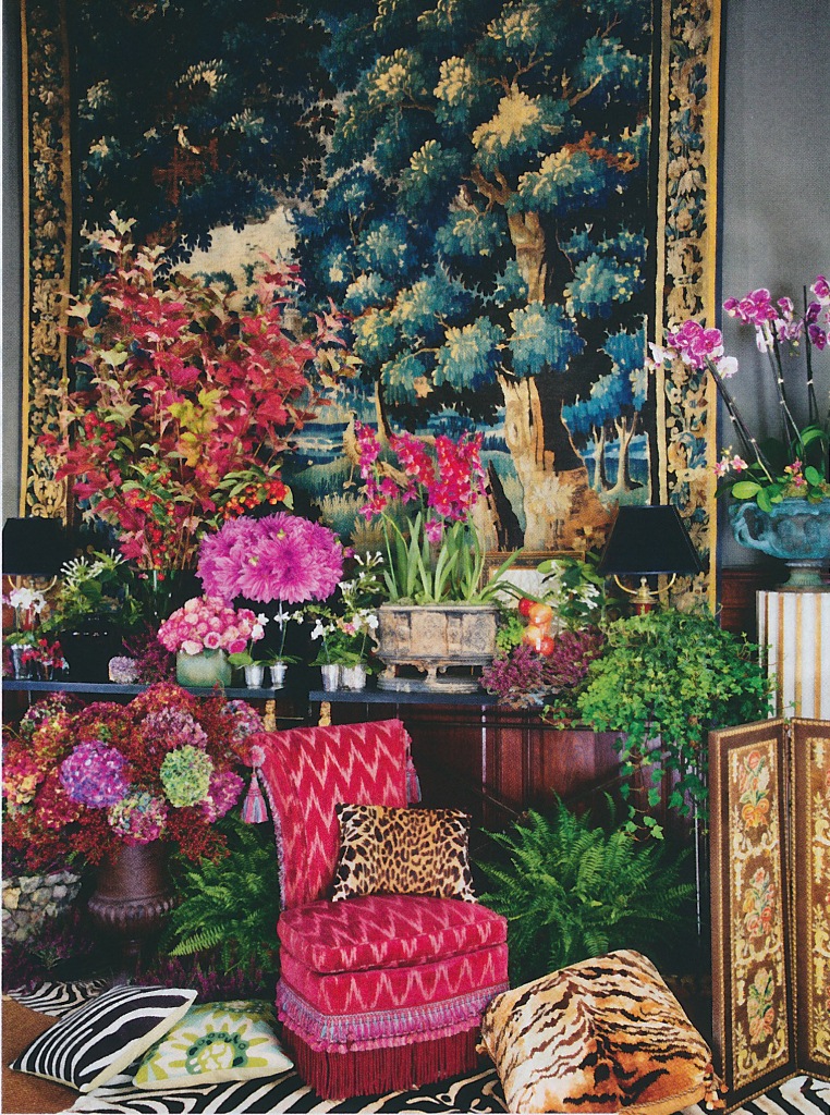
But really, when it comes to flowers, a picture is worth a thousand words. Here are a few of the more striking images from the book.


Wednesday, January 08, 2014
A Dash of Damask

Damask-style prints have long occupied neutral territory for me. In the past, I haven't been wild about them, but then again, I haven't disliked them, either. I suppose that I just never thought much about them. That is, until last October when World of Interiors featured the London town house of decorator Veere Grenney and David Oliver, creative director of the Paint and Paper Library. The whole town house is really quite fabulous, but it was the house's dining room and sitting room, above, that really captured my attention. I found the pair's use of Louvres, a Fortuny-esque cotton made by Marialida for Tissus d'Hélène, quite striking. Although the fabric's print is reminiscent of "Baroque foliate pattern found in flock wallpapers of the early 18th century," I consider it to be a damask print. The dark brown and white coloration makes this traditional print appear cool and dignified rather than precious or ostentatious. And, any of the damask print's long-associated fussiness has been banished thanks to the room's clean-lined, contemporary furnishings.
So, it seems that if you want to decorate with damask prints and maintain some sense of modernity, the key is to use neutral-toned damask prints (think caramel, chocolate brown, and even shades of grey) and to balance the print's inherent ornateness with simple upholstered seating, solid fabrics, and restrained-looking tables and case pieces. Just look to the work of David Hicks, John Fowler, Tom Parr, and now Veere Grenney and David Oliver to help guide the way.


For this apartment in Paris, David Hicks created a wallcovering, made of white impasto on linen, that was inspired by 17th-century damasks.

Tom Parr chose "Double Damask" paper, which was based on an 18th-century design, for his Eaton Square, Belgravia drawing room.

John Fowler also used "Double Damask" paper in brown and cream at Nantclwyd Hall.


The fabric that covered the walls of this French study was a cut velvet, which featured a damask-type print.
Photo at top: World of Interiors, October 2013, Simon Upton photographer; Hicks photos from David Hicks: Designer and David Hicks: A Life in Design by Ashley Hicks; Parr photo from House & Garden Guide to Interior Decoration; Fowler photo from John Fowler by Martin Wood; last two photos from Architectural Digest- International Interiors
Monday, May 13, 2013
Plum in Pink and Red

Unless you've been a recluse over the past week, you have likely seen photos of last week's Met Gala. I'm not going to get into too much detail about it except to say that my picks for the three best-dressed guests were Lauren Santo Domingo, Vanessa Traina, and Plum Sykes, all of whom work in the fashion world. Plum Sykes's decision to wear scarlet satin Manolo Blahniks with her pale pink column dress especially captured my attention because the color combination was a bit unexpected. And yet, it was really quite smashing, with Sykes's red shoes making her prim gown sing. It also reminded me of how much I love this color pairing. (I did not want to fool with obtaining permission from Getty Images to use their photo of Sykes, so you'll have to click here to see her stepping out to the Gala.)
Rarely do you see pink and red used together within the same room. In fashion layouts, however, you do. When standing alone, pink can appear slightly (or sometimes sticky) sweet. But when dashes of red are thrown in for flavor, the effect can be sophisticated and effervescent. Could this be why Babe Paley wore pink and red for her Round Hill, Jamaica portrait?
One interior designer who did mix the two colors together to great effect was David Hicks. Hicks, however, took a brash approach to the pairing, using pinks that had vigor and swagger. Cerises, scarlets, and magentas mingled to create rooms of bravado, fit for even the most manly of men. If all of this sounds too swashbuckling, you could take your cue from Hicks (or even Mark Hampton, whose 1970s-era Manhattan apartment included a red and pink bedroom) but tone it down for more feminine sensibilities. Paint a room's walls in lacquered aubergine and upholster its furnishings in pink silk and red damask. I think that such a room would like really pretty...or, to use a phrase that gets on my nerves, such a room would look "very gala."




Serge Obolensky photographed by Slim Aarons at the St. Regis Roof, New York. I can't really tell if the room was mostly pink or if there was some red somewhere (perhaps the ceiling?)
Photo of Paley and Obolensky from A Wonderful Time: An Intimate Portrait of the Good Life by Slim Aarons; Hicks and Hampton photos from David Hicks: Designer; Maharaja of Jaipur photo from The World in Vogue 1893-1963.
Monday, February 11, 2013
A Case for Printed Sheets

I realize that to some people, plain white sheets are the only aesthetically acceptable sheets to place on one's bed. Not so for me. While I do, of course, have some white sheets, I prefer bedding with a discreet floral or feminine print. It just seems so boring to turn down the covers, only to have plain white cotton greet me. Pink Porthault hearts, on the other hand, make my heart go pitter-patter.
While I have a weakness for Porthault printed sheets, I also like some of the prints available through Schweitzer Linen. Not only are their patterns feminine and sweet, but their bedding is quite affordable too. And although I don't own any bedding from the Lulu DK for Matouk collection, I do really like the upbeat designs that Lulu has created. If you have never before considered patterned sheets, perhaps now is the time for you to take a look at some bedding with personality.
It wasn't too long ago when patterned sheets were all the rage. During the 1960s and 1970s, many fashion and interior designers boasted bedding collections, a popular form of branding (did they call it branding back then?) during the early days of product licensing. As you might expect, the prints were often evocative of their era: colorful, exuberant, busy, and wild. David Hicks, you might remember, had a bedding collection as did Bill Blass. Some of these designer bedding collections look pretty atrocious, at least to twenty-first-century eyes. And what makes this bedding seem even more dated is that it was usually photographed alongside other interior fashions of the day that, like the bedding, hasn't held up very well.
It wasn't hard for me to find photos of designer sheets as my vintage magazines were chock full of editorial features and ads touting these collections. I think that if you take a look below, you might be surprised at some of the prints that these designers churned out, although I do wonder just how involved some of them were in their bedding collections. All I can say is thank goodness that we now have more demure and classic looking printed sheets than what you see below.
And although I don't care for Mr. Blass's sheets, I do think that he redeemed himself with his 1979 edition of the Lincoln Continental Mark V. That was such a fabulous car that I wouldn't mind driving one today!


David Hicks's collection for Stevens-Utica might be one of the better designer bedding collections. In fact, it doesn't look terribly different from his fabrics. The bathroom of the David Hicks Suite at the St. Regis Hotel in New York featured his H-logo sheets used as shower curtains, a basin skirt, and a lamp shade.


Bill Blass designed sheets for Springmaid. Those exotic printed sheets, photographed in Blass's bedroom, were named "Nemuri". Perhaps more representative of Blass's masculine style is the brown and gray plaid sheeting that "creates a penthouse environment in your home."


Just as Blass had his bedding collection, so too did Oscar de la Renta, though Cannon Mills produced his line. For one of the Oscar de la Renta-Cannon ads, the designer wrote, "My designs are for the woman who believes her bed and bath should be as well-dressed as she is." His sheets might look rather dated today, but I think that they might have been kind of chic back in the mid-1970s.

Missoni's sheeting collection doesn't look far removed from their classic clothing prints.

The problem with this bedding collection by Halston (yes, Halston) is that there are too many frills on this bed. Halston's rose pattern was, according to the modest designer, "the prettiest rose pattern that anyone's ever done." I'm not sure about that, but I do find that the pattern was inspired by some Joe Eula paintings to be interesting. I believe that this print also appeared on some of Halston's dresses.

Would you be surprised to learn that these "Rose Elegance" sheets were designed by Yves Saint Laurent? I was, but I really wonder how much of a hand he had in this collection.


Both of these bedding sets were designed by Angelo Donghia and were photographed in Rita Moreno's bedroom. The plaid version is really not bad. In fact, I might say that Donghia did one of the better designer bedding collections.
Slim Aarons photo at top from A Wonderful Time: An Intimate Portrait of the Good Life; David Hicks/ St. Regis photo from David Hicks: Designer by Ashley Hicks.


