

I never cease to find inspiration from old interiors. It doesn't matter if a room was decorated thirty years ago or one hundred thirty years ago. As long as it was designed with style, taste, and authority, an old room can provide one with decorating ideas and even spark one's imagination.
It's rare, though, that I find an entire home that I would consider move-in ready, but such was the case when I stumbled upon these photos of Ferris Megarity's Manhattan apartment. This has to be my new favorite home. It's perfection, or at least, my idea of perfection. The color scheme might be predominately neutral, but it's not snoozeworthy. Those chocolate brown walls with crisp white trim help to wake up close-by beiges and caramels. And can we talk about those snappy chairs covered in one of my all-time favorite fabrics, Brunschwig & Fils Les Touches? Sublime. I also spy bamboo shades, a tortoise-finish drinks tray, blue and white porcelain, needlepoint, silver-leaf wallpaper, books, and mirrored walls and screens. Those too are like a hit parade of my favorites. I'm getting heart palpitations just writing about them!
The late Megarity was publicity director and one-time home furnishings division director for B. Altman, so presumably he had access to the best of the best. But access alone didn't guarantee such a beautiful apartment. It also took a trained eye to achieve such a tasteful balance. Megarity, who hailed from Waco, Texas, credited his University of Texas education in fine arts and art history with informing both his career and his style of decorating. Of his education, he said, "It's held me in marvelous stead. Every step of the way it has been a continual boon, especially when I traveled. I found my training let me function as an editor when I had to coordinate the efforts of a number of people. It gave me a sense of the past and also put the present into perspective." Yet another argument for the importance of an art and design history education.
Oh, and by the way, these photographs were taken in 1975. Thirty-eight years later, and I can't find a thing about this home that needs updating. Too bad we can't all age as gracefully.


Photos from Architectural Digest, March/April 1975, Richard Champion photographer.


Me either...super space. When can we move in? xx.DT
ReplyDeleteYou are right, A classic interior. There is nothing wrong with it. The delft candlesticks from your previous post would be perfect on that dining table. My first apartment in NYC was painted chocolate brown. Everything and everyone looked good against it. It was a great party space.
ReplyDeleteIt does speak of a very specific time and place in the decorating world....and an elegant one.
ReplyDeleteFor me, the only element I would change would be the throw pillows. I think they look a smidge dated. Other than that it's pretty good.
OK everything I adore + I'll move-in today. xxpeggybraswelldesign.com
ReplyDeleteYes, perfection. Just purchased a pair of Biedermeier stands like those in the last photo--thank you for the confirmation! Have a great week-end.
ReplyDeleteMary
SUPERB!
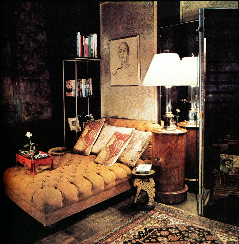
ReplyDeleteLove the dragon pillows in first pic, needlepoint? They are whimsical and a jolt of appropriate color without being hokey. The placement of the chandelier almost against the flue wall is genius, keeping it central yet not blocking precious headroom/floor space in a NYC apartment. What an assured eye he had...
I miss Altman's, the only NYC department store which took up an entire city block AND allowed one to look across the length and breadth of the selling floor to see each of the four facades entrances/exits; a rich and extravagantly luxurious use of space in an urban context - almost as if the great outdoors had been transposed inside a building. We will never see the like of such urban majesty again; and to think it was a charitable trust!
Jennifer, this is an elegant room, and you know, Stan Topol always taught us that what goes around -comes back around- nothing is new under the sun. I love lacquered walls- I love shimmer, and I love dark rooms. This vintage shot also reminded me of our late friend Mr. T. Gordon Little. Did you ever get around to researching Otto Zenke? He was a purveyor of this classic look, which, when one experiences it in person (in the room) feels so right and high quality. His clients have preserved the rooms he did in Winston-Salem- and the classical building his offices were in are still located in downtown Greensboro, NC. PS, I am living for my copy of "In With The Old" !
ReplyDeleteOh, it's really perfect. And from 1975? Wow. And the single rose on the tray? So sweet. What a charming home and what a charming resident he must have been!
ReplyDeleteDo you notice how much brown there is in the bamboo? You can't get that any more.
ReplyDeleteWhere do you see the silver leaf paper?
Is the button tufted chaise a bed as well? It's terrifically chic.
Thank you for sharing your ongoing research and education.
I have that exact cocktail table and for years having been trying to find out who made it. Can you give me anymore information on it. I also love the colors, the fabric, the symmetry of this room!
ReplyDeleteMies van der Rohe Barcelona Table? Lucky you.
DeleteI agree on all counts! Wonderful atmosphere and fabulous things to look at and admire.
ReplyDeleteWonderful post! One of my most favorite style of all times!
ReplyDeleteLove keeping up with your blog!
Love, Jamie Herzlinger
Wow, this is a find! Extraordinary blue and white porcelain and those 4 Japanese prints against the dark dining room wall!
ReplyDeleteRegarding the bamboo shades, they do have a lot of brown in them, which, as we know, is now hard to find. (I wonder why?) The magazine doesn't mention the maker of the cocktail table, but I would go with Victoria's answer.
ReplyDeleteAlso, the silver leaf paper was framed in panels, which hung on the bedroom wall. The tufted chaise did perplex me a bit...it does seem that it's the bed, but I can't be certain.
That silver leaf paper seems like an exploded shagreen pattern, or a 60's acid-trip vision of inter-galactic space, and I mean that in the best possible way; very handsome and using it in panels tames and yet highlights the patterning.
Delete