Monday, July 08, 2013
Putting a Space with a Name
I always get a kick out of finding an old article or book that features a home decorated by a friend or acquaintance. Such was the case the other day when I pulled my copy of Architectural Digest California Interiors from the shelf. When I first read the book a few years ago, I found the project that is seen here to be quite attractive and elegant. I was especially taken with the gazebo, which was decorated with an array of blue and white fabrics, furnishings, and porcelain. But at the time, I wasn't familiar with the home's designer, Jack Lowrance. Fast forward to today, when I do know Jack. Now that I can put a space to a name, I find the project even more interesting. Personal connections have a way of making things more meaningful, don't they?
The home (more of a cottage, really) was located in Woodside, California, close to San Francisco. Jack's longtime clients, who had spent years amassing a notable collection of porcelain and antiques, purchased the home as a place in which to enjoy their retirement. Accustomed to living in a formal manner, the homeowners were, at first, unsure of how to reconcile their treasures with a desire to live more simply. Jack's approach was to decorate the cottage in the elegant and refined style that the homeowners had long enjoyed and appreciated, yet he did so in a way that was comfortable and easy to manage. It was the best of both worlds, one in which the couple could continue to enjoy their collections but in a more relaxed fashion.
But still, I have to go back to the Gazebo and patio of this home. I think it's safe to say that the majority of us love blue and white, trellis, dining alfresco, garden seats, ceramics, and the like, so I think you'll especially enjoy the photos of these spaces. They were chic and snappy when they were decorated thirty-some-odd-years ago, and they're still chic and snappy today.
The focal point of the living room was the Edo Period screen behind the sofa. To the left of the sofa was a table upon which a Degas drawing and antique seals rested (seen in the top photo.)
Also in the living room was an 18th-century English lacquered secretary, which held the homeowners' collection of blanc-de-chine figures.
Another Edo Period screen could be found in the dining room, where the table was set with crystal, floral porcelain, and gilt figures.
The well-appointed master bedroom boasted a view of the home's swimming pool.
The Library had mahogany paneled walls, which, along with the blazing fireplace, created a cozy refuge.
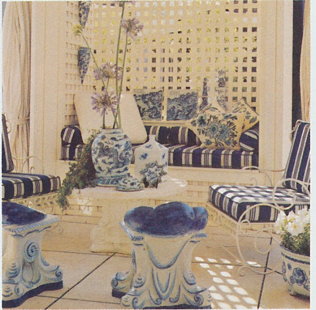
Jack employed lattice to create two different living spaces outdoors. Off of the living and dining rooms, a Pergola was added to create an outdoor entertaining space. Planted flowers helped to soften the edges of the space. (#2, #3, and #4 in the outdoor set of photos.) A patio, notable for its painted, trompe l'oeil scene of the surrounding area, was used for alfresco dining. (#5) The gazebo stood at one end of the pool, where it housed a collection of blue and white ceramicware as well as blue and white striped upholstered seating, blue and white planters, and fabulous grotto-like blue and white garden stools. (#1, #6, and #7)
All photos from Architectural Digest California Interiors, Max Eckert photographer.
Subscribe to:
Post Comments (Atom)


This is such a wonderful post. It is SO enjoyable to have a peek into rooms that are loved, personal and soulful...
ReplyDeleteExquisitely layered and yet so livable. That first photo, which I assume is a collection of finials? That's the sort of masterful touch which keeps the entire space from becoming stuffy. Love this, Jennifer--a much-needed Monday smile!
ReplyDeleteThey are seals. (They were used with hot wax to seal an envelope before envelopes had self-adhesive)
DeleteWhat an incredible collection. The Edo screens, the porcelains, the antique furnishings......I think I could spend days imbibing this beautiful home--and it is not over-the-top.
ReplyDeleteThanks for making my Monday.
Mary
What also struck me about this project was that all of the porcelain and objects obviously had great meaning to the homeowners. These were not accessories for the sake of accessories.
ReplyDeleteThe blue and white scheme looks like a tropical version of The "Coach House" sat Haseley court, and I love it! The gorgeous gazebo is so beautifully done.
ReplyDeleteIt's very pretty, and those pieces are all still valid today, and have surely increased in value! Thanks for the nice post, Miz Jennifer!
ReplyDeleteDean
What an amazing home! It's so impressive to see how they were able to merge all of the wonderful pieces the owners had collected from different cultures. The master bedroom was amazing and the gazebo by the pool a true work of art. Thanks for sharing
ReplyDelete