Remember how we all raved- for months- about Andrew Zega and Bernd Dams' Chinoiseries? Well, hold on to your hats because they are back with a new book that I think might be one of their best yet!
An Architectural Alphabet (Connaissance et Mémoires) is the new limited-edition artist's book that features the duo's watercolors of the alphabet. Each letter is featured in an architectural or garden related scene. In fact, a few lucky letters are painted against backdrops of Chinoiserie follies. How great is that?
The new book, with a forward by none other than Charlotte Moss (I told you this was good!), is hand-bound in silk, numbered, and slip-cased. Forget the jewelry, baubles, trinkets, and bibelots- this is what I want for Christmas. I better start writing Santa right now.
Cynthia Conigliaro and Will Rogers of Archivia Books and Catherine Cormery of Connaissance et Mémoires are hosting a book party where Zega and Dams' new book as well as some of their recent watercolors will be featured. The event takes place at Archivia Books on Thursday, November 20 from 6 until 8pm. To RSVP, call 212-570-9565.


Wednesday, October 29, 2008
An Architectural Alphabet
Tuesday, October 28, 2008
Carolyne Roehm and her Passion for Blue and White
I just returned from San Francisco where I attended a lecture given by Carolyne Roehm. Held in conjunction with the San Francisco Antiques Show, the lecture, entitled "All Roads Lead to Roehm" (very clever!), was a celebration of all things blue and white, including her new book A Passion for Blue and White
In both her lecture and the book, Roehm champions the versatility of this classic color combination. First, you have an array of shades with which to work- from icy blue to cornflower to navy and beyond. And blue and white also works well with other colors too such as pink, yellow, and red.
I believe that many of us think of blue and white as being casual, and it certainly can be. Really, what is chicer than a white blouse with a pair of blue jeans? But Roehm also makes the case for blue and white to be used in elegant and formal settings too. I suppose you can say that blue and white is like the perfect date- you can take it anywhere and it will fit in marvelously. No need to put lipstick on the pig! (Just kidding.)
I have to say that I admire Roehm's efforts at putting her passion into images and words. Roehm's love affair with blue and white began many years ago, and years later it is still going strong. While other colors might stir my passion more, I think I might be coming around to the whole blue and white thing.
Joe Nye New York will be hosting an afternoon tea in honor of Carolyne Roehm and her new book on Wednesday, November 5 at the Joe Nye New York showroom. To RSVP, contact Christina Juarez, tel 917-463-3685. Wish I could join you!

Blue and white can be laid back and informal

Or it can be quite grand and proper

Blue and white can be exuberant

And it's also quite breezy

And you know what? It looks quite smashing on a cake too.
(All images from A Passion for Blue & White, Carolyne Roehm, Broadway Books, 2008)
Wednesday, October 22, 2008
Amaze Me!


In Regency Redux: High Style Interiors: Napoleonic, Classical Moderne, and Hollywood Regency, author Emily Eerdmans mentions an anecdote in which couturier to the stars Adrian commissioned Tony Duquette to design his Beverly Hills dress salon. And the directive that Adrian gave Duquette was really quite simple- "Amaze me". How fabulous is that? I'm sure that for many of you designers, these two little words uttered by a client might be like manna from heaven. It's a directive that gives the designer license to pull out all of the stops and unleash the full force of one's creativity. But I suppose it's also a command that is fraught with uncertainty and that just might provoke stage freight.
I've been thinking about this story for a few weeks now because I would love to tell certain people "Amaze me"- my shoe salesperson at Neiman Marcus, my general contractor, and my hair stylist, for example (and all three are pretty fantastic so I feel confident that they could do so.) But in terms of design, sometimes you see an interior and you can just tell that the designer felt compelled to give the client something ultra special and well, amazing. I wonder if this might have been the case in the following interiors (and a garden too).
The Paris apartment of Charles de Beistegui, c. 1933. Designed by Le Corbusier and Pierre Jeanneret, the apartment featured this stunning cement staircase painted blue and white. Note too the crystal rail.
The entrance hall at Sa Torre Cega, Cala Ratjada, Mallorca, Spain. Carlos Ortiz-Cabrera of Maison Jansen was responsible for the Pop Art looking, trompe l'oeil painted floor in the foyer.
The Madrid bathroom of the Duchess of Alba, designed by Armand Rateau, c. 1925. The bath was carved from a single piece of white marble, and the walls were covered in gold lacquer with pastoral type scenes.
Landscape design can be used to amaze too, as seen here in the park of Mimi Pecci-Blunt's Paris home, c. 1926.
Images at top: The ultra chic, ultra glam studio of Adrian, designed by Tony Duquette
Tuesday, October 21, 2008
Todd's New Digs

One of my favorite stores in New York is Todd Alexander Romano Antiques and Decorations. Not only is Todd charming and friendly, but he has the type of style and flair that I hope to aspire to someday! Todd has recently traded up to bigger quarters in The Fine Arts Building on E. 59th., and I'm dying to visit the new shop in person. Todd and his assistant Nicole sent me some photos of the new digs to tide me over until my next trip to New York. But after seeing these images, I'm really thinking that I need to hightail it up there. Anyone care to join me?
(If you live in New York or are planning to visit there soon, make sure to stop by Todd's shop. The new location is The Fine Arts Building, 232 East 59th St., 4th floor. Tel. 212-421-7722.)


Monday, October 20, 2008
Now Available: The Tony Duquette Collection

Big news for you Tony Duquette fans. Baker Furniture, in collaboration with Hutton Wilkinson and the Tony Duquette Foundation, has just introduced the new Tony Duquette collection of furniture and accessories. The new line consists of reproduction pieces that were originally designed by Duquette throughout his long and prolific career. I must admit I have a weakness for furniture and objects that have a story attached to them, so I'm prone to like these pieces because of their history and lineage. But I also like the fact that the collection is anything but cookie cutter- much like Duquette himself. It's quirky, a bit bizarre, and really quite chic. What do you think?
(To see the rest of the collection, visit Baker Furniture's site.)
Regency Pagoda Lamp. Duquette produced various resin pagoda lamps that were originally inspired by an antique pair that were in his possession. Light is dispersed from the tiny windows of the pagoda; I would love to see this piece in person.
Organic Baroque Chair. Duquette came up with the design of this chair while serving in the army in World War II, but it was not until the mid-1960s that Duquette actually had the chair fabricated.
Elsie Tabouret. Not a Duquette design, but this tabouret was an Elsie de Wolfe creation c. 1926. de Wolfe was a mentor to Duquette, and the original tabouret that inspired this piece is ensconced in the Duquette studio.
Abalone Chandelier. This chandelier was originally designed for Duquette's one-man exhibition in Los Angeles in 1952. After the exhibition closed, the chandelier was moved to the Charles and Palmer Ducommun home in Bel Air, where it hung for many years until Duquette purchased it back from the estate.
Sunburst Torchere. The original torchere was designed for the drawing room at Dawnridge circa 1949.
Image at top: The drawing room at Dawnridge with the famous Sunburst Torcheres.
Thursday, October 16, 2008
A Fantasy Movie Set
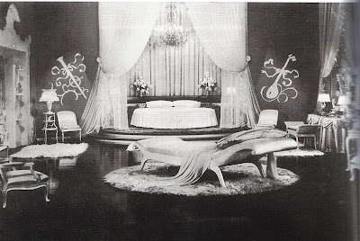
On a whim, I decided to play set decorator and throw together a fantasy 1930s bedroom. I think Carole Lombard would look quite smart in this bedroom. I don't envision Joan Crawford in it though. I hear she was quite the rounder, and my pristine bedroom set might end up in shambles!

How about these velvet roman shades from Pottery Barn? White and grey were de rigeur back in the 1930s (and still are in my book!), and the velvet provides just the right amount of sheen. Shine, shimmer, and gleam are very important when one is designing a decadent boudoir!
And of course you've got to have some satin and silk, such as these quilted silk throws from Schweitzer Linen. I'd use either the cream or white.
I would have to find some place for Jonathan Adler's Montmartre table, because you have to have some type of Neoclassical element in the room. Or maybe you need a few...
...in which case I would use the Athena stencil and paint this Greek motif on every door in the room.
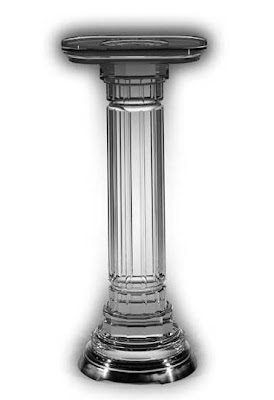
This acrylic pedestal from Richman Design would look fabulous in a corner with some type of urn on top. Perhaps a ceramic one with lilies in it? Or, what about an alabaster urn lamp?
I might use this old Western Electric rotary phone, but I would prefer it in white. If you're going to schedule social engagements or liaisons, you really should do it in style.
The leading lady would have to wear the appropriate attire for such a room. No flannel pjs!! But we wouldn't want our leading lady to dress (or undress) like Gypsy Rose Lee either, so this robe is glamorous but tasteful too.
Keep in mind that the next time you're on television or in a movie, your eyes will really stand out if you use false eyelashes. And as long as we're going with the glamour theme, what about these feather lashes from shu uemura.
Image at top: A still from the 1935 movie "Top Hat"; set design by Van Nest Polglase
Wednesday, October 15, 2008
Whatever Happened to the Decorative Arts Collector?

For years now, we've read about internet entrepreneurs, young Wall Street tycoons, and the like who have set out to become serious art collectors, and the high prices that this art (usually Contemporary) commands just proves what a hot market it is. But what about decorative arts collectors? How many young or middle-aged people do you know who collect porcelain, silver, or antique furniture? I'm not really talking about someone who dabbles in a few objects here and there. I mean those people who have a serious and abiding passion for a particular field of collecting.
I think this is one reason why I so admire the late Philip Shutze, the dean of Atlanta architecture. Shutze's architecture, rooted in the Beaux Arts tradition, has an elegance that is both classic and erudite. But did you know that he was also a passionate collector of 18th and 19th century decorative arts? Shutze had a marvelous collection that ranged from Meissen porcelain to Chinese Export. In fact, he purchased many of his pieces from Northeast dealers who also supplied Henry Francis du Pont with much of his collection.
What struck me was not just the breadth of his collection, but the way in which he displayed it. Living in a small apartment on Peachtree St. in Atlanta, Shutze's home was chock full of antiques, objects and books. The man actually lived with and used these precious objects. One look at the photographs and you can tell that this was someone who was a passionate and curious collector. It's evident that an interesting person lived there- someone you might like to know.
Shutze once wrote "It may well be that another generation will see collecting, as we have known it, by the individual come to a grinding halt." Shutze believed this might be due to economic reasons, but I believe it also has to do with the fact that collecting decorative arts is just not sexy. But Shutze did go on to say that "it is the duty of the present generation to preserve what we have of value for the level of taste has sunk to an unprecedented state and our production is blue denim and ersatz." To think that this was written in 1973-74! Now, I'm not going give up my dark blue denim nor some of the pastiche that I have in my home, but Mr. Shutze has inspired me to become a serious collector too. But before I pull my money from under my mattress, I think I'll do my homework first!
A view of Shutze's Dining Room.
The other end of his Dining Room with his "Mandarin" and "Fitzhugh" Chinese Export porcelain displayed on a sideboard.
The living room with a Shutze "tablescape".
Shutze's kitchen and his collection of blue and white Chinese Export which he used on a daily basis.
Image at top: Philip Shutze
Tuesday, October 14, 2008
Why Don't You?

Don't you just want to get your mind off of our troubles? For a few moments, don't you want a little fun and frivolity? And who better to turn to for this than Diana Vreeland and her "Why Don't You?" columns for Harper's Bazaar. After all, this monthly column was written during the Great Depression to help readers escape the uncertainty and drudgery of the times . While some of the nuggets of wisdom (or perhaps they should be called flights of fancy?) are a bit outlandish, some are actually quite doable.
As DV once said, these suggestions "were all very tried and true ideas, mind you." If that's true, then why don't you...
Tie black tulle bows on your wrists?
Black tulle ribbon from Bags and Bows Online
Pick up in Florida the prettiest shells you can find and make them into a mirror frame of a baroque scroll design?

Shells from Seashells.com, Sanibel, FL
Have a yellow satin bed entirely quilted in butterflies?
I couldn't find a comparable photo, but aren't these butterfly garlands from Pearl River charming?
Serve individual Pfirsch Bowle which is a peeled peach in a chilled glass with ice-cold Moselle or Rhine wine poured in? Marvelous at tea time.
Weingut Gottelmann Riesling
Go to Dazian, the theatrical-material shop, and get fake leopard skin for your bathroom floor and fake beige fur for your slipper chair?
Faux leopard, still available at Dazian
Design monograms with circles around them for the pockets of your children's cardigans and the sleeves of their dressing-gowns?
Nicholas monogram from Leontine Linens
Cover a big cork bulletin board in bright pink felt, banded with bamboo, and pin with colored thumb-tacks all your various enthusiasms as your life varies from week to week?

Pink felt from Hancock Fabric Store and Bamboo custom made frame from Pictureframes.com.


