
Dare I admit that I place more emphasis on the aesthetics of the cookware I buy? I know, I know. The way it conducts heat is important. And so is the construction of the pot or pan. Oh, oven proof handles are important too. But while I do cook, I'm no Julia Child, so I can justify choosing cookware based on the way it looks.
I still love my Le Creuset dutch oven and gratin dish- in Flame, my favorite color. Although, the new Slate color is awfully appealing too. I'd love some copper cookware, but it's a bit pricey and maintenance is rather labor intensive. I like my Calphalon for non-stick cooking, and I do have some stainless cookware that looks perfectly acceptable on the top of my range.
But the latest cookware that has stolen my heart is that designed by John Pawson for Demeyere. In fact, I might give my right arm for some of it, although cooking might prove to be difficult as a leftie. Just look at it! It's sleek, sexy, and supremely glamorous. It has a look that fits in with the 1930s aesthetic that I love so much. This is cookware that looks so darn good that you might not want to mar it with extensive use. And with a six piece set costing around $1000, the price is a little hard to swallow. So, in the meantime, I'll continue to use my Le Creuset and Calphalon, but I'll be dreaming about the Pawson cookware.
(The John Pawson line can be purchased at Moss and on various cookware websites.)
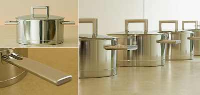

Image at top: Julia Child's Kitchen, now on display at the Smithsonian. Julia would have found this whole post ridiculous!
Thursday, July 31, 2008
John Pawson and My New Dream Cookware
Wednesday, July 30, 2008
Ruthie Sommers on 1st Dibs

I'm sure you all already know about this, but make sure to read this week's Style Compass on 1st dibs. One of our favorite designers, Ruthie Sommers, is featured. It's a great read, and it looks like there are some new photos too!
(Image at top from 1st dibs, photo by Jim Wright)
Design in Film, Part 2

If my cable system ever drops Turner Classics, I don't know what I am going to do. I don't really do reality shows, and I don't like getting involved with a television series- too much commitment. But old movies? Love them! I can't get enough of them.
Nerve.com posted an interesting article yesterday about design in film. Blogger Phil Nugent listed five movies where "design nearly stole the show". I'll let you click over to see his choices, but one movie about which Nugent and I are in complete agreement is "My Man Godfrey". Early last year I posted a list of six of my favorite movies where design played a starring role, and "Godfrey" is right up there amongst the top. But why stop at six? Here are a few more movies whose sets and interiors have struck my fancy.
The Divorcée, starring Norma Shearer. When this film was released back in 1930, it caused a great scandal. A married woman having an affair... on screen? Horrors! The movie has those quintessential 1930s glamorous movie sets- Cedric Gibbons was the Art Director of this film, after all. But what you should really see is the so-called "country house" of the lead characters. It's a vision in white, black, Serge Roche-esque furniture, and satin. If Miles Redd had a country house (and maybe he does), this would be it!

Trouble in Paradise. Ernst Lubitsch's 1932 film is a sparkling, witty movie with Art Deco interiors and exteriors galore. The stylized Colet & Co. perfume factory is absolutely fabulous.

Who wasn't struck by the interiors in Gosford Park? I don't know which part of the house I preferred- the upstairs or the downstairs. Things were awfully glamorous up with the wealthy people, but I did love that kitchen too!

You can't have a list about movie interiors without mentioning Auntie Mame. Mame was a bit like Dorothy Draper on speed- she was all about having FUN, especially in her decorating. Mame's apartment went through so many different phases, and I can't decide which version I like best. Was it the over the top Chinese restaurant look? Or the crazy, modern Yul Ullu version?
The Paradine Case (1946), starring Gregory Peck. Set in London, this lesser known Hitchcock movie is actually rather good. Peck plays a dashing attorney who has an attractive, kind wife and lives in a very elegant home. What I never understood was why he would fall for his client, a woman of questionnable virtue- especially when said client has a gaudy, Baroque bed with a painting of herself on the headboard. Would you choose a tacky bed over a gorgeously appointed home? I thought not.
This:
Over this? What was Peck thinking??
Image at top: My favorite person on TV- Robert Osborne.
Tuesday, July 29, 2008
Entertaining Tips from the Pros

Entertaining and food seem to be areas of great interest to many interior and fashion designers. Perhaps it's only natural as most of these individuals have a keen sense of aesthetics. If a designer's home is his calling card, why would he or she sully the image with sloppy entertaining?
Ideas, tips, and recipes from designers abound- most of them have very definite opinions. So let's see what a few design legends have had to say on the subject. Some of the advice might seem outdated or rigid, while others might induce an "A ha!" moment.
* Elsie de Wolfe had a lot to say about entertaining. So much so that she wrote Elsie de Wolfe's Recipes for Successful Dining. de Wolfe believed that "the perfect meal is the short meal". Remember, de Wolfe wrote the book at a time when dining was a bit more elaborate than today. A few other tidbits: Never have high flower vases on your table. Keep your table decorations "low, low, low". And "Curried Veal Kidneys" is a recipe for successful dining.
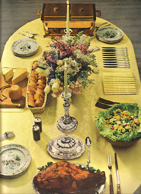
* Dorothy Draper, the merriest of decorators, once wrote that a "delighted hostess is a delightful hostess" (this from Entertaining is Fun!). Dorothy had a point- who wants to be around a harried hostess? She also wrote that she never held up a dinner party for more than half an hour waiting for a tardy guest. And canned turtle soup with sherry is something that one should always have in his pantry. (Do they still make canned turtle soup?)

* Dorothy Rodgers thought (and wrote) a great deal about entertaining. The woman certainly was attuned to the details and planning of dinner parties, weekend house parties, and casual affairs. Rodgers' advice included using cloths on small tables as opposed to place mats, using matching crystal stemware, and passing crackers with the first course. Oh, "The Game", "Improbable Conversations", and "Botticelli" are all FUN parlor games, at least according to Rodgers.
* Genevieve Antoine Dariaux, the late directrice of Nina Ricci couture house, wrote all about Entertaining with Elegance. Did you know that yellow asters and orange chrysanthemums in a copper container make a chic floral arrangement? Or that Asparagus tips with a bit of mayonnaise rolled up in thinly sliced white bread makes a tasty tea sandwich? And that wine glasses should be filled one half to two-thirds full? You do now, thanks to Ms. Dariaux.

*Mark Hampton was not a fan of table linens made of polyester. He also thought one should avoid using colored candles (unless it was a Christmas celebration) as well as narcissus and lilies- too odoriferous for the dinner table.
*Bunny Williams likes to have a drinks tray set up on a table so that guests can help themselves to libations. She also uses Pepperidge Farm thin sliced bread for tea sandwiches and Duncan Hines brownies for dessert.
Monday, July 28, 2008
A Swellegent, Elegant Event


The August issue of Atlanta Homes & Lifestyles has a terrific article about elegant entertaining à la Phoebe Howard (pictured above). The magazine photographed a cocktail party hosted by Howard and held at her Atlanta pied à terre. Honoring a new employee, the all female bash is an excellent example of how to entertain and still be as cool as the avocado-cucumber soup that was served.
First, I like the fact that the guests all attended the party in their best summertime frocks. Granted, they were being photographed for a magazine, but isn't it nice to see an event where people make an effort to look nice?
An accomplished hostess, Howard knows that simple but tasty food is the way to go. (Remember the advice of Gene Hovis: always serve something simple and straight-forward.) Guests enjoyed a menu of parmesan-pimento cheese hors d'oeuvres, avocado-cucumber soup, Tuna Niçoise, and lemon sorbet and lemon cookies for dessert. Oh, and Watermelon martinis were served too. Nothing like a good cocktail to get the fun and frivolity started.
To Howard, entertaining is an important part of being in the decorating business. It's a "very important business skill, where attention to detail is paramount." So true, and it's nice to see people keeping the art of gracious entertaining alive.
(For more images of Howard's Atlanta apartment, visit the House Beautiful website)

An elegant Summertime tablesetting
The Tuna Nicoise looks all the better amidst topiaries planted in silver buckets.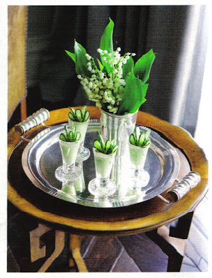
Avocado-Cucumber Soup anyone?
(All images from the August issue of Atlanta Homes & Lifestyles; Erica George Dines photographer; text by Kate Abney and produced by Rachel Cardina)
Thursday, July 24, 2008
Coleen's New Venture

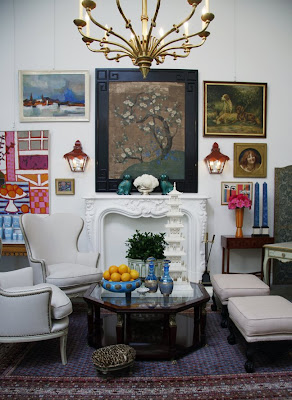

Coleen Rider of Coleen & Co. was kind enough to send me some photos of her brand new showroom in Los Angeles. The grand opening was last Saturday, and distance was the only thing that kept me from attending. As you can see, the always creative Coleen has outdone herself with the new space. How great is that rattan bed? I also think the outdoor pagoda is divine. I love the avocado colored rooftop with the blue painted ceiling. If you want one too, you're in luck. They can be custom ordered through Coleen (click here for more info).
As usual, interesting and beautiful things abound at the shop. Here's a peek at some of the new items:
Early 19th c. English Chinoiserie clock (love this!)
Bone Pagoda
Large pair of Celadon pots on stands
Tuesday, July 22, 2008
The Silver Fund

And speaking of china and silver, have you ever visited The Silver Fund? Based in the UK, The Silver Fund is one of the world's most prestigious dealers of Georg Jensen silver. Unfortunately, I have not visited the London shop, although I did have the chance to peruse the San Francisco operation recently. Talk about manna from heaven!
The beauty of Georg Jensen silver is that it runs the gamut from Art Nouveau style to Mid-Century Modern. You can find streamlined or art deco pieces that will add some jazz to your silver collection. Or for you nature lovers, there is the legendary "Blossom" pattern- Jensen's famous Art Nouveau inspired design from the 1910s. Jensen's designs just never seem to go out of style. My parents bought a set of Jensen stainless flatware over 30 years ago- despite daily use it has held up remarkably well and it still looks fantastic today.
I've tried to show a range of what The Silver Fund has to offer, but as you can tell it's the Art Deco pieces that make my heart sing.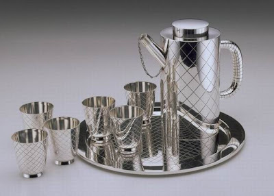
Georg Jensen Cocktail Shaker Set and Tray, c. 1930s
Jensen Salt and Pepper Shakers, pre-1945
Jensen Art Deco Tea Set with Ebony Handles, c. 1930
Jensen Ivory Handled Bell, c. 1930s
Jensen Toast Rack
Jensen Pyramid Pattern Cruet Set, c. 1930s
A five piece place setting of Jensen's famous "Blossom" flatware
Image at top: Blossom Pattern Coffee Set with ivory handles, pre-1945
Monday, July 21, 2008
Covetable China Closets and Cabinets

Did I ever tell you that my well-used magnifying glass not only gets a workout over photographed libraries but comes in handy to peer into china closets and cabinets too? I was reminded of this little proclivity of mine when I posted about Gene Hovis' fabulous china closet a few weeks back. I've never met a salt cellar or a champagne saucer that I didn't like, so it's only natural for me to be a bit nosy when it comes to others' collections of table accoutrements. In fact, my excitement over these things is such that I might want to don evening wear whilst in the presence of my china and silver- much like Kelly Wearstler above.
So which china cabinets and closets have struck my fancy? Well, there have been many, but here are some of the more memorable ones. And remember, with the aid of a magnifying glass, you might just find some type of table oddity that you never knew existed. After all, you never know when a pudding trowel or a caster might come in handy.
The china closet of the late Geoffrey Beene. Beene obviously preferred a sleek and well-edited collection. See how great the white china looks with all of that silver and crystal? (Photo from House Beautiful Entertaining)

Christopher Spitzmiller did an excellent job of displaying his collection of china and copper cookware in his small New York kitchen. You can tell he is someone who likes to cook and entertain- my kind of guy! (Photo from Elle Decor, photographer William Waldron)

Spitzmiller was inspired by this New York kitchen of Wade McCann. Now, I know that some of you may be overwhelmed by the amount of "stuff" in this kitchen, but look at how wonderful the stuff is. I think I'm fascinated by the breadth of this man's collection. And to think that I always believed you could get away with only two or three decanters! (Photo from Private New York)

I completely get Bunny Williams. Maybe it's our shared Southern heritage, or perhaps it's our love of fine things. Whatever it is, this closet in her Connecticut home is right up my alley. First, her pressed tablecloths are stored on hangers in her entertaining closet. A very clever solution that I would like to try someday. And buying candles in bulk? I've done that too with my late, great Williamsburg candles. Basically, this closet is so well thought out that it would appeal to all neatniks. (Photo from An Affair with a House)

And for a historical reference, here is the games room at the 18th c. Music Pavilion, the last standing structure of the estate of Comtesse de Provence, the wife of the man who would become Louis XVIII. Purchased by the Bazaine family in 1960, the Pavilion has been restored to its former glory. The cabinets in the games room are filled with Vieux Paris dinner services as well as Sevres porcelain.
(Image at top from Domicilium Decoratus)


