As I'm traveling this week, I wanted to leave you with something beautiful and felt that these images would fit the bill. Here is the Chinese Pavilion at Drottningholm, Sweden, courtesy of World of Interiors, May 1996. Built for Queen Louisa Ulrika in 1753, this paean to Chinoiserie is located on the grounds of Drottningholm Palace. It was also an early prefab structure, being built in Stockholm and assembled on location at Drottningholm.
You will see all of the usual suspects that were found in most Chinese pavilions: Chinese porcelain, Chinoiserie murals, and Chinese textiles. Still, the pavilion, restored to its former glory in the early 1990s, is a sight to behold. What strikes me the most is the vibrant, rich color found throughout the pavilion. Each room is a different color- perhaps not unusual for that time, but certainly worth noting today with many contemporary homes having only one or two colors in its interiors. Do you think people today would be bold enough to make such a colorful statement?
Rich red walls are the perfect backdrop for the Rococo chairs that are covered in painted silk taffeta.
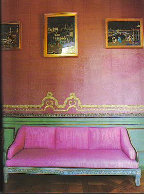
The bedchamber with mauve moire and silver galloon covered walls. The pictures are 19th century and are made of fabric, bone, and feathers.
The Yellow Cabinet retains the original painted Chinese silk wallcovering. The fabric on the chairs is a copy of that on the walls. The porcelain figures of a man and woman have nodding heads, and note that the hair on the female figure is real human hair.
An image of the Blue Salon looking into the Green Gallery.
The Library with a collection of Chinese and Japanese porcelain. The salmon pink walls and the green trim is such a striking combination.
Image at top: The Chinese Pavilion at Drottningholm Palace. Photographer Jacques Dirand.
Wednesday, July 09, 2008
The Chinese Pavilion at Drottningholm
Subscribe to:
Post Comments (Atom)


I have been thinking the same thing! We tend to think of vibrant, bold colours as something we won't find in historic buildings. I get amazed each time I see pictures like these!
ReplyDeleteSuper-chic. Super-colourful. Simply superb. I'm all for the strong-colour scenario, but the balance of colours is important, I think. It wouldn't do to have, say, five quiet rooms and one bold one. What makes the pavilion work is that its colour schemes are bold throughout, so they link and have similar relationships re strength, et cetera. It's similar, in a way, to Tony Duquette's work, chromatically speaking.
ReplyDeleteWonderful visit, keep it going.
ReplyDeleteAs a design professional I am always thrilled when the public not only notices an exceptional design but is moved enough to pass these impressions along. good or bad.
Again, keep up the great work.
All the best,
Michael
www.restaurantsbydesign.com
Ah the yellow cabinet. So luscious!
ReplyDeleteI think that Los Angeles (maybe Beverly Hills?) family home that Mary McDonald recently did (HB a year or two ago) had quite a few different wall colors -- room colors -- going on. So that could be a contemporary example other than Lynn von Kersting :)
Great post.
That yellow cabinet will keep me up tonight. Funny that I've been fiddling with the idea of a little pink. Kismet.
ReplyDeleteWow.
ReplyDeleteThanks for creating such a great (and beautiful) blog!
Some real Swedish touches here: Notice the plain fir floors in the library.Window treatments are very simple, just unlined fabric shades. The settee is Gustaviansk, Swedish Neoclassic of the late 18th century. Construction is probably birch, native to Sweden and thus painted(not the costly imported hardwoods)Notice how simple the sides and back are,just boards,really. Marvelous for all that.
ReplyDeleteAbove the settee is a set of Chinese export reverse glass mirror paintings. The porcelain is a treasure trove. In the library a similar Samson porcelain glazed bird sold for $90,000. at Sotheby's.The grisailles chinoiserie panels in the room with the pair doors are smashing.
Your blog never ceases to delight me - and we seem to have the same books and clippings(Hovis, Drottninghaolm, favorite fabrics such as Riviere Enchante )- I could go on and on with our similar tastes.
ReplyDeleteMakes me feel still somewhat "with it" tho ancient.
Happy travels!
Lisa B.drzxonrc
hmm, silver galloon(?) down the rabbit hole I go.
ReplyDeleteBon voyage. Will look forward to your wonderful posts on your return.
Wonderfully bold colours, which are not usually my forte. But remember where it is - and how enjoyable they would be during the long, cold, dark winters. I particularly like the mauve moire against the green, and the salmon pink against the green. The colours are very reminiscent of the shocking vibrancy of Thai silks, and are recently something I have looked at doing.
ReplyDeleteI'm totally in love with this pavillon ! the mauve moire is G-O-R-G-E-O-U-S ! J'ADORE the yellow cabinet ! this post is a fantastic voyage
ReplyDeleteWe are in love with the colors used here. Thanks for the post!
ReplyDeleteThe Laundress