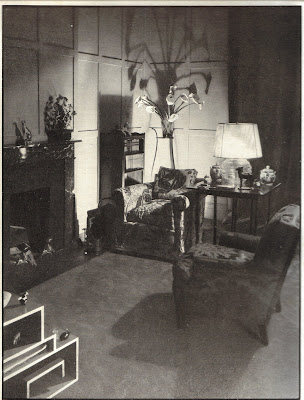
You know what I've been taken with lately? Uplights. Are you still with me? Have I lost a few readers??
I know that uplights are considered by some to be gauche, perhaps due to their use and abuse back in the 1970s and 80s. I suppose they might, and I stress might, be in the same league as those big and bad track lights from a few decades back. But you know what? I think that when used tastefully, uplights can be quite practical. And the light they give off can really add some drama to a room. Need some light in a dark corner? Stick an uplight on the floor. Want to give that bust on a column some brooding personality? Put an uplight on the floor at the base of the column. Or, shine a little light on a piece of wall art- preferably a large canvas- with an uplight.
There are different options available for uplights, but to get the most bang for your buck I would suggest the canister lights from CB2. Available in black or white, they're only $19.95 a piece. For that price, you can go crazy with uplighting. I bought one in black and I'm having fun trying it out in different areas of my home. And you know what I've realized? Dramatic lights are a lot easier to stomach than dramatic lives!
John Stefanidis used this chrome canister to light this large painting.
Mica Ertegun used an uplight behind this screen. Positioning an uplight behind a screen seems to be a big decorating trick of the trade.


David Hicks... On Uplights. When I think of uplights, I immediately think of Hicks. Here, he has used them to light blank walls (both painted and upholstered) and to light a corner of a room concealed by a screen.
CB2's Can Lights, available in black or white, are a great way to experiment with uplights.
Image at top: Even back in the late 1920s, people used uplights for a bit of drama. Don't you love that shadow that the calla lilies cast?
Monday, November 03, 2008
Good Drama
Labels:
Lighting
Subscribe to:
Post Comments (Atom)


What a great affordable tip. Love how you highlighted Hicks use of the uplight with fabric covered walls.
ReplyDeleteThey can be wonderfully dramatic when trained upon something sculptural~think of all those watercolours by Gandy of Sir John Soane's architectural artifacts, where everything is lit from below. But as a strong light splashed on an ordinary ceiling, quite pointless and distracting.
ReplyDeleteIf only there were a less obtrusive form of modern uplight, other than those ugly canisters! In fact the source of uplighting ought to be concealed if possible.
There's gotta be a way.
I love this idea! I haven't thought of uplights except for outdoors ever! I can think of a couple of places in my home that uplights just might be the solution to lighting dilemmas I am having! Thanks for the tip!
ReplyDeleteCourtney- At first I thought it a bit odd to light a blank wall, even if it is covered in fabric. But I think that idea is growing on me.
ReplyDeleteToby- Personally, I'm planning on hiding mine behind something. What I want people to see is the light and the dramatic shadows it can cast. They're great behind a piece of furniture or a column.
ReplyDeleteMimilee- I'm still working out where my can light will go. But for that price, if you don't like it you don't have that much invested in it. Let me know if you decide to take the plunge!
ReplyDeleteI adore uplights and use them frequently. Nothing outre about them at all, in my book!
ReplyDeleteTotally quotable: "Dramatic lights are a lot easier to stomach than dramatic lives!"
ReplyDeleteThey should be put on dimmers, though. It's that klieg-light, crime-scene shine that is to be avoided. Uplights are best kept somewhat low, for atmosphere, and hidden discreetly.
ReplyDeleteYeah, really Hicks was the master. You can see uplights, in almost all his work. I think the best example is the entrance-hall in the Theodoracopoulos flat in New York. The way so soft how he iluminates this cozy room is wonderful. (Pag 139, of David Hicks Designer, by Ashley Hicks)
ReplyDeleteColumnist- Amen! I'm so with you.
ReplyDeleteCashmere- That will be my new motto ;)
ReplyDeleteAesthete- Mine is hidden, but it's not on a dimmer. I don't think this particular light is too bright though, which is a good thing. But you're correct- you don't want glaring light anywhere.
ReplyDeleteWannabe- Good memory. That is a wonderful apartment- dramatic but soft too.
ReplyDeletei am a big fan of up lights - just another easy and effective way to add a little ambience to a space. Great images as always xv
ReplyDeleteoooh, what a cool little light:)
ReplyDeleteTrès beau blog!!!!
ReplyDeleteI'm inclined to agree with Aesthete~uplights ought to be on a dimmer of some kind, or else the bulb very tiny to start with.
ReplyDeleteGreat little lights. It's like a $20 makeover. I will have to give it a try.
ReplyDeleteI haven't thought about uplights in years, something to contemplate!
ReplyDeleteThanks for a great tip.
ReplyDeleteI am going to CB2 downtown in the morning to get some right away...will change the whole feel of a couple of my room! Great tip!
We have one from the 1930's (weathered brass sort of thing.) I hide it in the corner of the bar room under a plant. The shadows that it splashes up the wall are very dramatic and make it seem like there is more of a jungle than there really is. The foliage also cuts down on the overly bright splash of light from the 40 watt (?) bulb.
ReplyDelete