Wednesday, January 20, 2016
Albert Hadley on Illustrations
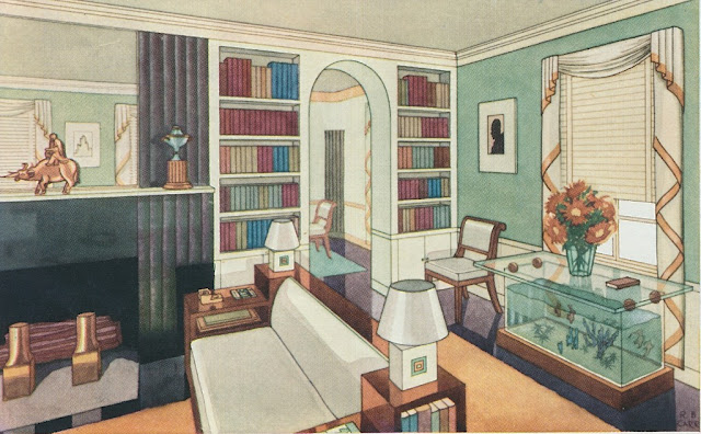
About eight or nine years ago, I had the opportunity, thanks to a friend, to meet privately with Albert Hadley. Because our meeting was one of those "pinch-me" moments (at least, it was for me,) much of what we discussed is a blur. But Mr. Hadley made one comment that I will never forget. He said that today's magazines feature too few illustrations. His comment struck a chord with me, because I'm an avid fan of illustrations, especially those of interiors. When executed by a deft hand, interior illustrations can convey a room's personality in a way that photography simply can't.
Take these illustrations, for example, which appeared in a 1934 issue of House & Garden. Depicting an "all-metal house in a traditional style" (the house's architect, Robert B. Carr, specified that the make-believe structure be constructed of "enameled metal shingles over steel braced structural walls",) the illustrations show an inventive marriage of Regency-style flourishes and then-cutting-edge finishes. What I find so beguiling and, yes, inspiring is the style of the illustrations. They are colorful and concise in a way that really captures- and even amplifies- the decorative essence of each room. And because the rooms are anonymous, I find it easier to imagine myself inhabiting these spaces. Finally, although there are dated elements to these rendered rooms (that fish-tank table in the living room illustration should be left to the 1930s,) many of the colors and decorations still look fresh today. Can't you just see the bathroom's bright blue door with gold star (see below) in a stylish home of today?
Would magazine pages full of interior illustrations fly in today's world? Probably not. But I agree with Albert Hadley that interior illustrations still have relevance. The benefit to such illustrations is that they stimulate the reader's imagination, requiring the reader to flesh out details and adapt the illustrated ideas for use in his or her home. And it's imagination that gives design its flavor and its personality.
Subscribe to:
Post Comments (Atom)


Lovely! Mr Hadley was right when he said that but I wonder who, nowadays, could illustrate a house or an interior without the use of a computer program? Is illustration even taught in schools? Without use of digital, I mean.
ReplyDeleteagreed! fabulous
ReplyDeleteJohn Tackett, who used to work with Albert Hadley, is a marvelous illustrator. He has a blog, The Devoted Classicist, which often features his illustrations. We are always amazed at the quality of his renderings.
ReplyDeleteYour comments about illustrations really hit a nerve. Consumers of design magazines probably take much more interest in illustrations of all varieties, including interiors, exteriors, and gardens, than the very small portion of illustrations in leading shelter magazines would suggest. Photography became the status quo in fashion publications in the early 60's although a few major illustrators continued to appear regularly, and that trend seemed to affect the decorating publications even earlier. If Veranda or Elle Decor put a striking illustration on their cover it would be a refreshing change from what has become an almost monotonous expectation. The major magazines are so driven by sticking to familiar formulas that they seem afraid to deviate for fear of failure. The most interesting magazines have always been the ones that bring unexpected content. In its early years World of Interiors particularly introduced innovations, and it seemed over time that other larger publications adapted many of those innovations that are expected in current shelter magazines. It would undoubtedly create a lot of discussion if a major magazine tested the waters with an illustrated cover or exceptional and prominent illustrations in a feature article, and with some luck your entry has got an editor somewhere thinking about what you've said.
ReplyDeleteWhat an interesting post - and speaking of "pinch-me" moments, that HAD to be a thrill!
ReplyDeleteThese are amazing! So inspiring
ReplyDeleteI love looking at hand-drawn/painted renderings. House Beautiful does use designers' illustrations in their monthly series The Best. My favorite is Mark Hampton who was a master watercolorist, painting with so much detail. Michelle Morelan [A Schematic Life] is another talented designer who does beautiful renderings.
ReplyDeleteIt's about time someone mentioned Robert B Carr again--and I knew you'd be the most likely suspect, rooting around in the back room of libraries, which are a gold mine of forgotten examples of once-favored modes of representing spiffy rooms. In the Old Days, that function was the specialty of The Aesthete. These days, it's you. Bart.
ReplyDeleteIllustrations - they surely bring back memories, but they wouldn't work today. I'll rephrase that, they wouldn't work for the large audiences. Of course, they would still work for some of us because they remind us about our childhoods, about schools, and about the books that we used to read. I grew up with illustrations and they were used in almost all of my study books. I am trying to remember what staircase designs' illustrations helped me to get where I am today.
ReplyDeleteThank you for the post.
George, I think you're right. Illustrations would likely not appeal to a broad audience. The nostalgia factor is certainly one reason why I find illustrations so appealing.
DeleteRemember when floor plans were included in some magazines? I used to devour them as a kid.
ReplyDelete