

Every so often, there is a home whose interiors seem to resonate with us. Perhaps it's because the home captures the mood of the time, or maybe it's that the homeowner or designer hit the nail on the head when it came to using various popular decorative trends. No matter the reason, these homes usually end up being featured in numerous shelter magazines, and now, blogs, too.
One such home that was the hit of design magazines in the early 1970s was the Manhattan apartment of Mr. and Mrs. John C. Moore III. I first saw the home, one notable for creating a country home effect in a New York apartment building, in a 1970 issue of House & Garden. While the home was evocative of that era- layer upon layer of prints and patterns, wicker furniture, needlepoint, and Italian ceramics- I do think that it was a rather interesting idea to imbue the space with such quaint, country effects. Design editors must have thought so, too, because just a few months later, in 1971, House Beautiful also featured the Moore's apartment. But this version was a little different. I'm fairly certain it was the same apartment, but the fireplace mantel seems to have changed as well as some of the fabrics. And strangely enough, the painted piano from 1970 seems to have been repainted with a different design just a short time later.
There are other differences, but I stopped looking at the photos as it was giving me a headache. Suffice it to say, the Moore's residence was an "it" residence of the early 1970s, one that captured the spirit of that time.
Image at top: The Moores' Dining-Sitting Room as it appeared in 1970. The white piano bore painted miniature fruits and vegetables.

In 1971, the dining room has a change in fabric, and paneling seems to have been added. Here, the piano was painted with exuberant flowers.

Jumping back to 1970, Marni Moore was photographed sitting on her charming sofa with blue and white floral pillows.
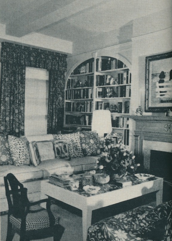
Another 1970 photo which shows a wider view of the living room.

A detail 1970 photo of Mrs. Moore's cocktail table with a top made of blue, white, and red tile. The same table was a holdover for the 1971 photo shoot.

The Living Room circa 1971.

And here, in 1970, was a black and white shot of the living room with the dining room beyond.

The colorful Library made it into the 1971 House Beautiful article, but not that of the 1970 House & Garden issue.

The Moores' bedroom, which I do think is rather pretty, from 1970.


Interesting to see the famous print in green...and a real flashback on interior photography of an earlier era. I thought it was funny then (and it looks even funnier now) to see the huge flowers in the foreground. So ubiquitous was this styling, that it was a cliche, even in the top shelter magazines.
ReplyDeleteI can see why you got the headache. Way too much for me to digest. But that red lacquer table is great.
ReplyDeleteMary
Those flowers in the foreground!I so agree with Katie funny then and funnier now. Grand post. xxpeggybraswelldesign.com
ReplyDeleteGreat to see Mrs. Moore III. Always nice to put a face to an interior.
ReplyDeletePeople used to display charming crystal or silver candy dishes. I used to fill my parent's cigarette box. It was a wedding present - clear acrylic with tiny shells and sea horses.
Recently, I came across a photo of a gentleman's study c1960's. What struck me was a round pipe holder. It lived on the coffee table. They looked great; comforting.
This seems to be the Genteel version of psychedelic. Incidentally, they really must have liked pillows--how can one even sit on that couch or lie on that bed?
ReplyDelete--Road to Parnassus
This certainly was a stylish apartment for the time.
ReplyDeleteWho were (or are) these people? I've never read or heard about them. Designers?
Hey Jennifer!
ReplyDeleteLOVE, LOVE, LOVE! It looks like Horst did the photography!
Dean
Great post. Reassuring to see sofa pillows in the classic black-spot fabric. Color room photography (and mag printing) was so primitive in 1971. Rooms were just blasted with light. All the subtlety was lost.
ReplyDeleteThank goodness that printing and photography has improved tremendously over the years!
DeleteThe green print fabrics make me smile; they work today (though I'd lose the ruffle on the chaise. And do I spot Wedgwood Wild Strawberry perched on the chair's arm. Some things simply endure with beauty.
ReplyDeleteFun post Carla. My parents had the same huge mirror tiles and Rubber Tree plant in the living room. Guess that were "hip" in the 70's LoL
ReplyDeleteThat's my Mom and our apartment the year I was born :-) Such fun to see old pictures. Thanks for your article.
ReplyDeleteCaroline D. Moore