
I don't know much about Jay Crawford other than the fact that he was a fashion illustrator and a founder of Quadrille fabric. But what I do know is that I love his style. I first saw some 1979 images of his Manhattan townhouse (the top two photos) a few months ago and was struck by how chic the rooms still seem as viewed by these 21st century eyes. And then last night I found photos of what I believe is the same townhouse circa 1990 (check them out below). To me, both versions have that certain Billy Baldwin/Albert Hadley-esque flair. Can anyone fill in the blanks and give me more information on Crawford?

(Top two images from Architectural Digest New York Interiors; 1990 photos from Manhattan Style
)
Tuesday, February 24, 2009
Jay Crawford and his Timeless Interiors
Monday, February 23, 2009
Baroque-en Beds

I'm a great admirer of people who have the guts to go out on a limb and do something crazy in their homes, even if it's not so very stylish. Didn't Diana Vreeland once say that it was better to have bad taste than no taste at all? One room that seems to really stir people's fantasies is the bedroom. And no, I'm not talking about those fantasies. This is a design blog after all.
Most of us have tailored, upholstered headboards and plain but appropriate bed linen. Can you imagine having one of these Baroque, bold, and over the top beds in your bedroom?? Probably not. But sometimes it's interesting to see what goes on behind closed doors.
(Image at top: I could say something cheesy like "Snare him in your web of allure", and I just did!)
Only a Hollywood actress would have an over the top bed like this. And that actress was none other than Mae West, famous for her risque one liners. When asked why the bed had a mirrored ceiling attached to it, she quipped "I like to be able to see how well I'm doing!"
Helena Rubinstein was nothing if not innovative and provocative. Here, she was photographed in her illuminated lucite bed designed by Ladislas Medgyes. The bed was only four feet wide by five and a half feet long to accommodate Rubinstein's short stature. Notice the footboard is etched with a vase of roses and an "H".
Yet another illuminated bed, c. 1936. What I want to know is...would the lighting on this bed create down shadows on your face? If so, that might not be so attractive.
Men are not always immune to the flamboyant bed syndrome. Cecil Beaton had this exuberant bed in the Circus Bedroom at Ashcombe. If those walls could talk...
Friday, February 20, 2009
Bunny Williams and BeeLine Home
First, the whole line has that Bunny Williams' flair. Each piece that I saw- whether it was a mirror, a table, a lamp- looked like a "found" object. The collection was inspired by both pieces in Bunny's own collection and objects that Bunny had been searching for. And one of Bunny's objectives was to provide a mix of modern and traditional pieces. After all, that's the way we live, and I think that's what makes Bunny's interiors so rich, so inviting, and so now (and yet so timeless too)!
The other thing that I shouldn't neglect to mention is the gorgeous finishes of the furniture. One of the reasons that I'm hesitant to buy new pieces is the lack of quality finishes- they either look cheap or too new. And that's definitely not the case with BeeLine Home. There were a few tables that I really thought were antiques...until Bunny pointed out that they were part of her new collection. I was pleasantly surprised.
The collection won't be available for sale until late March. But there's good news for all of you who are not in the trade. The line will be available to everyone at retail shops around the country, including Mrs. Howard, Hollyhock, Mecox, and others. Visit the website to see the entire collection and the retail locations. And if you can, try to see BeeLine Home in person. I really think you'll love it as much as I do.
Oh- and before I forget. These are limited edition pieces, meaning get them while you can. It also means we get to look forward to fresh, new additions in the future!

Hand carved wooden Garden Panel with gesso finish, reminiscent of a 1930s plaster panel.

Shadowbox Mirror, inspired by a mirror in Bunny's Connecticut home, has a mid-20th century feel to it.

This Nailhead Sofa is absolutely gorgeous in person. The combination of the nailhead trim, the curvy apron, and that rich olive cotton velvet is perfection! (The sofa is available in taupe and moss linen twill as well, or can be upholstered in the customer's own material.)

I think this Hourglass Table might be one of my favorite items in the entire collection. It's so glamorous.

This Chicken Feather Lamp is charming in person. And, the price is nice too- $500.

And as we all love Sister Parish (who was Bunny's former employer), I thought you'd like to see the Parish Cachepot, based on a pair of that were once owned by the late decorator. Now where else would you find something as charming as this?
Thursday, February 19, 2009
Grown Up Color

Recently, I was interviewed for an Atlanta Journal-Constitution article on color. I was asked for my thoughts on color trends and the predictions that yellow and purple will be THE colors for 2009.
Though I don't have any yellow in my home, I heartily approve of the color- whether it's the "in" shade of the moment or not. I prefer gutsy yellows, much along the lines of Nancy Lancaster's buttah-yellow drawing room. (I recently saw the room in person, and it's far more vivid than I expected. The buttah that I grew up with is quite positively pale in comparison.) To me, the other gold standard of yellow rooms is Chris Spitzmiller's living room. The color- and everything else in it- is perfection!
In terms of purple, I am quoted as saying that I'm not a fan of purple. That is true. It's a great color, but it's just not for me. And then I went on to say that I'm mad for aubergine. The kind journalist asked me "Well, isn't aubergine a shade of purple??" Well, yes it is, and obviously I was having a daft moment. So to clarify, aubergine is one shade of purple that is very me.
But I did go on to say that I'm currently craving deeper, more sophisticated colors like aubergine, moss green, and moody shades of blue. Basically, I'm ready for some depth. And I swear it was as if Jeffrey Bilhuber read my mind. When I read my March issue of House Beautiful last night, I was giddy over his use of color in a Pennsylvania farmhouse: aubergine, kumquat, and indigo to name a few. It's a combination that just seems right for right now. As for that indigo room featured at top, Bilhuber was inspired by a similar color that he saw at Mount Vernon. (If I used it in my home, I'd have to go the high-gloss route just because I'm weak for shiny surfaces.)
I think we've all grown up a lot over the last year- we've had to because of the current political and economic climate. And I think color has matured too.
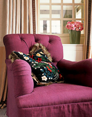
An armchair in the farmhouse decorated by Bilhuber. I adore this color; I almost want to eat it! The fabric is "Carom" from Malabar.
The kumquat/aubergine combo has some zip, especially against that blue chair frame. Bilhuber obviously has a great eye for color.
Chris Spitzmiller doesn't know this yet, but I'm planning on moving into his apartment with him. His living room is probably my favorite yellow room.
I remember being struck by this room in the Newport home of designer Meg Braff. Back in 2007, you really didn't see this shade of blue very often. It was a breath of fresh air, and it still is. The wallpaper is Farrow & Ball's Plain Stripe blue wallpaper with Stone Blue trim. The red accents look really good against that blue too.
Katie Ridder does some really interesting things with color, and I think her rooms have a lot of depth to them. Again, this room is a unique shade of blue.
(Bilhuber images from House Beautiful, March 2009; Julian Wass photographer. Image of the Spitzmiller living room from House Beautiful; photographer Tara Striano. Braff living room from House Beautiful, June 2007; Simon Upton photographer. Katie Ridder room from her website.)
Wednesday, February 18, 2009
Masterpieces by RL Goins


Anytime I'm browsing through books on design and interiors of the 1920s and 30s, I'm struck by the bespoke furniture that filled many of these luxe interiors. The pieces were really like works of art and were usually crafted by ateliers of artisans who were skilled in all kinds of techniques and finishes: verre eglomisé; lacquering; gold leafing. And inevitably, I always wonder who are our 21st century Jean-Michel Franks and Jean Dunands? Just how many artists are there today who still have the knowledge of and the enthusiasm for this type of amazing craftsmanship?
Needless to say, I was shocked to find out that there is in fact a very talented artist and designer here in my very own backyard of Atlanta. Raymond Goins has his own atelier, RL Goins, that hand crafts furniture and accessories for clients far and wide, and I think that Ray's studio fills a void in the marketplace for high end, hand crafted pieces with panache. I recently toured his workshop, and I'll admit that I was gobsmacked by the cabinet that is shown at top. The custom "Dutch Gothic" cabinet is made of wood with hand carved shells that adorn the top and bottom. The doors feature hand-blown glass painted with a verre eglomisé, trompe l'oeil scene. Is that gorgeous or what!
Now I know that not everyone has the guts to commission a piece like this. In fact, Ray said that this was for a client with "flair". But Ray understands subtle and he's quite accomplished at that too. In addition to custom work, RL Goins has a gorgeous line of screens, tables, chairs, cabinets, and accessories that have really beautiful finishes. He also works with designers on interior treatments like murals and hand painted scenes. Oh, and he restores and conserves antiques as well. Obviously, Ray is an artist with boundless enthusiasm who has been blessed with a great eye.
(To see Ray's entire line of furniture and accessories, or to see his portfolio of custom projects, please visit his website)
I'm very much in love with this verre eglomisé "Marseilles" screen. It's absolutely gorgeous in person, and the hand painted scene of the Amazon is one of Ray's original designs. Part of the RL Goins collection.
"Fontainebleu" hand painted grisaille screen with trompe l'oeil scene of hunting implements. Original artwork by Ray. Part of the RL Goins collection..jpg)
"Albero di Vita" screen with hand painted leather panels. Ray's design features the tree of life motif and is available in other colors as well. Part of the RL Goins collection.
"Nautical" trumeau with a hand painted scene. Scenes and background color for the trumeau are customizable. Part of the RL Goins collection.
"Chelsea Urn" lamp with hand painted design by Ray. Part of the RL Goins collection.
There are also plenty of non-painted items in the collection which really allow the beauty of the wood to stand out. This trestle table has an aged tobacco finish. The neat thing about it is that you can assemble the table and break it down with your hands rather than tools...meaning that it's easy to transport outside for a picnic or some such event! Part of the RL Goins collection.

Custom designed outdoor swinging bench and chair. I'd say this is Gothic done right!
The "Paris" bed is another custom piece designed by Ray.
A custom designed vanity and mirror by Ray. The lacquered blue finish is stunning. So stunning that I'd like to lacquer my whole home in this shade of blue.
Tuesday, February 17, 2009
Thrifty Chic

Jean-François Daigre designed this tablesetting for Tiffany Taste

According to Emily Eerdmans' book Regency Redux

You can't make a silk purse from a sow's ear...unless you were Tony Duquette! He used all kinds of detritus such as vegetable strainers, golf balls, and plastic bottles to create beautiful masterpieces. Here he used Styrofoam grapefruit packing cases on the ceiling of his studio c. 1980 (image from Tony Duquette's website).
Mrs. Howard Joins the Blogosphere

Just wanted to pass along some exciting news for all of you Mrs. Howard, Max & Co., and Phoebe and Jim Howard fans. There's a new blog in town: Mrs. Howard Personal Shopper. The blog will feature articles and gorgeous photos of what's in store at Mrs. Howard and Max & Co. (And for those of you who have seen the stores in person, you know that it's like walking into the very stylish home of a very stylish person.) There will be articles about new merchandise, events held at the store, and other fun things in the world of Mrs. Howard!
Monday, February 16, 2009
Swimming with the Fishes

Back when my sister and I were young, the highlight of each Fall was our school fair. Not only was it a lot of fun, but it was also our opportunity to win a few pet fish. All you had to do was toss a ball and hope that it landed in an empty fish bowl. Much to the dismay of our parents, Laura and I had really good aim and inevitably we would come home with two or three fish. And every year, we pulled out the cheap fish bowl and deposited our prizes into that bowl where they swam for about a week until they died. During that week, Laura- the good child- took care of those fish, paid attention to them, and cleaned that dirty bowl. I immediately lost interest and was on to the next thing.
So based on my history with fish, I don't think I'm cut out for providing a proper home for the poor things. But fortunately, there are people who are not only good fish care providers but who house them in really chic bowls and aquariums. 1936 must have been quite a year for a few lucky fish who found themselves housed in some stunning fish abodes. Just look:
This aquarium was built into the overmantel above a striking streamlined fireplace.
George Frelinghuysen, Jr., a decorator, designed this entrance hall panel in his home. The aquarium was built into the panel.
Frelinghuysen also designed this chandelier aquarium for his bedroom. Attached to the ceiling by black silk cords, the bowl was open at the top, and a group of crystal prisms hung down from the ceiling and dipped into the water. I think it was electrified, but I can't tell. Between the chandelier aquarium and that bed, Frelinghuysen really created his own bedroom grotto.
If I were to own a fish, I would use the Elsa Peretti fish bowl. Actually, I might ditch the fish and use this bowl for something else- it's that fabulous! (And no, that's not a real fish in that bowl.)
(See that Schlumberger brooch at top? Now that's my kind of fish!)
Thursday, February 12, 2009
Katie Ridder Hits a Home Run

Just this past Monday, I was waxing poetic about vintage prints from the 1920s and 30s and was wondering whatever happened to the unique prints of yesteryear? Well, I just received some samples from Katie Ridder's new wallpaper line, and I think that I found those unique prints. To me, Katie's designs are vintage in spirit, but they're completely "now" too.
One thing that really struck me about the entire line is the color- it's so rich that it practically jumps off of the paper. Don't get me wrong, though. The color nor the prints knock you over the head. But these are the kind of prints that make you stand up and take notice, and isn't that nice for a change? Oh, and they're exuberant too. I think it's time for some exuberance in design. We certainly could use it!
(I scanned my samples in hopes that you could get an accurate idea of the amazing colors. For more colorways, visit Katie Ridder's site. I really recommend getting some samples so that you can see the paper in person. It's gorgeous stuff! The wallpaper is available through Holland and Sherry showrooms.)
"Leaf" in Black. Wouldn't this look great in an entryway or a powder room?
"Beetlecat" in Blue. Such a charming print, and to me it's evocative of those great 1920s and 30s prints.
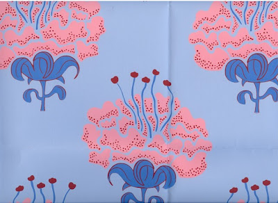
"Peony" in Pink. Sweet, but not at all saccharine. A great option for those who are on the fence about florals.
"Attendants" in Pink. I think this is my favorite print- I adore it!! Those wonderful shades of pink against the gray background are stunning.
"Moon Flower" in Red. Great color combination, and the metallic pattern on the moons adds some gleam.
"Oiseau" in Chocolate. For those who like more subtle prints, this one is for you.
Image at top: "Seaweed" in Green. This print has a Deco vibe to me. Beautiful!


