Thursday, June 28, 2007

An Iconoclastic Spirit


It seems to me that one trait that characterizes the legendary French designers is their confidence in their vision and style. I think that this is certainly true of famed French designer and shop owner Madeleine Castaing. Castaing's style could at the very least be described as eccentric. Inspired by 19th century antiques and interiors, Castaing strived for a romantic look (albeit a sophisticated one) that she achieved through vivid colors (blues, greens, and pinks in particular), mixing of prints, and a jumble of different styles of furniture and accessories. All together, this combination gave a room an unidentifiable style, but it was a look that seemed rather "weathered by time". Of course, Castaing's eccentricity was only heightened by her use of plastic flowers and her donning of a wig with a chin strap.

Although Castaing died in 1992, we are still able to purchase her favorite fabrics and rugs today. The rugs are manufactured by the French firm Catry and are available through Stark. The fabric is available through Edmond Petit. What I love about these prints is that although many of these designs are rather old, they still look fresh today.


"Castiglione" fabric


"Coppelia" fabric (one of my favorites)


"Rayure Fleurie" fabric (remember this from Mathilde Agostinelli's bedroom?)


"Leopard" carpet from Catry; this print was one of Castaing's favorites.


"Carrelage Castaing" carpet (this design is most of Castaing's most famous; Jacques Grange used it in a white colorway for Mathilde Agostinelli's apartment)


"Eglantines" carpet


"Feuilles de bananier" carpet


"Cachemire Castaing" carpet

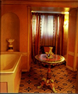
Photo at top: The private bath of Castaing at her shop on Rue Jacob
Wednesday, June 27, 2007

A Fashionable Life: Amy Fine Collins


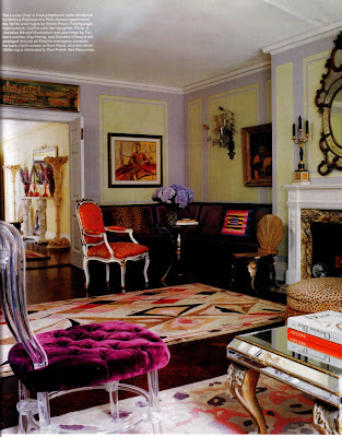
Fashion icons tend to live in a rather grand way, and why wouldn't they? Their sense of style and presence inevitably spills over to their homes, and more often than not, their passion for fashion is apparent throughout their domiciles. Writer and fashion muse Amy Fine Collins is one such individual. Known for her unique style and pixie-ish haircut, Collins' home is feminine, sophisticated, and chock full of references to fashion. The scrolled back lucite chair was designed for Helena Rubenstein's apartment. There are paintings and illustrations by Christian (Bebe) Berard and Marcel Vertes. Even one of the living room's rugs is attributed to Paul Poiret! It's actually rather amazing to see such a collection of pedigreed pieces. All in all, a unique home for a singular (and fashionable) personality.


A view of the living room with the Poiret rug and the Rubenstein chair.


The eclectic dining room with a Vertes painting, chairs by Syrie Maugham, and fashion sketches on the walls.


The entry, with console, mirror and torcheres by Serge Roche.


Another Vertes, this time in the form of a screen, in the bedroom. The caned cabinet is Jean-Michel Frank, which had at one time been owned by Horst.


Collins' office with a Louis XV style desk that at one time belonged to Hugh Hefner (!)

(All photos courtesy of Elle Decor)

Tuesday, June 26, 2007

Offices with Style


Most of us have home offices- places where we pay bills, use the computer, and possibly even blog. Offices have to be functional first, but this does not preclude one from injecting style and beauty into them. Here are some of my favorite offices (all are home offices with the exception of the office of Mary McDonald); my little desk looks nothing like these, but perhaps this post will inspire me to get my act together!


Gorgeous and feminine office of designer Mary McDonald


Nick Olsen's chic little tented office area in his chic little apartment.


Aerin Lauder's office in her Park Avenue home (that fabulous desk is a Gabriella Crespi).


Ruthie Sommers snappy striped office


Barclay Fryery's office tablescape


Emma Jane Pilkington's classic office

Image at top: Ultra chic office in the home of Charlotte Moss

Monday, June 25, 2007

Miles Redd's Solution for Cramped Quarters


I recently came across "House Beautiful- Decorating Solutions for Small Spaces" at the bookstore, and what did I find inside? None other than the former apartment of Miles Redd. The 550 square foot apartment, located in the East Village, was absolutely tiny, and Miles was forced to create spaces that performed double duty. The bedroom, with its suspended bed, also served as a den; the living room acted as a dining room and office; and the bathtub was in the kitchen (covered with a slab of wood, it served as a cutting board). As you can see, the apartment is chocked full of objects, something which Miles said made his small space seem larger. And of course, his use of mirrors everywhere also helped the illusion that his home was more spacious than it really was. What I find most interesting, though, is how Miles' style has changed and matured over the years. Many of his treasures seen in this apartment now reside in Miles' more spacious, and more formal, townhouse. The seeds of his glamorous style are visible here, but what I think you see in his current home is a more mature and tightly edited version of it.


Half of the living room, with the other half below


The bedroom/den/library


The bathtub in the kitchen, and a view of the bedroom dresser

(All photos courtesy of House Beautiful Decorating Solutions for Small Spaces)

Friday, June 22, 2007

Old Fashioned Prints


For a few years now, certain prints have held our attention; graphic prints, prints with that 1960s/70s vibe, and exotic prints have reigned supreme. This is certainly not a criticism because I too have used many of these. That said, wouldn't it be nice if some of the "old fashioned" prints made a comeback? There are beautiful floral prints that were designed many, many years ago that are still just as charming today. Or what about document prints, which are reproductions of historical prints and patterns? Here are a few designs that truly are vintage (such as those from Secondhand Rose), some that were inspired by old prints, and others that are new but look old.


"Barley Twist" fabric by Robert Kime


"Sunburst" wallpaper by Robert Kime


"Marblehead" wallpaper by Tyler Hall. This print was inspired by an early 19th c. American document print.


"Nosegay" wallpaper by Tyler Hall, inspired by an 1850 English document.


Vintage sea creature wallpaper from Secondhand Rose


Vintage bird wallpaper from Secondhand Rose

Photo at top:
"Shannongrove Blue" fabric from Carleton Varney

Thursday, June 21, 2007

Ballroom Bling


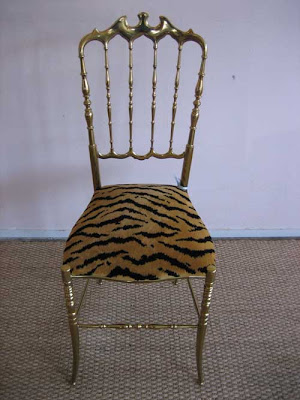
One of my all time favorite chairs is the ballroom chair. They have such grace and style, and most importantly, they can be moved around quite easily. These little gems are the perfect size and shape for all rooms- in the hall, against a wall in a living room, or in a dressing room especially. I am lucky enough to have a generous friend who gave me the classic, bamboo-style wooden ballroom chair with green and gold paint; it's perfect for my dressing table. The beauty of a wooden ballroom chair is that you can paint it to match your room. That said, if you really want to turn up the glamour, you might want to consider a vintage brass one- these are really quite elegant. And are you wondering why so many of these chairs are called "Chiavari" chairs? Well, I did too, and from what I have been able to determine, this style chair first originated in a town in Italy called Chiavari, where they are still manufactured today. (If anyone knows any additional information about this, please let us know!)


Vintage brass Chiavari chair at Coleen & Company


Pair of wooden Chiavari chairs at Chez Camille


Wooden ballroom chair from Source Perrier


More brass ballroom chairs at Thomas Brillet

Photo at top: Ballroom chair in the home of designer Krista Ewart

Wednesday, June 20, 2007

Katie Ridder Style


I've long admired designer Katie Ridder's work. Her rooms are always tasteful yet never boring. There is always a sense of adventure and fun to her rooms, but there is also an intellectual streak that runs through them. Ridder never seems to employ any gimmicky decorating tricks, which in essence truly make her rooms timeless!


(Photos from Katie Ridder's website)

Tuesday, June 19, 2007

A Fashionable Fruit


The pineapple has gone glam! Long a symbol of hospitality, the pineapple motif has been part of the American decorative arts for centuries. And, for many years, the poor pineapple has been relegated to second rate design and Williamsburg inspired kitsch. But no more! This exotic fruit that hid its light under a bushel is stepping out and is ready to take up the mantle of chicness for the 21st century.


"Pineapple" wallpaper by Studio Printworks


"Isadora Silver" crystal pineapple by William Yeoward


"Harbour Court" fabric at Lewis & Sheron


Pair of Pineapple Lamps, circa 1950-60, attributed to Maison Charles; available at Tom Thomas


Pineapple basin set at P.E. Guerin

Photo at top: The Pineapple, an architectural folly in Dunmore Park, Scotland