Monday, February 16, 2015
A Nifty Shade of Grey
Perhaps I ought not to admit this, but I saw Fifty Shades of Grey last week. When I received an invitation to attend a preview of the movie, I accepted with alacrity because I wasn't about to miss an opportunity to see what the hoopla was about. And what did I think about Fifty Shades? Let's just say that there are two good things about this film, both of which are awfully nice to look at: the actor Jamie Dornan ("Christian Grey"), whose good looks made me forget the absurdity of the movie's premise; and the de Gournay wallpaper that hangs in one of Grey's bedrooms. The movie redeemed itself immeasurably thanks to both.
As you can see in the photo above, the wallpaper, which is de Gournay's Askew pattern, is a wonderful bird and tree scene painted on a silver background. This shimmery version works well with the film's chilly grey color palette (what a surprise!), striking a feminine note in a mostly flinty, hard-edged apartment. Of course, there is that one room in Christian Grey's apartment that is red, but I won't get into that.
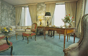
All of this leads me, in a very roundabout way, to the focus of this blog post, which isn't really about the movie of the moment, but rather Estee Lauder's former office. I have been meaning to show photos of her office for some time now, and the uncanny similarities between de Gournay's Askew paper and the hand-painted rice paper on Lauder's office walls made now seem like a good time to discuss it. The first thing you might notice is that her office resembled a formal living room, what with the wallpaper, that Louis XVI desk, and those dressy fabrics. But the other story here is the room's color palette, which is comprised mostly of shades of taupe, oyster, cream, and champagne. The one touch of grey can be found on the office's carpet, which provided an unimposing foundation for the room's furnishings. It just goes to show that grey doesn't have to, ahem, dominate those softer, quieter colors surrounding it.
*With special thanks to Angela Patrick of Ainsworth-Noah for identifying which de Gournay pattern appeared in the movie.
Estee Lauder office photos from Executive Style by Judith Price


Before working at P-H, I was at BBB who designed some Post-Modern-inspired corporate office interiors for Estée Lauder in the early 1980s. She always claimed to be her own interior designer and this was largely true though there was in-house assistance. Her own office in the General Motors Building on Fifth Ave across from the Plaza Hotel was interesting in that it was such a contrast from the harsh corporate environment that proceeded the progression access. Wisely, she avoided overhead lighting, preferring more flattering table lamps. Rather than gray (which was fashionable for masculine interiors at that date), the effect was actually more celadon and silver with champange, a soft and sophisticated urban scheme for the time that also reflected her brand's packaging.
ReplyDeletelove her ,Estee, office + great photos of her office. xxpeggybraswelldesign.com
ReplyDeleteLove that desk! Mary
ReplyDeleteJennifer the movie do not interest me, probably because I have already seen and heard so much about it. I agree with you though about this one wonderful feminine bedroom with the de Gournay paper. Adore Estee Lauder's office and color palette!
ReplyDeletexoxo
Karena
The Arts by Karena
Take away the curtains and I think her office could be just as usable today!
ReplyDelete