Monday, June 16, 2014
Carolina Irving in 1993
To most of you, Carolina Irving needs no introduction. The textile designer and recently-appointed Creative Director of Oscar de la Renta Home is featured often on blogs, and with good reason. She has style in spades, is a scholar of the decorative arts, and is a crack decorator to boot. And if you spend any time on Pinterest, Instagram, or any other social media site, then I don't have to tell you that her beguiling homes, which have been featured in an array of publications, have a tendency to elicit near-hysteria.
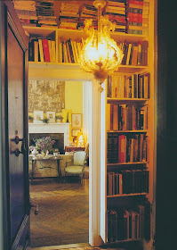
But what many of you may not have seen before are photos of Carolina Irving's Manhattan apartment, circa 1993. Irving's notable melange of styles and pieces was very much in evidence here, a mix that reflected her wide-ranging interests. Antique textiles bumped up against sterling silver, porcelain, and even a baseball. Also, after having seen photos of Irving's most recent homes, she seems to be a champ at bringing large-scaled rooms down to size, making these rather behemoth spaces comfortable and livable. But what I just might like best about this apartment was the book-lined entry hall. Can you think of a better greeting?
All photos from HG, January 1993, Ivan Terestchenko photographer


Omg. How did you find this???? Wow!!!
ReplyDeleteHi Joni! It was luck that I found these photos in an old HG.
DeleteFirst, John Richardson and now, Carolina. You've chosen spaces that resonated with me years ago. Sadly, my old issues of HG are currently in storage. Seeing your posts is like visiting old friends. Thank you, Jennifer! Susan
ReplyDeleteSusan, Both homes are definitely oldies but goodies. Just goes to show that good design and taste never go out of style.
DeleteP.S.- Hope that you can retrieve your old issues of HG from storage soon!
Jennifer,
ReplyDeleteIt was such fun to work with Carolina when I was with Tice Alexander, Inc. She has that european point of view. I do recall seeing this apartment of hers, although I was never there. It does resemble the one that Carolyne Roehm has on East 57th Street, only with yellow instead of brown- I think that Carolina (Estrada) just liked to see what Tice and I were up to- and it was similar when Reinaldo Herrera would drop into the offices of Robert Metzger, whom I also had the privilege of working under.
Dean
Dean, I didn't realize that you once worked for Robert Metzger. You continue to surprise me! :)
DeleteYes, I had quite a wild ride! Tice and I had a disagreement, so I left him and went to work for Robert.
DeleteOf course, I missed Tice terribly!
Dean
Perfection Jennifer! Adore her style and the book lined entry for guests first impression!
ReplyDeleteXoxo
Karena
Glad you enjoyed it, Karena!
DeleteYes, it's amazing that you found this. I actually remember this article. I wish I kept my old HGs and my father's collection of ADs. Why did I throw them out? It's even more remarkable to see them today. Thank you.
ReplyDeleteAnon- I once threw out a bunch of old magazines, and ten years later, I still regret it!
DeleteJennifer, I have been madly in love with Carolina Irving ever since seeing this spread in HG.
ReplyDeleteAnd covetous of the whole scene, but particularly that broadly woven red stripe seen in close-up!
Toby, Did you ever find out who produced the striped fabric? Do you think it was Ian Mankin?
DeleteThese spaces are so incredibly beautiful. At first glance I thought that her beautiful baby girl was a doll. I would love to see this design aesthetic make a return--soul filled rooms. Thank you. xo
ReplyDeleteMary
Mary, Soul-filled rooms are always a joy to behold!
DeleteAnd in addition to every thing else to love about this space, I love the fact that the book shelves aren't styled - paperbacks stacked across the top looking as if they've actually been read!
ReplyDeleteElizabeth, Excellent point! It's always comforting to see a shelf of books that have actually been read.
DeleteThese rooms are so very timeless, they could've been decorated today, let alone 1993!!! This is a pure example of how excellent design with classic pieces NEVER becomes dated, and always remains elegant. Thank you so much for posting these.
ReplyDeleteAnon, So true. These rooms aren't the least bit dated. Classic never goes out of style.
DeleteI assume she has changed this room - think I found pictures of a more recent room. This one is quite grand but very, very beautiful and livable. The pictures of her new version appear to have taken the large grand room and broken it up into a more "homey" English feel with slipcovers etc. Both are beautiful. Frankly, I can't imagine ever having changed it. Great style is timeless, never dated, and this is great style.
ReplyDeletesrb, I have seen those photos too. I assumed it was a different apartment, but maybe I'm wrong?
DeleteI have no room to store whole magazines; but I sure as heck tear out pages!
ReplyDeleteI found these pages in a notebook in a few minutes!! I ripped them out 31 years ago!!! (extremely unusual for me to find them that quickly; I readily admit!!)
Exactly the point I believe in! "Soulful rooms" "meaningful rooms" Real living. None of this ever goes out of style. Furlow Gatewood and his new book "One Man's Folly" is an even more extreme example. That book; I believe is the "Bible" of timeless ; subtle,unusual, and "trend-free decorating"! That is my "religion" !!!
ps You can always tell if books have "been read"; or "going to be read"! Any other kind of books on shelves I think are an "affectation"! Just my opinion!
Thank you Jennifer, I have visited this post a few times to study, your work is a valuable resource as always. Beth
ReplyDelete