Monday, June 17, 2013
Dining with Mario
There seemed to be a lot of enthusiasm for last week's post on tablesettings, so if you'll indulge me, I've got one more for you. But the twist is that all of these photos feature "tableware at its finest in innovative settings by Interior Designer Mario Buatta"- to quote the November 1977 House Beautiful article from which these photos came.
This post seems especially timely, too, considering that Mario's work for Hilary and Wilbur Ross is featured in the July issue of Architectural Digest. Have you seen the article yet? All I can say is thank heaven for Mario Buatta!
And when you look at the photos below, I think you'll see plenty of the ol' Mario Magic. Other than the quality of the photos (they were taken in 1977, after all), everything still looks fresh today.
In the photo above and at top: Interlude china and Castle Garden crystal by Lenox and Reed & Barton's classic Francis I flatware were set on a cloth made from China Seas' Ball fabric. (I don't think this print is in their current line-up.) The best part of this setting, though, has to be that beautiful bevy of blue and white porcelain.
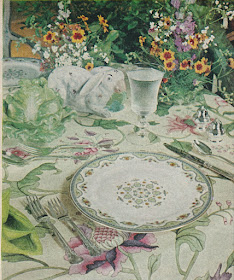
This "English Country" table is set with Gorham's Minaret china and Chantilly sterling flatware and President crystal by Gorham. The grass green napkins are by Vera, while the cloth is Madeleine chintz from Clarence House. I wonder if the lettuce tureen and earthenware rabbit were part of Mario's collection. I also find the library setting very cozy.
The sweet ribbon print fabric is Brunschwig & Fils' Cecily Ribbon and the china is Indian Tree by Aynsley. The crystal is Eileen by Waterford and the flatware is French Empire.
A more subdued setting thanks to the neutral tones of Dragon Sorrell china by Royal Worcester and a tablecloth by Fabrications. The flatware is Grand Majesty by Oneida.
All photos from House Beautiful, November 1977; Feliciano photographer.


In the first photo, the editorial styling got out of contol with the tall flowers and the napkins under the plates -- generally considered hospitality "Don'ts".
ReplyDeleteLove the beautiful table settings dahhling, my favorite obsession!
ReplyDeleteThere is no one better than Mario when blue and white is your passion. Gorgeous.
ReplyDeleteMary
MB no one does it better + terrific. xxpeggybraswelldesign.com
ReplyDeleteAll so lovely! Timeless...
ReplyDeleteWhat gorgeous tablescapes. I love the color schemes here!
ReplyDeleteYes, the china is beautiful when bare, but the question for me is always whether the food will look good on it. Several of these patterns fail on that account (especially the Dragon Sorrell).
ReplyDeleteAnonymous raises an interesting point. Personally I "clocked" the Dragon Sorrell pattern and even went as far as emailing it to Mrs Aitch. We both prefer the beige pattern to the blue, although both are stylish. Very 1910's! As for food looking good on it, I think an English breakfast (kedgeree, bacon, fried egg, devilled kidneys etc, etc) would look terrific on it. Again, I'm a bit bored of the bog-standard minimalist white plates you see over and over again in gastropubs and restaurants. But that just happens to be my view. I'm not sure if Dragon Sorrell is still in production. There seems to be masses of the blue version available on ebay, but the beige colour seems to be harder to source. Wonder what date the pattern is?
ReplyDeleteI am of course familiar with the blue Dragon version but the beige colorway is new to me. Not sure of the date.
ReplyDeleteI think that there are certain colors and prints that are more conducive to displaying food than others. In fact, a lot of people don't care for black china because of the display issue, but I think that black china can be quite lovely.