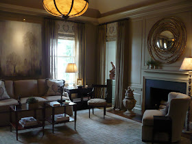
Yesterday, I attended a press preview for the 42nd annual Atlanta Decorators' Show House & Gardens, presented by the Atlanta Symphony Associates. This year's show house takes place at Knollwood, a beautiful 1929 home designed by famed Atlanta architect Philip Shutze.
This year's show house is really a knock out thanks to a stellar line-up of designers. Each room has its own unique style, and yet interestingly enough, the rooms all flow together quite nicely. I was impressed by how cohesive the show house is.
I took over two hundred photos of the show house, but no matter how terrific the show house is, I won't overwhelm you with all of those photos. Today, I'll show you the first floor rooms with the second and third floors to follow next Monday. The show house opens to the public tomorrow and will remain open through May 13. For more information on the house as well as how to purchase tickets, visit the official website.


You enter the house into the Foyer, decorated by Melanie Turner of Turner Davis Interiors.

The Ladies Parlor designed by Tish Mills of Harmonious Living by Tish Mills


The Back Hall by Kelly Hansen of Kelly Crago Hansen Interiors
The Butler's Pantry by James Farmer of James Farmer Designs


The Family Dining Room was designed by the talented mother & daughter duo, Alison Womack Jowers and Cheryl Womack of Womack Interiors. By the way, the amazing dining table is a Maison Jansen "Palais Royale" table from Parc Monceau.


The Dining Room by Carole Weaks of C. Weaks Interiors. It's nice to see two round tables in this space as opposed to one long dining table.


Stan Topol and Reynolds Brown of Stan Topol & Associates decorated the Living Room. The photo of Stan with Billy Baldwin was taken while Stan was working for Baldwin, his mentor. Baldwin sent the photo of himself to Stan's mother.


John Oetgen of Oetgen Design decorated The Solarium. Many of the designers included something musical in their rooms in honor of the Atlanta Symphony Associates. John stands near a stand with sheet music. Butterflies (not real) are used in place of chess pieces on this antique Chinoiserie games table from Parc Monceau.
The Library designed by William Murphy of Essary & Murphy.


The Gentlemen's Powder Room by John Fernandez and Jennifer True of Fernandez & True Interiors.
All photos are the copyright of The Peak of Chic.
I'm a docent tomorrow and looking forward to it. Thanks for the sneak preview.
ReplyDeleteThanks for the preview. I liked the Library the best.
ReplyDeleteAs the Designer of The Library, Bill Murphy, I thank you for your Posting. It was a Great room to work with. Thank you so much. Bill
DeleteIt looks like a great house, sizeable but not overly-large.
ReplyDeleteLooks great, I love the gentleman's bathhroom and the library! I cant wait for the Kipsbay up here in NYC! Great Post!
ReplyDeleteThe library my favorite, then the gentlemen's bathroom and the ladies foyer, follow. Great design.
ReplyDeleteGosh , I wouldn't think a true gentleman would need a "Powder room"
ReplyDeleteLove seeing what others do! xxpeggybraswelldesign.com
ReplyDeleteI liked the gentleman's bathroom...and the pictures of Billy Baldwin. What a wonderful touch to that room both the pictures and the spirit.
ReplyDeleteThe house is beautiful and every inch has a special detail - just perfect. Enjoy your weekend. Jalon
ReplyDeleteMy favorite room is the dining room with the pair of round tables; the sun room is a close second. I love seeing Southern decorating as it differs from California design in so many respects. Great photos. Thanks. Mary
ReplyDeleteThe chartreuse drapes in the Dining Room are spectacular.
ReplyDeleteWhat a Wonderful House this has been to work with as a Designer. Thanks for the Great Comments about loving my room, The Library. Hope all could be there to see the House in Person. Our Atlanta Symphony women have done a Great job helping the Designers Showcase This wonderful Shutze Home. Thank you all, Bill Murphy
ReplyDeleteso much to love but the bunnie portrait has won me overj, though there has to be a better place than the men's loo for poor bun.
ReplyDeleteWhat a treat to see these photos! I love the entry the most, maybe iffy on the ostrich. Melanie turner is a favorite, so no surprise that the foyer so gorgeous. All that Double Happiness is very happy and the floor is fantastic!
ReplyDeleteThat entry has a interesting resemblance of the dining room that Grant Gibson did in San Francisco last year. Coincidence or inspiration?
ReplyDelete