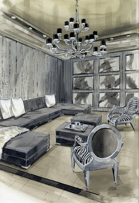
Last week's posts about fashion and interior illustrations seemed to resonate with many of you. A few (myself included) lamented the fact that illustrations seem to have gone by the wayside, while others were quick to inform me that there are still companies and designers who use, and in fact embrace, the artistry of illustrators.
Case in point- Donghia. Although I have not yet had the pleasure of visiting their new Manhattan flagship showroom, I hear it's really quite amazing. The 18,500 square foot showroom houses the lines of Donghia, Bergamo, Hinson, and Mrs. MacDougall. But while the showroom might be new, it is also respectful of the style of the company's late founder, legendary designer Angelo Donghia. Chuck Chewning, the Creative Director of Donghia, has added lacquered door casings, gold and silver leaf ceilings, and decadent finishes to the showroom, all of which were inspired by Angelo Donghia's interiors.
What is also quite clever, in my opinion, is that Chewning commissioned Masaru Suzuki, one of Donghia's acclaimed designers, to render illustrations of both the flagship showroom as well as those around the world. If you compare the illustrations to the actual photographs of the showrooms, you can see that Suzuki's renderings are indeed accurate representations. (Although that being said, Suzuki does note that art and accessories are items that are changed out seasonally, hence a few subtle differences between renderings and photographs.) The illustrations really seem to help flesh out the personality, style and energy of the showrooms, something that cannot always be captured by photographs. That's just my two cents.
And if you want to see the flagship showroom for yourself but have no plans to visit Manhattan anytime soon, you might want to watch a virtual tour via YouTube. Click here to see it.

Two images of the flagship Manhattan showroom, including a few framed photos of Angelo Donghia and his celebrity clients.
Suzuki's illustration of Donghia's Paris showroom.
Donghia's Moscow showroom, as represented by Suzuki.
And last but certainly not least, Suzuki's rendering of the Chicago showroom.
All photos and illustrations used with express permission of Donghia. All illustrations by Masaru Suzuki.
I agree with you that the drawings are charming, but in this case I think I like the photos better, which emphasize the elegant nature of the rooms, and especially that ceiling, and allow us to see more details of the furniture.
ReplyDelete--Road to Parnassus
Jennifer I love these illustrations by Suzuki, very fine! Wonderful background on Donghia.
ReplyDeletexoxo
Karena
Art by Karena
Jennifer, I love the ilustrations, what a beautiful post about one of my favorite designers...and you must check out the NY showroom, quite fabulous! Thanks
ReplyDeleteLisa
Marks & Frantz
Love these + adore Donghia. Grand post. xxpeggybraswelldesign.com
ReplyDeleteLove the illustrations. Very inspirational. Thanks for posting.
ReplyDeleteNice!!! I come from the time when illustrations or we called them renderings were the "icing on the cake" for any design presentation. I enjoyed drawing them free-hand. But of course, by the time I graduated and started my 1st job as an Architectural Intern...we were using CAD (Computer Aided Design) to produce those renderings. I appreciated technology providing a more productive means of producing these renderings but, I still feel that CAD takes away from the true "ART" of designing. So, long story short... I truly appreciate your write-up on these illustrations. Especially, from one of my favorite designers. Thank you for sharing!!!
ReplyDelete