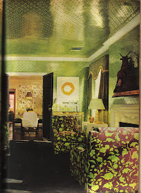
As I'll be traveling this week and time will be limited, I've decided to post about designers whose heydays were in the 1950s through the 1980s. I feel that these designers deserve some 21st century recognition. While some of the interiors may appear rather dated, it's important to remember that at the time they were quite the thing.
Today, I've decided to show more images from the portfolio of Zajac & Callahan. To learn more about them, read my previous post from a few weeks ago. Yes, it's a lot of prints and pattern, but you've got to hand it to the two men. Somehow, I think it worked. And hey, it was the late 1960s and 70s!


Jennifer these are all so great! I love the use and mix of patterns. I actually think the photos have a very contemporary feel! Safe travels.
ReplyDeleteGoodness gracious, Jennifer.....these designers surely believed in "busy" didn't they! Alot 'going on' in these rooms for sure! AND you are right, somehow it does WORK!! Beautiful!
ReplyDeleteI love that twin bedroom. And, you're right. It still works today.
ReplyDeleteGlad y'all like the photos. I think that even if you didn't want to go CRAZY with the prints, it's inspiring to see how such different patterns actually work together.
ReplyDeleteI love combining a pinstriped suit with a patterned shirt and patterned tie; it's like Shakespeare... it's either done right on or it's terrible. These rooms are great!
ReplyDeleteWow - I think I see some Diamond and Baratta inspiration here. And that dining room with the white lacquer table and chairs could have influenced a few fashion collections. I love skillful combinations of patterns.
ReplyDelete-Lana
I LOVE the last image of the dining room. Especially the straight bold lines of the double doors. Also love the mirrored wallcovering on the ceiling.
ReplyDeleteLove It! Keep the Zajac & Callahan coming. My first thought was Diamond & Baratta as well.
ReplyDeleteI really like the green and yellow rooms. I am seeing a trend of matching many patterns and making them work.
ReplyDeleteLove the last one!
ReplyDeleteYes, yes, YES! These are divine - thank you. You've such a great eye - well done.
ReplyDeleteI remember when decorating looked like this it was just before the world the " English Country House" period decor came into vogue. The Mark Hamptons, Reaganomics and suddenly everything made up or glitzy or too high style was out and we wanted traditional realness. The D&D building was reinstalled with actual period fabrics in period color-ways and anything groovy was out. But it really is just a revolving door isn't it? These rooms look so now- so Kelly Wearstler and the like! Please keep up the walk down memory lane its very enlightening
ReplyDeleteJ- This was a high style look, wasn't it! You're so right about design being a revolving door. Wonder what's next??
ReplyDeleteI adore Zajac and Callahan - do they have an archives? KDM
ReplyDeleteamazing... i'd love to see what door handles they used...
ReplyDeleteloved the black doors in the last 2 pics they just do it for me :)
ReplyDeleteLove Z&C! Big style and great taste don't get out of date. it's sophisticated and fun. Tootsie
ReplyDelete