Wednesday, January 28, 2009
Creating A Little Drama Down at the Party Barn
I wonder if I was an actress in another life because I sure like dramatic interiors. I don't have the guts to go completely overboard in my own home- you know, it's that burden of Southern propriety or something. So I always thought that if I had some type of party barn, I would go the theatrical route and give it the old Oliver Messel touch. (For those of you who aren't familiar with Messel, he was a socially prominent British artist who was one of the leading set designers of the twentieth century. And if you're interested, his nephew is Lord Snowdon.)
To furnish my little fantasy barn, I would choose pieces that have presence. Now, each of the pieces below would look great on its own. I wouldn't necessarily mix them all together. After all, you only need one diva in the room! That said, this is for fun so let's throw caution to the wind.
I also think I would keep my color palette limited to black and white with just a few accents of color. Why? Perhaps it's because I have a fondness for old black and white movies. And when you pit deep, dark black against pure, creamy white, well, it's like good vs. evil, and is there anything more dramatic than that?
(Image at top: George Carter's party barn is perfection- at least to me.)
Possible Furnishings for the Party Barn:
White Webb's Intaglio Console Table
White Webb's Intaglio Chandelier
Wall Sconce Shell by Nymphenburg
Maitland Smith Black and White Obelisks. I would use them for table decorations.
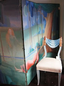
Handpainted Screen by Gracie
Chrome fireplace mantle
Polychrome painted over-mantle mirror. Not really part of my party barn design scheme. I'm only showing this because it caught my eye and it's fabulous!
Thursday, January 22, 2009
Design Legend Melanie Kahane
The late decorator Melanie Kahane understood color. And the other thing she "got" was the importance of publicity. Because Kahane did not have the social connections that designers like Mrs. Parish and Dorothy Draper had, Kahane had to prove herself by concocting eye-catching rooms- rooms that were sure to garner attention. The image at top was from a showroom that Kahane designed in 1949, and based on what I've read this room was one of the most photographed and published rooms of the year. Back at that time, black, white, and pumpkin orange was a rather daring color scheme. Don't you think it still looks pretty fresh today?
Kahane (b.1910-d.1988) was not one to shy away from color, and pink was one of her favorites. She could create interiors that were subtle and sophisticated, but I prefer her colorful confections more. I like the bold bursts of color that she injected in her interiors as well as the daring color combinations with which Kahane experimented. Pink and orange anyone?
Wednesday, January 21, 2009
Design Legend Anthony Hail
The late Anthony Hail is a designer about whom I know little. But I will say that I have been struck on more than one occasion by old photos of his interiors. I feel that only an elegant person could have created beautiful interiors such as these.
What I have been able to find out is that Hail was either a Texan or a Tennessean (conflicting reports on the internet) who was raised in Denmark and France. He studied under Walter Gropius at Harvard's Graduate School of Design, served as a correspondent for various magazines, and set up his own interior design business in San Francisco in the late 1950s. For years, Hail was the éminence grise of the San Francisco design community. In his obituary from 2006, Hail was described as one who understood living on a grand-scale. It also seems that Hail was a bon vivant who counted Alexis, Baron de Rédé, Arturo Lopez-Willshaw, and Truman Capote as friends. This worldliness of Hail's certainly seemed to shine through in his work.
If any of you have additional information on Hail, I'd love for you to post it in the comment section.
Tuesday, January 20, 2009
Design Legend Joseph Braswell
Today, I'm featuring the work of the late Joseph Braswell, a designer who seemed to have quite a range. As you can see here, he could design masculine, neoclassically inspired interiors. Or, he could do kicky and colorful or elegant and serene. No matter the style in which he was working, his interiors seemed to be elegant, appropriate, and quietly confident.
An Alabama boy who later graduated from Parsons School of Design, Braswell worked for leaders of the field including Melanie Kahane and Raymond Loewy. It was when he set up his own business back in the mid-1950s that his career really took off. I found a quote of Mr. Braswell's on the internet that I think is just terrific, and I'd like to share it with you.
Blessed are the beautifiers, for they see God in everything they do. This work may deal in things, but it is really, truly, at heart, about the people who occupy the space, use the things. If design is good, it makes the people whom it serves better people. It is very difficult to be mean spirited in an uplifting environment. That, ultimately, is what I try, at my best, to deliver.
I'd say he delivered, and with such style and grace.
Braswell quote from Interior Design Magazine
Monday, January 19, 2009
More Zajac and Callahan
As I'll be traveling this week and time will be limited, I've decided to post about designers whose heydays were in the 1950s through the 1980s. I feel that these designers deserve some 21st century recognition. While some of the interiors may appear rather dated, it's important to remember that at the time they were quite the thing.
Today, I've decided to show more images from the portfolio of Zajac & Callahan. To learn more about them, read my previous post from a few weeks ago. Yes, it's a lot of prints and pattern, but you've got to hand it to the two men. Somehow, I think it worked. And hey, it was the late 1960s and 70s!
Friday, January 16, 2009
It's a Small World
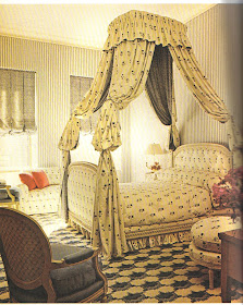
"In miniature, anyone can live in a room designed by an expensive and exclusive New York decorator."
Do you know what I would like to see more of? Miniature rooms. How charming to see elegant rooms shrunk down to Lilliputian size. I marvel at the details of these self-contained little worlds- the tiny furniture and artwork, the miniature rugs, the thimble sized light fixtures. It is probably not feasible for a designer to create these models as selling tools for clients. But for a really good client, wouldn't it be fun to have a miniature replica made of said client's favorite room...perhaps as a thank you gift?
Some of the most amazing miniature rooms I've seen were those designed by McMillen Inc. back in 1932. Because the Depression was underway, Eleanor McMillen Brown wanted to avoid having to lay off any of her well-trained staff. So, her brilliant employee Grace Fakes came up with a fantastic idea- why not make miniature rooms and display them in a traveling exhibition? It would certainly keep the employees occupied for a while.
Done on a scale of one and a half inches to one foot, these rooms are incredible. When you see photos of them, you almost think that you're looking at a life-size room. Everything was made with correct proportions and unbelievable details. There was a mini painting by Van Day Truex and small busts by Wheeler Williams. Small fireplaces, petite Aubusson rugs, and little bouillotte lamps rounded out these rooms. They must have been something to see in person!
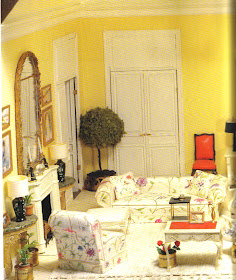
Jump ahead to 1978 and miniature rooms were on the mind of legendary window dresser Gene Moore. Moore asked various decorators to design scaled down rooms (a scale of one inch to one foot) for display in Tiffany's windows. Parish-Hadley and Mario Buatta both participated, and again, I wish I had been able to see them for myself. For many passersby, I'm sure it was the first time they had seen a Parish-Hadley or Buatta room up close. And truly, are these rooms any less charming than the real deal?
(Images at top: A small scale room designed by Parish-Hadley for Tiffany & Co.)
McMillen's Miniature Rooms:
An authentic replica of Mrs. Marshall Field's living room
A blue and white bedroom. Notice the tiny magazines and flowers on the tables.
A penthouse sunroom with mural by Barry Faulkner. The plants are real.
The Tiffany Rooms:
Even someone with a large personality like Mario Buatta can do miniature rooms!
Room designed by Kevin McNamara
Room by Angelo Donghia
(McMillen rooms from Sixty Years of Interior Design: The World of McMillen. Tiffany & Co. rooms and quotation from Windows at Tiffany's: The Art of Gene Moore)
Thursday, January 15, 2009
Marcia Sherrill at Roland Antiques
Marcia Sherrill has long been a fixture here in Atlanta. Part of it has to do with her vivacious and madcap personality. But the other thing about Marcia is that she is accomplished in so many areas. For years she designed a gorgeous handbag line. She is also an interior designer, a writer, an antiques and vintage furniture dealer, and now a co-founder of a new website called Victory Over Divorce. She's a bit of a modern day version of Auntie Mame.
Sherrill now resides in New York, and I'm sure many of you are familiar with her articles and interviews that are featured on 1st dibs. Marcia recently emailed me with the news that she has partnered with some friends to open a new store called Marcia Sherrill at Roland Antiques. The shop is located at 74 East 11th St., and I do hope to visit it in person soon. (Or you can simply go to 1st dibs and see her wares for yourself.)
Marcia emailed me a few photos of her shop, and I love the mix of pieces. It's the type of shop where you never know what you might find. And if you need a little levity, you might want to read Marcia's monthly column for Atlanta Homes & Lifestyles (available on their website). It's a hoot!
Wednesday, January 14, 2009
A Rant and a Plea for Help
The Sophia Flush Mount
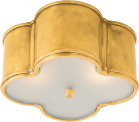
The Basil Flush Mount
"I'm mad as hell and I'm not going to take it anymore!"
You know how I try to keep things positive on my blog, and I'm a firm believer that if you can't say something nice, don't say anything at all. Well.... most of the time. But there are times when I can really get mad as a hornet, and that's the state I'm in right now.
You see, I'm majorly irritated with Circa Lighting. I've been a long time customer of Circa because I think they have a wonderful selection of lights and the prices are really affordable. I'm hardly one of their bigger clients, but I furnished my last house with sconces and ceiling lights purchased from them. And in my new condo, I found some great ceiling mount lights that I ordered back in early August (see above). The Sophia Flush Mount light was to go in a hallway, and I chose to use the Basil Flush Mount in my closet. And what was even better was that I found out later that these two lights were part of Alexa Hampton's collection for Visual Comfort (a company that is related to Circa), and I'm a big admirer of Hampton's work.
The Sophia was supposed to arrive on September 5, 2008 and the Basil was due in at the first of last December. So... where are my lights?? Well, I've just checked on them again, and now I'm told they should be in sometime in May. May??? Come on, that's nine months after the Sophia was supposed to be in stock. That's ridiculous. When I checked on the lights last Fall, I was told the delay was due to the hurricane and because they were waiting on UL approval. And now the explanation is that they sold more of these lights than they anticipated. Did my order get shoved to the back of the line??
I'm obviously very disappointed because I love these lights and thought they would be perfect in my new home. But can I live with wires hanging out of the ceiling for five more months? Nope. Sorry, but there are too many light fixtures out on the market for me to wait around.
So, I'm asking for your help readers. First, do you think that I should sit tight and wait for my Circa fixtures? Or should I cancel my order? Secondly, I would really love some suggestions for alternatives to these two lights. I would especially like to find a ceiling mount star fixture that is similar to the Sophia. I figure that if anybody can help me find other options, it would be you.
And tomorrow, I'll go back to being positive!
Update: I want to let everyone know that I spoke to the top brass at both Circa Lighting and Visual Comfort. First, I want to say that Circa is not responsible for the delays as they are simply a retail outfit that sells Visual Comfort. The delay is due to a longer than expected production process. In addition, the lights I chose have turned out to be far more popular than anticipated, which meant a larger production run than expected. Both Circa Lighting and Visual Comfort were very concerned about my experience and stressed that they do not take customer service lightly. Visual Comfort is doing everything they can to get these lights in stock and they should be available by sometime later this Spring. I appreciate that they contacted me, and as I think the lights are so good looking, I think I'm going to wait. Thank you to everyone for their help and their suggestions!
Update on Michael Smith and the White House Gig
Tuesday, January 13, 2009
Deborah Buck and the Art of the Tableau
I love Buck House and think that Deborah Buck has the best eye. Well actually, I've never visited Buck House in person, but I have passed by the shop a few times at night and I'm always captivated by Deborah's vignettes and tableaux. I'll admit that styling a tableau is not one of my fortes. You have to really let your creativity and artistic side take control of the situation. You have to let loose, so to speak. Otherwise, your efforts will appear tight, rigid, or at worst contrived.
I think that one reason Deborah is such an ace at assembling objects is due to her artistic background. She seems to innately understand the souls of the pieces with which she's working. And to me, that is the heart of decorating. You take furniture and objects that have stories and histories and you weave them together to create a new story- yours.
Deborah has recently published a book entitled Tableau, and you can get a sneak peek on her website. I think this book looks fantastic for two reasons. From a practical standpoint, you might get a better feeling for creating your own vignettes. And more importantly, you'll be privy to the stories that Deborah has chosen to share through her tableaux.
(Tableau is available for sale on Deborah's site by clicking on the link. The book retails for $71.)
All images from Tableau by Deborah Buck