I know many of you are in the throes of planning Spring parties and charity events, and believe me, I know that it can be daunting to decide on a scheme for an event. Sometimes all it takes is a spark... which is why I thought I would show some images from last week's New York City Ballet Spring Gala which was designed by none other than Charlotte Moss in collaboration with the talented DeJuan Stroud. (Moss and her husband Barry S. Friedberg were also Chairmen on the event.)
The event kicked off the Ballet's Jerome Robbins Celebration, so naturally the evening's program included such Robbins' works as Circus Polka, The Four Seasons, and of course West Side Story Suite. It was the graphic backdrop of this last piece that inspired the design duo's scheme for the event: yellow and black. I think this was an interesting choice because this color combination is graphic and gutsy and is not usually seen in Moss' residential work. But this is where Moss and Stroud were absolutely correct- when planning an event, sometimes you've got to think big and bold. What might work in a small room at home might fall flat in a large space, especially one like Lincoln Center.
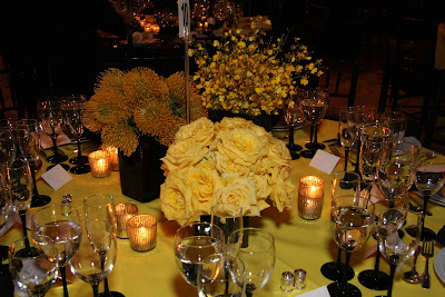
Stroud and Moss, seen above attending to pre-gala details, kept things interesting by mixing up the table settings. Some tables had yellow cloths and small arrangements of yellow roses and protea, while others were all about black- black tablecloths, big black vases, and tall branches of forsythia.


Mixing up the table settings keeps things interesting.
Of course, the table settings are not the only things that need to be considered. What to do with the general atmosphere of the space? Are there architectural details that can be incorporated into your design scheme? Are there large voids that need to be attended to? In a place like Lincoln Center, it was important to make sure guests did not feel overwhelmed by the vastness of the space. I think they managed the space issue quite successfully, both with the tall masses of yellow flowering branches and with the yellow sculptural pieces hanging from the ceiling. And how great does the yellow and black striped banner look behind the Nadelman sculpture?
Bringing a large space down to size
It's all about the details
I hope that these tips might help you in planning your next event. With a little creativity, forethought, and careful planning, not only will your party be a success, but you too will be cool as a cucumber the night of the event. Just like Charlotte Moss.
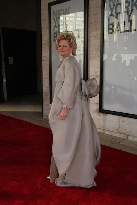
Moss making her entrance at the Gala.
(For more information on the New York City Ballet, click here.)
(Image of Moss at top courtesy of Erin Baiano/Paul Kolnik studio. Decor shots and image of Moss at bottom: Mary Hilliard.)
The space looks incredible! And I love her dress. It's almost like a Korean formal costume.
ReplyDeleteIt's by Ralph Rucci (hence the Asian overtones) ... and utterly amazing ...
ReplyDeleteWow Jennifer, excellent coverage. You make so many insightful observations. It's fun to see Moss work with yellow and black, and she looks amazing!
ReplyDeleteI wondered if the dress was a Rucci... beautiful!
ReplyDeleteCourtney- A bit of a different color scheme for Moss, but it works here.
ReplyDeleteooh - my favorite lady! What great pictures. And boy, she looks beau-ti-ful!!!! Are you home now????
ReplyDeleteJoni
Hope positive comments aren't mandatory, as I personally don't feel colored napkins are ever appropriate.
ReplyDeleteAnon- I think that the debate over colored napkins is similar to that about colored sheets and towels: you either like it or you don't. Some people only stick to whites and creams. My guess would be that they chose colored napkins as white/cream would be too jarring against the black cloths (but that's a guess only!)
ReplyDeleteI'm nearly always enamored of your posts - but Moss, yellow and black? Home run. It's beautiful - thanks for the images.
ReplyDeletePatricia- Thank you! Well, you've obviously had a lot of experience in the gala preparation department as of late!
ReplyDeleteWhat a wonderful posting -- and really excellent suggestions and thoughts. I did notice that the yellow-and-black hanging behind the statues had strong large horizontal lines -- which seem to bring the whole expansive space down to size! Love the different tables -- and the clever use of different floral elements on each one! Moss is brillant at the mix!
ReplyDeleteJan at Rosemary Cottage
what an incredibly beautiful room. so timelessly glamorous...and the centerpieces are truly works of art!~
ReplyDeleteWhat a Grand event! It looks amazing! It's no surprise that that the Queen of creative flair had a hand in this.
ReplyDeleteStunning! And Charlotte looks like Royalty. (Just curious, were the larger arrangements for VIP tables? Or just for the overall effect?)
ReplyDeleteI love these flowers arrangments but above all I love her dress
ReplyDelete