Yesterday I posted about the rich history of trompe l'oeil, and this artistic trick is just as popular today. Of course, painting trompe l'oeil designs on walls and floors appears to be the most popular application. For example, some people choose to paint mouldings on a wall to give the illusion of architectural features that in reality are not there. But trompe l'oeil painting is only the tip of the iceberg. There are trompe l'oeil prints on fabrics and wallpaper, and trompe l'oeil ceramics have long been popular with collectors. Here are a few examples of creative uses of trompe l'oeil.
Trompe l'oeil painted headboard (Domino 3/06; photo by Paul Costello)
Trompe l'oeil chair in a Philadelphia home (Cookie magazine)
Closeup of "Bibliotheque" wallpaper from Brunschwig & Fils. This trompe l'oeil print of a library of books was designed by famed trompe l'oeil artist (and decorator) Richard Neas.
"Le Temple des Grec" wallpaper by Studio Printworks. This print has the appearance of a wall built of blocks.
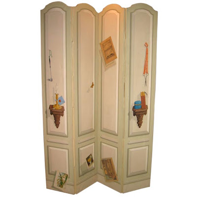
1960s Trompe l'oeil screen by Daniel Greene, available at Benjamin Storck Ltd.
Trompe l'oeil tableaux cloths by Los Angeles designer Mark Cutler
Italian ceramic bowl of Barlotti beans from Gump's
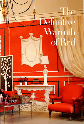
Image at top: Charming trompe l'oeil vignette at Hollyhock. The walls were painted by Paulin Paris.
That headboard with the John Robshaw pillows propped against it is my favorite!!
ReplyDeleteCourtney- I thought that was pretty clever too, although I don't know if it would bug me not having a real headboard!
ReplyDeleteExcellent couple of posts. I love Mark Cutler's tableaux cloths.
ReplyDeleteLinda- I think those cloths are very clever!
ReplyDeletePeak - you've chosen the best of old and new - I checked out some early 90's HB design books this weekend - lots, lots, of very bad faux. These are dreamy.
ReplyDeleteKC- Yes, there is a lot of bad faux "stuff" out there. I thought about mentioning that, but decided just to talk about the good things.
ReplyDeletePeak - you would - leave the dishing to me. :)
ReplyDeleteKC- Nothing wrong with dishing!
ReplyDeleteWonderful Trompe l'oeil images! I do agree with KC though. The 80's and 90's were sort of a lengthy "bad hair day" when it came to faux finishes. But these are wonderful!
ReplyDeleteKatie- So true! Done well trompe l'oeil is great! Done poorly, well, we just won't talk about it!!!
ReplyDeleteI really like the chair next to the mirrored chest of drawers!
ReplyDeleteXO
Anna
great post...again! love the gumps's bowl. i'm a porcelain girl.
ReplyDeleteI think Mark Cutler's covers are genius. What a chic and inexpensive (?) way to get a fresh look.
ReplyDeletePatricia- I thought Mark did a fantastic job with those- so clever!
ReplyDelete