Tuesday, April 30, 2013

Stanmore Collection from Travers


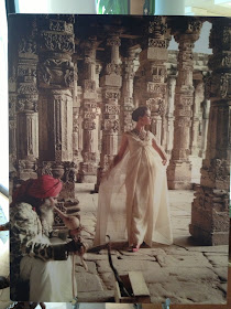
Last week, Ainsworth-Noah of Atlanta hosted a cocktail showing of Travers' new fabric collection, Stanmore.  Inspired by an exhibit of Norman Parkinson's fashion photography, Erin Finn, Travers Design Director, used the photos' ornate Indian settings as a starting point for her latest collection.  And indeed, when you look at the new fabrics, you do see the influence of these photos.

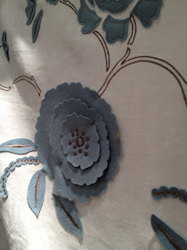
What I found to be most striking about the new collection is the starring role that texture plays.  There are embroidered flowers and vases, appliquéd flowers (made from laser-cut petals), and crewelwork that is anything but old-fashioned looking.  One of my favorite prints is Changmai Chine, which is a fresh and lively take on a traditional warp print.  In fact, most of the new fabrics are based on historical fabric styles, but they have been given rejuvenated appearances thanks to updated colors and motifs.

To see these fabrics for yourself, visit Ainsworth-Noah or your local Zimmer-Rohde showroom.


A few of the Norman Parkinson photos that influenced this collection.


 Vasi


Floral Portrait 


Le Toquet 


Edenberry


The four images above show Changmai Chine, which is a beautiful silk warp print.


 Antonia


Salaria 


Stanmore Felt 


Or you could do as Dennis Hunt of Zimmer-Rohde did and have some pants made up of the Coralie print fabric.


All photos are the copyright of Jennifer Boles for The Peak of Chic

2013 Lake Forest Showhouse & Gardens

Decorator Showhouse season is in full swing, and that means that wherever you live, there is probably a recently opened showhouse close by.  One showhouse which I recently visited was the Lake Forest Showhouse & Gardens, located in a fabulous David Adler house in Lake Forest, Illinois.  As expected, the house's architecture is amazing, but what is equally as impressive are the rooms decorated by some of the finest Chicago and Lake Forest designers.  Although the rooms represent a range of styles, what they have in common is that they are all well-appointed and finished looking.

I was able to take just a few detail shots, but I hope that the photos are enough to pique your interest.  It's really a great showhouse and one which, if you live in the area, you shouldn't miss!


Susan Kroeger did a lovely job creating a tranquil, feminine bedroom.


Summer Thornton Design took a stylish walk on the wild side with her Upper Gallery space. I liked her use of Les Touches for the space's curtains.


This centerpiece of Julia Buckingham Edelmann's Party Room was this Currey & Co. "Rondelay" covered in a Brunschwig & Fils fabric.  She also included a great looking card table and chairs in this space.


Matt Lorenz of ML Design Studio used the Garden Room's niche as a bar.


Joseph Szymczak conjured up a masculine Dining Room with Grand Tour accents.


The entry foyer as designed by Lichten Craig.  The paper is a Fornasetti design.

Monday, April 29, 2013

Le Cabinet de Porcelaine


My weekend internet fishing expedition turned up what has to be my new favorite shop...although sadly, I have yet to visit it. Le Cabinet de Porcelaine, located at 37 rue de Verneuil in Paris, deals exclusively in the porcelain work of Didier Gardillou and Samuel Mazy. You might be familiar with Gardillou's charming porcelain fruits, vegetables, and flowers, which have been sold in the past at Charlotte Moss' Townhouse, Sue Fisher King, and Branca. Unfortunately, I do not own any pieces by Gardillou, but my sister has one of his small lettuce boxes, which is très magnifique.

I love the idea of a jewel-box shop that is devoted solely to one type of treasure.  (It doesn't get more focused than a store that sells not any old porcelain, but porcelain vegetables and flowers!)  In fact, my idea of heaven is a small cobblestone alley filled with shops selling embroidered linen, porcelain, stationery, antique books, scents for the home, antique copper cookware, and antique silver- all on a bijou scale, of course.  Le Cabinet de Porcelaine would fit into this dream shopping mecca perfectly.


All photos from Le Cabinet de Porcelaine.

Thursday, April 25, 2013

Time May Change Me


While flipping through The New York Times Book of Interior Design and Decoration, I came across the photo above, which depicts a Manhattan living room. It's certainly attractive and elegant, but it's not extraordinary. The furnishings seem very much in keeping with that early to mid-1960s formal style that was just starting to loosen up.

And then, while looking at the pillows on the sofa, something caught my eye. It was my first indication that this apartment belonged to someone with whom we are all familiar. Can you guess?


The pillow at the far right bore the logo of Bill Blass. A little research on the internet confirmed that this was, in fact, the home of Blass. It's far different from his later homes, where strict editing and a well-defined aesthetic, coupled with the decorating assistance of Chessy Rayner and Mica Ertegun, resulted in interiors that were pretty close to perfection.

As it turns out, it was another female design duo, Barbara Brown and Clare Morrow, who decorated this apartment for Blass.  Brown and Morrow were models who also decorated, working for clients such as Blass and Donald Brooks, another talented fashion designer.  (Morrow mostly modeled for Norman Norell.  Glamorous, don't you think?)  But it seems that Brown and Morrow also had a knack for decorating for attractive, single women, with Brown once telling the New York Times, "it's a help to work for beautiful women, especially if you feel you should help them get married."  Um, I think that there might be quite a few of us who could use the decorating/matchmaking services of Brown and Morrow.

The photo below shows Blass' dining room.  As much as I love Porthault table linen, I have to say that I'm a little surprised to see it combined with the leaf-print covered walls and the faux-bois chair cushions.  I suppose that I just never thought of Bill Blass as being a floral Porthault linen kind of guy.  Nevertheless, the dining room, like the living room, has a charm that was fitting for the time.  It is also a good example of how personal style and taste change, evolve, and, most importantly, mature over time.


Photos from The New York Times Book of Interior Design and Decoration; NYT quote from September 10, 1968 article by Virginia Lee Warren.

Tuesday, April 23, 2013

What I Saw at the Chicago Botanic Garden Antiques & Garden Fair


I had a wonderful time last week attending the Chicago Botanic Garden Antiques and Garden Fair. Not only did I thoroughly enjoy participating in a panel discussion with Julia Reed, Marisa Marcantonio, and Emily Eerdmans, but I also had the chance to listen to Michael Smith speak about his forthcoming book (it looks very interesting, by the way) and do a lot of shopping. I'm currently getting caught up on emails and laundry, so until regular posting resumes in the next day or so, I'll show you some of my favorite picks at the show, seen below.

And next year, you should really consider making the trip to Chicago to attend this show. It's a top-notch show filled with antiques, 20th century furniture and accessories, and garden-related furnishings.

Photo at top: Garden vignette designed by Mariani Landscape.


Donald Stuart Antiques of Winnetka, Illinois had a really lovely booth, which was one of my favorites. They don't have a website, but they can be contacted at (847) 501-4454.


Lee's Antiques of Kenilworth, Illinois had a lot of vintage furniture for sale, including a pair of red director's chairs with zebra needlepoint backs and seats.


You know that I love porcelain, so I took copious photos at the booth of Lynda Willauer Antiques of Nantucket, Massachusetts. Looking at all of the beautiful platters, bowls, and urns, I was perplexed as to why more people don't collect porcelain. (I also couldn't resist a photo of the Staffordshire dogs that looked like Alfie.)


The Find, which has locations in both Chicago and Highwood, Illinois, also had a nice booth filled with great accessories, like these fish and shell motif objects.


I had to stop at the booth of Ben Caldwell as he lives in Nashville. He crafts all kinds of beautiful copper serving pieces, including these antler-handled serving spoons and flat servers. Made from naturally shed antlers, some of the handles' ends have been carved. (Check out Ben's website as he also crafts pieces from sterling silver, too.)


I love the seed packets from Hudson Valley Seed Library.


At more & more Antiques of New York, there was an intriguing set of 19th century watercolors that depicted various Danish rulers. I also spied a good-looking tole floral piece.


How great was this gazebo at the booth of Mayfair Antiques?


All photos taken by Jennifer Boles for The Peak of Chic