Sunday, December 23, 2012

Walking in Jonathan Preece's Winter Wonderland


I know that many of you, like me, are always enchanted by the vignettes and table settings created by Jonathan Preece, Creative Director and Special Projects Designer at Bunny Williams Inc.  Through the years, Jonathan has conjured up fantastical Thanksgiving and Sukot tables for clients not to mention magical holiday vignettes.  This year is no different, with Jonathan turning Treillage, Bunny and John Rosselli's delightful shop in New York, into a winter wonderland.

What makes Jonathan's creations so special, and what might also be one of the secrets to their success, is that a great deal of research goes into his work.  History, literature, and traditional art forms frequently figure into these tableaux, and this year is no different.  For the Treillage windows, Bunny requested that Jonathan include snowflakes.  From that kernel of inspiration came Jonathan's clever idea to use magnificent quilled paper snowflakes that were hung throughout the store.  Quilling, as Jonathan informed me, is a traditional paper craft in which strips of paper are tightly coiled around a quill in order to shape them, with each strip then being attached to one another to create a work of paper art.  (I doubt that I'm adequately explaining the process, so click here to read the Wikipedia entry.)  Jonathan eventually found a woman in Idaho who was a fourth generation quiller and commissioned her to make these magical snowflakes that, thankfully, are for sale at Treillage.

Also taking a cue from C.S. Lewis' The Lion, the Witch, and the Wardrobe, Jonathan designed a snowy scene reminiscent of that in Narnia that the children encounter upon stepping out of the wardrobe.  Even the lamp post that figures into the story makes an appearance at Treillage.  There is also a Pied India Blue Peacock in one of the windows, although I can't say whether the peacock was a character in Lewis' novel or not; it's been ages since I read the book and my memory of it is a little fuzzy.

Those of you who live in New York have probably seen Treillage's Winter Wonderland this season, but for those of you who have not had the opportunity to do so, I'm including numerous photos to give you a sense of Jonathan's handiwork.  I hope it's a nice respite from that last minute shopping that many of you are doing today!


All photos courtesy of Jonathan Preece

Thursday, December 20, 2012

Will Merrill and His Mountain House


I'm so happy- actually, thrilled- that my dear friend Will Merrill's Blowing Rock, North Carolina home not only appears inside the February 2013 issue of House Beautiful, but it made the cover, too!

Will has been a close friend to me for a number of years now, and what never ceases to impress me is his enthusiasm and love of design.  His excitement over the latest design book or an antique store find is infectious, so much so that I usually want to buy the same book or a similar piece of furniture based on Will's endorsement alone.  All of Will's treasures have found a lovely home in Blowing Rock, and what struck me about his home upon seeing it for the first time was how sophisticated it was for a mountain house, and yet, it's completely comfortable with its rustic setting.

When Will bought the 1970s-era home, it was in rather sad shape with avocado colored wall to wall carpet and sliding glass doors.  By adding poplar bark siding to the exterior and salvaged wood floors inside, he transformed the house into a rustic gem.  The bonus to the house is his amazing back porch which acts like an outdoor living room, one that Will can use for most of the year.

I'm including a few photos here, but there are many more in the February issue.  I do hope that you'll read the article because I think that you'll find the house to be charming.


Above, a guest room with usually seen in the city leopard print carpet and a Coromandel screen.


A back porch vignette with poplar bark siding as a backdrop.


The stairwell leading downstairs has a knotty branch stair rail while the walls are covered in tramp art mirrors.


Another guest bedroom in which framed botanical specimens are hung floor to ceiling.


All images used with express permission of House Beautiful.  February 2013 issue, Simon Watson photographer.

Tuesday, December 11, 2012

At Last


I've never been a big fan of frogs, a feeling that I believe stems from the fact that they're slimy.  Or at least, they look slimy.  I've never touched one because, as we were all led to believe when we were young, doing so would give you warts.


There are a few frogs that I do like, though.  Kermit seems awfully sweet.  And one of my favorite restaurants is La Grenouille, named for the French word for frog.  Now that I think of it, I've never had the frog legs at La Grenouille before.


I would consider sending Dempsey & Carroll's Cocktail Frog Invitation to guests because who wouldn't like a convivial frog?


If I had a little boy, I would use Scalamandre's Calabassas County fabric in his room because it's cute and youthful...and I'm old-fashioned enough that I think that childrens' rooms should look youthful, not hip.

But there is one frog that I have coveted for years.  I've spied him, or rather one of his relatives, before in some pretty swell homes like those of Tony Duquette and Valentino.  And finally, after all of these years, I can call him mine:


He'll look much happier with a little plant inside of him, perhaps a Christmas cactus (remember those?) in honor of the season.  Now this is a frog that I'll happily take, warts and all.

Image at top: Frogs by Picasso, Metropolitan Museum of Art

Friday, November 30, 2012

Tapestries and An Exciting Auction


It's been a busy week, but I didn't want to leave for the weekend without mentioning an exciting upcoming auction. Arader Galleries will be hosting an auction on December 5 that will include such lots as rare maps, atlases, globes, and Audubons. But what I think many of you will be interested in are the pair of exquisite Gobelin tapestries once owned by the great tastemaker, Carlos de Beisteigui, and installed at his Palazzo Labia. If you visit the auction's online catalogue, you can see photos of the tapestries and read more about their provenances. (You can also see one of the tapestries in situ in one of my previous blog posts; click here to read it.)

Tapestries have long been coveted by tastemakers, including the Duchess of Montesquieu-Fezensac (at top), Robert David Lion Gardiner (below), and Harold K. Vanderbilt (at bottom). In each of these Slim Aarons' photos, the tapestries almost upstage the stylish subjects...and that's not an easy thing to do.

For more information on the Arader Galleries/Guernsey's auction, please click here.


All photos from A Wonderful Time: An Intimate Portrait of the Good Life and Slim Aarons: Once Upon A Time.

Tuesday, November 27, 2012

Cozy Groupings


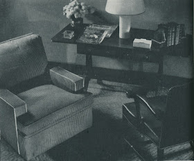
I love this time of year.  It's as if the chilly weather gives us permission to stay home in the evening, forgoing social engagements for the comfort and coziness of our homes.  Comfort food, warming libations, wool throws (no snuggies please), and engaging books are the ingredients for a winter evening well-spent.  And I know that others feel the same way, too.  Take this 1935 issue of House & Garden in which the pleasures of cozy are touted through "groups that suggest some pleasant interludes in winter evenings."

There is the "Reading Group", above, with its reproduction Duncan Phyfe table and comfortable chair upholstered in green and white striped cotton.  My ideal reading group would be accompanied by a fireplace, and that too was shown in this article, below, in the "Nightcap" grouping which included preparations for mulled wine prepared over the fire.  But really, you could enjoy any hot beverage like Swiss Strawberry Tea, a Tom and Jerry, or a Caudle Cup, each drink's preparation detailed in this same issue.  (Whatever happened to Hot Buttered Rum?)

There is the "Card Group", appropriate for an era when many civilized people played bridge and such.  I don't play cards nor do many of my friends.  A shame, really.  But I do know if my friends and I did play cards, the cards would be accompanied by cocktails and food.  Not a lot of food, just a few nibbles.  And then there is my favorite grouping of all, "And So To Bed".  This is where I do most of my reading considering that I don't have a fireplace to cozy up next to.  The bedroom seen here included Amodec furniture made of maple and a candlewick bedspread, very popular at that time.  I would forgo the candlewick spread for a satin quilt, but that's just me.  I have visions of Hollywood grandeur running through my head.

And so, after all of this, I'm off to bed!


As I mentioned, I don't play cards, but if I did,


I would serve Mamie's Tuscan Wafers which have a little more zing than the original Cheese Wafers but are just as good. The perfect snack for a game of cards, especially with drinks served in glassware like this:


High Ball glasses by James Mont, available through BG Galleries


To create my Nightcap group, I would first need some kind of electric fireplace.


This is the best looking one I have found. Not bad, but do you know of any that actually look kind of chic?


At the end of the day, though, my favorite cold weather retreat is my bed, especially if I ever take the plunge and buy one of Leontine Linen's satin quilts and bed jackets.


Both would help to ward off chills while reading juicy books like these:


American Lady: The Life of Susan Mary Alsop by Caroline de Margerie

and


Inventing Elsa Maxwell: How an Irrepressible Nobody Conquered High Society, Hollywood, the Press, and the World by Sam Staggs

Monday, November 19, 2012

Inman Cook and the Celanese House


While looking through the November 1965 issue of House & Garden in hopes of finding Thanksgiving related photos, I found an interesting article that featured the work of designer Inman Cook.  I've seen Cook's work before, usually in mid- to late 1960s design magazines, and it has always caught my eye.  Like so many other designers of this era, Cook embraced bold prints and colors, and yet, there was a reserved elegance to his work as well.  His interiors were exuberant, but they also conveyed a traditional sense of propriety.  If my memory serves me correctly, I believe that a friend told me that Cook was Southern, so this might explain his work.  And if Cook wasn't born in the South, well, then, what do I know.

The photos seen here show Cook's decoration of a mid-19th century brownstone in midtown Manhattan that temporarily housed the Celanese House, a show house sponsored by Celanese Contemporary Fibers.  The Celanese Corporation charged Cook with decorating the four-story brownstone for a mythical family.  The challenge, though, was that Cook could only update the home through paint and fabrics woven of Celanese.  According to this article, the house was rife with exposed pipes and radiators, but as they were mostly located near windows, Cook was able to hide them using cleverly designed curtains and low screens.  Now that you know this fact, you can look at the photos below and determine which rooms were plagued with these eye-sores.  I have to say, though, that Cook was successful in his cover-up.  My only question is, if Celanese is a synthetic fiber (am I correct?), then how did the fabric near the radiator not go up in flames?

The other thing that struck me about the interiors is that if you didn't know this was a show house, you just might think a real family lived here.  Nothing looks temporary nor too staged, something that sometimes happens at show houses.  And despite some of the dated-looking prints, I must say that few of the rooms look out of place today. 

Image at top: The Living Room.  Note how the curtains extend beyond the corner of the room. This device helped to conceal exposed pipes. 


The Upper Hall, one converted into a sitting room.


 A view from the library, looking into the parlor-floor hall and the living room beyond that.


The Library


 The Dining Room


 The Foyer, what the article said was "a new room for entertaining".


 The Guest Bedroom


 The Master Bedroom


 The Guest Room


A corner view of the Master Bedroom


All images from House & Garden, November 1965, Otto Maya photographer.

More Constance Spry...in a way


Quite a few of you expressed interest in the lead photo of my recent Constance Spry post.  The photo shows a c. 1911 Manhattan apartment that was decorated by Alexander Doherty.  Featured in the December-January issue of House Beautiful, the apartment is awash in moody colors and tranquil light.  You can see a few photos here, but for the full effect, check out the upcoming issue of House Beautiful.


All images courtesy of House Beautiful, December-January 2013, Francesco Lagnese photographer.