Tuesday, August 31, 2010

Remember This One?


Let's rehash an oldie but goodie- the New York apartment of Jeff Pfeifle, former president of J. Crew, and his partner Adam Mahr. I was reminded of the fabulous apartment, featured in the December 2006 issue of House & Garden, when I saw Pfeifle's photo on New York Social Diary the other day. Now, you might think that I was taken with the home because of the children of the house (see above), children who bear a striking resemblance to Alfie. Well, perhaps it swayed me a bit, but really, the home is downright chic. Starting with...


...the tented entryway. Did someone say tented? I think perhaps that's what hooked me.


Or perhaps it was the good old-fashioned dining room that is anything but old-fashioned.


The guest bedroom? Yep, like that one too.


And the telephone room? Why, it pushed me over the edge. Time to dial 9-1-1.


(All images from House & Garden, December 2006; Hugh Stewart photographer)

Monday, August 30, 2010

Mad for Marion


Thanks to the non-drowsy decongestant I've been taking all weekend, I've been a little too revved-up to sleep. A little annoying, but on the bright side, I've redecorated my apartment...at least, in my mind. I've decided that I need a small rug in my dressing room. I already have a nice wool, Wilton weave carpet in there right now (I'm a big fan of wall-to-wall carpet in bedrooms, closets, and dressing areas), but I think a throw rug would add some zip to the space. After all, a minimalist wardrobe, though chic on the body, is too subtle to do much in the way of decoration.

So what would be perfect in my dressing area is a Marion Dorn rug. I mean, if you're going to daydream, you might as well shoot for the stars. It would certainly be in keeping with the loose 1930s look that I'm going for. And if they were good enough for Syrie Maugham and Frances Elkins- both fans of Dorn's work- they are more than good enough for me.

(Speaking of Maugham, don't forget that Pauline Metcalfe's much anticipated book, Syrie Maugham, is being released in a few weeks. Look for a review here soon.)


This Dorn rug, c. 1930, was sold at Christie's for around $4300. The pale tones would be perfect for my room's color scheme of pinks, grays, and creams. The zig-zag design is reminiscent of the Dorn rug in Mrs. Celia Tobin Clark's bedroom (c. 1929-31; seen at the top of this post), a room decorated by Syrie Maugham.


Frances Elkins chose this beige and off-white Dorn rug for the bedroom of Ruth Winslow. The rug was a nice modern counterpoint to the traditional French floral chintz.


How chic was the Lounge at Claridge's Hotel, c. 1930? Decorated by Oswald Milne, the space was a combination of Art Deco and Modernist decor. The black and cream geometric patterned rug was, yes, by Dorn.


Another stylish room decorated by Maugham, this time the London drawing room of Mr. Robin Wilson. I wonder if that was a Dorn designed rug?


This Dorn work is/was available at a rug dealer in Paris.


Not quite the right colors for my dressing area, but this Dorn rug- auctioned off by Sotheby's- is certainly enchanting.

(Clark image from David Adler, Architect: The Elements of Style, Martha Thorne editor; Elkins image from Frances Elkins: Interior Design by Stephen Salny. Claridge's photo from Martin Battersby's The Decorative Thirties; Wilson drawing room photo from The Great Lady Decorators: The Women Who Defined Interior Design, 1870-1955 by Adam Lewis.)

Tuesday, August 24, 2010

Cooling Effects


After every walk that we take during the hot summer, Alfie marches inside my apartment and immediately collapses on my entryway's tile floor. I don't blame him; it's such a quick and easy way to cool off. This summer has been so hot and muggy that there have been times when I have considered lying down on the tile floor as well, although a modicum of decency has prevented me from doing so. But, there really is something appealing right now about things that are cool to the touch. To me, that usually translates to ceramic or porcelain and white, of course.


Like this 1930s French Patisserie Table from Soane Antiques. It's the perfect size for Alfie! Seriously though, I am charmed by this table.


In terms of garden stools, this drapery and tassel version is completely unexpected. (from Palm Beach Antique & Design Center.)


Who knew that firewood could be so cool? It is when it's made of bisque porcelain. (Still Life Logs from Klein Reid)


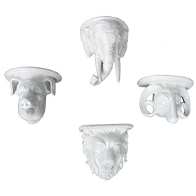
How cool are these ceramic wall brackets? (from Dixon Lane Antiques)


Just wanted to see if you were paying attention (Ceramic turkey from Kirk Albert Vintage Furnishings)


A little blue is perfectly acceptable, especially when it's on a table as terrific as this. (from Carlos de la Puente Antiques)


And finally, if I had a floor made of this Barbara Barry tile for Ann Sacks, I suspect Alfie and I would be fighting for space on the floor.

Monday, August 23, 2010

Inside "Inside Design"


I'm feverishly working on an article right now, so I'm going to rely upon Michael Greer to carry this post. You remember Michael...his 1962 book was on my top ten book list last week. For some, the mention of Greer's name prompted a walk down memory lane, while for others, his work was entirely new.

His book,
Inside Design, is chock full of practical design advice that still holds true today. And the photos of his work that accompany the text? Well, truth be told, a little of it is dated. Most people just don't live like that anymore. But to me, that's beside the point. He had a well-honed sense of color, a predilection for decorative flourishes, and a way with curtains and valances. Sounds okay to me.


Decorative painting and trompe l'oeil were seen often in a Michael Greer interior.


According to a very knowledgeable reader of mine, this is the living room of Charlton Heston. Yes, the man who starred in "Planet of the Apes" had curtains made from one of our favorite Pierre Frey prints.


Here's the dated look that I was talking about. Still, there's an interesting use of color here. And see what I mean about those valances?


How I wish this were my terrace.


A masculine, restrained, and symmetrical composition.


Love that royal blue screen.


Greer used this photo to demonstrate his use of vinyl tile flooring. I'm starting to rethink vinyl...

(Top photo by Jennifer Boles. Remaining images from Inside Design by Michael Greer.)

Tuesday, August 17, 2010

A Beaton Beatification


It was a Cecil Beaton kind of week. Not that that's a bad thing- far from it. It just seems as though everywhere I looked, there he was.

First, I bought a book that showed his London home from the early 1960s. It was not what I expected as I'm more familiar with Beaton's romantic, eccentric style of decor. (Or perhaps I should say "romantical"...a term coined by Paula Deen. Actually, every time I hear her say that, it drives me up the wall.) This particular version of Beaton's home has a French Billy Baldwin kind of feel to it. That is, if Billy Baldwin had been born and raised in France.

The two images at top were Beaton's living room in which the walls were covered in black velvet. Yes, black velvet- how great is that? What might be even more interesting is that the velvet is trimmed in gold and silver Spanish embroidery. Fortunately, you do not need to imagine what it looked like. Here is a detail shot:


The marquetry floor was saved from a Rothschild house that was demolished. The corner banquettes are vermilion with pillows made of obis. Both the floor lamp and the cocktail table were by Diego Giacometti. And notice too (in the photo at the very top) the painting of Beaton by Christian Bérard.


Vermilion made another appearance in Beaton's bedroom, though this time in the form of flocked walls. The bed is a rather simple affair of steel with brass pineapple finials, and according to the book's text it was covered in white draperies in the summertime. Both the bedside cabinets as well as the room's doors (not shown here) were white with gilt detail. I admit that I'm not too crazy about the carpet, but it was a different era and perhaps we would have found it attractive at that time.


Beaton's bathroom with sumptuous silk curtains and a gouache by Denis Hawkins. The mahogany bath fixtures were from Wilton House.


A grainy photo I know, but this landing sported animal print chairs and a jardinière filled with plants.

So after having studied these photos, I later attended an event at my friend Jared's
showroom which fêted Cecil Beaton fabrics. More Beaton, but just in the flesh. Well, Beaton wasn't there in the flesh, but the textiles inspired by his sketches were. Here are a few that caught my eye:


(Beaton home photographs from The Best in European Decoration)

Monday, August 16, 2010

Timeless Shoes...Timeless Spaces


Am I the only person who has been bored with shoes over the last few years? There was a time when I had difficulty figuring out which shoes to buy because most of them were pretty, glamorous, feminine, and made one's legs look really good. But lately? Well, not so much so. The shoes seem so, well, aggressive and frankly not very attractive. I tried- really tried- to be open-minded this season and considered buying a pair of Louboutin pumps that had that military look going on. But when I saw them in person, I realized that should I wear them, I just might be mistaken for a pole dancer- from the ankles down, of course. That, or I could possibly end up in traction. Basically, the shoes were fraught with danger.

This is why I find my mid-thirties self buying shoes that are classic. Shoes that look stylish today and that will look equally as chic next year and beyond. I'm still wearing my black suede Manolo 4" pumps that I bought ten years ago...and I still get compliments on them. It's why I bought the Roger Vivier shoes at top in both black and gray suede. I've already worn them a great deal and will continue to do so until they fall apart.

So why am I on a shoe tangent? Well, I started to think about shoes- and classics- after seeing these photos of the Paris apartment of who else? Roger Vivier. The designer and Jacques Damase created a home that was a blend of antiques and modern art and furnishings- a combination which, by the way, is now classic. There was 13th c. sculpture, Louis XVI chairs from the Palace of Rambouillet, 20th c. artwork, and Georgian silver. Quite a mix, and one that could have veered into hodgepodge territory. Fortunately, it did not, but I suppose that's not a surprise. When one buys and collects pieces (and shoes) that are more timeless than of the moment, somehow they always have a way of working with what you already own.


The spacious entrance hall had an 18th c. stone figure on one side, while on the other was "Compressions", a work by the artist César. Those uplights, left visible on the floor, add a sense of drama to the space.


More of that dramatic lighting, this time in the sitting room. The mix here includes a 12th c. Chinese goddess, a Mies van der Rohe Barcelona chair, a Coromandel screen, and red leather Louis XV chairs.


A different view of the sitting room. The rustic looking tiled floor is an unexpected choice for a room filled with refined furniture.


The Regency paneling in the dining room was scraped of its paint. Collections of Georgian silver and Creil china filled the corner cabinets


A Louis XIV Boulle table holds a South Sea Island mask and rock crystal candlesticks.


Monsieur Vivier's bedroom was painted gray. One of the more unique pairings in the home has to be the black leather bed on which a white cotton Louis XIV Provençal coverlet was placed.

(Vivier apartment photos from The Best in European Decoration)