Thursday, December 24, 2009

Seasons Greetings


A very Merry Christmas to each and every one of you. May your holidays be filled with great joy. (And I assure you that despite the look on Alfie's face, he is looking forward to Christmas.)

Merry Christmas and a Happy New Year to all,

Jennifer and Alfie

Wednesday, December 23, 2009

An Inspired Christmas


I know that envy is not in keeping with the holiday spirit, but I do envy those people who decorate their homes for the holidays in a most imaginative way. Take, for example, that homeowner who wrapped his home in thousands of blinking lights and created a light show set to the music of the Trans Siberian Orchestra. Admit it- you know exactly what I'm talking about. It's that video that made the YouTube and email rounds last year and if you see it one more time you're going to scream. Now, I don't want to decorate my home like that, but I've got to give that homeowner credit for his creativity.

Another way of decorating for Christmas is with a theme. Jonathan Preece of
Bunny Williams Inc. does this but in a most unique way. (You might remember that I wrote about Jonathan's Thanksgiving table for a client.) For the holiday tableaux that he creates, Jonathan looks to Charles Dickens and Medieval England for inspiration. You won't find chasing lights in his decor either. He prefers using natural materials like evergreens, Juniper, Magnolia, and white flowers. And like all good designers, he is ever mindful of scale; you'll see that Jonathan usually incorporates one large objet within a mix of symmetrical and asymmetrical items in order to create balance.

Over the years, Jonathan has assembled some truly stunning vignettes in the Main Gallery at Bunny Williams Inc. After seeing these photos, I've decided that next year I'm going all-out in my own home. Just don't expect to hear the Trans Siberian Orchestra in the background.


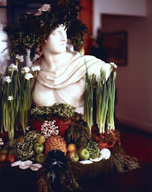
For this tableau above and at top, the theme was Saturnalia, the ancient Roman celebration of the Winter Solstice. Jonathan used greenery, a traditional symbol of hope that Spring will soon be near. The assemblage was set in a circular fashion, another ancient symbol meaning eternity.

Jonathan chose 19th century stone garden finials as adornments on top of the painted, mirrored cabinets. The chandelier was a dilapidated, antique woven basket with defunct sockets which he transformed into taper candle holders. The life-sized 19th century plaster bust of Apollo took center stage in Jonathan's tableau. For many years, Apollo resided at John Rosselli's shop, but now he is ensconced in Jonathan's Tudor City apartment. (Jonathan says he's the best kind of roommate- looks pretty, doesn't talk back and never touches the drinks tray! I'd like one of those please.)

Surrounding Apollo were terracotta pots of narcissus, variegated mini Cedar plants, Granny Smith apples, bleached oyster shells, and cotton seeds. And of course, the single pineapple representing hospitality had a prominent role.


With another Christmas came a different scheme. This time Jonathan took his cue from two turtle doves. In the entryway to Bunny Williams Inc., two Regency Carrera marble busts on claret colored scagliola columns were crowned and mantled with cedar, spruce and juniper garlands.


The centerpiece here was the 19th c. zinc bird cage from Treillage. Yes, those were real doves inside, but don't fret. The birds took a Christmas vacation from All Tame Animals and were fed daily by one of the company's animal experts. Doves are a symbol of purity and life and were also chosen to commemorate a dear friend who had overcome cancer.

The table was covered in a late 18th c. silk gold on silver cloth in a fleur de lys pattern. Flowers and plants included potted Amaryllis, Hydrangea, succulents, and cedar branches. Seeded Eucalyptus was incorporated into the scheme because of its silvery tones which were in keeping with the blue tones of the painted cabinet, mercury glass, and antique zinc cage.


And finally, there was the Boars Head tableau. The Boars Head is an English tradition which dates back to the 16th c. and is still celebrated at Queens College, Oxford today. There was a celebrated carol, The Boars Head, which described the ancient custom of sacrificing a boar and presenting its head as part of a Yuletide feast. According to Jonathan, this bringing in of the boars head was later incorporated into the traditional Madrigal feast.

Now, regarding the boars head which was used for this particular tableau- I'm sure that some of you are angry at the use of taxidermy in design. I think it's important to note that this head was used for many years as a prop for an Iowa school's Madrigals. No boar was killed for this decoration.

An English Regency table was covered in an 18th c. Kilim rug. An early 19th c. sterling gallery tray was set with compotes filled with chestnuts and mini Bartlett pears. Garlands of Cedar and Magnolia were arranged with white grapes, bay leaves, rosemary sprigs, kumquats, plums, and cherries.


So, not only did we get a design lesson today, but a history one as well. I wonder what Jonathan will come up with next year?


(All images courtesy of Jonathan Preece)

Tuesday, December 22, 2009

A Lesson in Tableau-ing


I think that creating successful and effortless looking vignettes and tableaux either comes naturally to you or it doesn't. The biggest issue that I have is that my tableaux come out looking too forced or too uptight- a result, I believe, of my need for symmetry and order. I realized that I needed help, so who better to turn to for advice than the master of the tableau, Deborah Buck. That's Deborah at top in her recently relocated shop Buck House, holding her recently published book titled, what else, "Tableau". But for most of you, I'm sure you already knew that.

Deborah approaches creating tableaux as an artistic and intellectual endeavor, one that requires some thinking on one's part. She recommends first finding a common thread that can be woven throughout your vignette, but it shouldn't be one that's too obvious. OK, so how do you do that? By listening to what the objects have to say. (Did I mention that Deborah likes to anthropomorphize objects? For example, a vase is a "she" because it's a vessel, while a heftier piece is a "he". Makes sense to me.) The idea is to create a conversation between the objects, and in order to foster a pleasant conversation between these pieces, you have to listen to them. If you just force disparate objects together, you might end up with an argument on your hands.

Going back to what I said earlier about my need for symmetry, I asked Deborah about how you achieve a balanced composition without the rigidity. The answer to that is through the use of odd numbers. Deborah advises against putting four of something together, for example. If you have a pair of something, that's fine because they serve as guardians. And the other key is to give the objects their own oxygen. You want enough space around them (and around your vignette) in order to keep your eye moving. If things get too crowded, your eye gets stuck. As Deborah said, "soak an area and then create an area of rest around that." Oh, and how do you know where to put something? Deborah said wherever your eye rests, put something there.

Deborah includes such interesting objects in her tableaux, so I was curious if there was anything that she didn't like to use. As it turns out, she loves to use almost anything as long as it speaks to her. It might be something priceless, or something from the five and dime. The one thing that doesn't speak to her, however, are skulls and skull motifs. That's something that she feels is too dark for her tableaux. And in regards to trendy accessories (the ubiquitous coral, for example), Deborah said that if you love it and it's very "you", then embrace it and use it in a way that hasn't been done before.

The most important thing that Deborah stressed is to keep your vignette personal. After all, these objects that you've culled must say something about you. Otherwise, would you have purchased them? Compiling your objects into a tableau is like creating a narrative, one which might reflect your history, your travels, or your interests. Figuring out the narrative means that you'll need to start thinking- really thinking- about your past, your present, and your future. The end result is not just a beautiful tableau, but perhaps a different and more sensitive way of thinking.

(For more information, or to purchase Deborah's book, visit the Buck House website.)


A few vignette shots from Buck House with Deborah's signature striped walls:


An image from "Tableau"

(All photos courtesy of Deborah Buck)

Monday, December 21, 2009

Finally in the Christmas Spirit


You haven't seen many posts about the holidays around here because quite honestly, it snuck up on me. It dawned on me last week that Christmas is this Friday. Have I been out to lunch or what? But someone who has been in the Christmas spirit for a few weeks is my friend Bob Garner, owner of Fabulous Things in Atlanta. Thanks to the creative eyes of Bob and David Duckworth, the shop looks amazing with wreaths, bows, garlands, and trees everywhere.


Nothing to do with Christmas, but I adore this custom Pagoda lantern. Too fabulous.

A few weeks ago, Bob hosted a very festive Christmas party in the shop for family, friends, and clients. I have to share with you some photos of the dining table laden with food. To me, this is such a wonderful example of gracious entertaining. Bob prepared most of the food himself- favorites like cheese straws, sausage balls, and pimento cheese- and served it from his grandmother's silver trays and bowls. If you don't have Grandmother or Mother's silver, it doesn't mean you can't have an elegant gathering. The point is that when you make an effort, when thought and care have got into the food and the setting, when things look lovely, and when you have plenty of booze, a good time is sure to follow.


A display of famous (or infamous) Claxton fruitcakes.

If you see something you like (perhaps that Pagoda lantern?), contact Bob at (404) 350-0916 or fabthing@bellsouth.net. The wreaths you see above are now being offered at reduced prices and can be stored for use next year- much like the Claxton fruitcakes, which will taste the same whether you eat it today or a year from now.

And A California Christmas


One place I've been meaning to visit in San Francisco is the Crown & Crumpet Tea Room, located in Ghirardelli Square. (I bet Grant Gibson has been there!) In time for the holidays, proprietors Amy and Christopher Dean have opened a pop up shop filled with all kinds of unique fancy goods from around the world: mini baking sets from Japan, Cath Kidston accessories, sweet treats and holiday decor. You'll need to hurry because it's only open for a few months. What better way to spend an afternoon than having tea and doing a little shopping?

(Crown & Crumpet's Holiday Shop is located in the lower plaza of Ghirardelli Square. For more information, click here.)


All images taken by Kristen Loken

Wednesday, December 16, 2009

Wigs and Braids


So I read something about wigs yesterday, and that got me thinking of Madeleine Castaing. (And for those of you who are sick to death of reading about Castaing and her wig with the chin strap, I know and agree. She was so much more than that wig, but what a wig it was.) One of my very favorite Castaing rooms is the Paris bedroom of composer Baron de Banfield, which I am assuming was decorated in the 1950s or early 1960s.

I think that what strikes me about this room is the architecture. The apartment itself was in a modern building, so Castaing had to employ architectural improvisations. The designer chose to imbue the apartment with an 1830s feel (think Regency, Charles X, and Biedermeier), which explains the use of arches and columns throughout the space. Because Castaing felt the bedroom was too long, she added an arched alcove at one end with closets on either side. (Don't you love those closet doors?) A bronze Directoire bed was placed within the niche, but according to the accompanying text, it rested only halfway in the alcove. Quite honestly, it looks to me like it's pressed up against the wall, but what do I know. Still, if it was positioned the way the text says it was, it would have given the perception of depth.

Another bold design gesture was the color choice: red. An unusual choice for a bedroom certainly, but the fact that the walls were covered in red fabric might mean that the effect was more cocoon-like. But to me, the most striking aspect of this room (other than those fabulous closet doors) is the "braiding" that was used on the walls. Castaing trimmed the walls with it, and cleverly created crown molding with it as well. In the top photo, notice how she took the fabric over the edge of the ceiling.


The same fabric was used in the small hall that led from the bedroom to the bathroom. Note the criss-crossed braiding on the ceiling.


If I'm not mistaken, the braiding was one of Castaing's signature fabrics. If it looks familiar, it might be because the same Castaing fabric (or one that looks awfully similar) also made an appearance in Lisa Fine's Paris flat, featured in the current issue of Lonny.


See the fabric on the little slipper chair? Looks similar to the Castaing fabric, don't you think?

Many of the fabrics that were hallmarks of Castaing's work are available through Clarence House, including my all time favorite "Coppelia". But, for a fabric with a similar feel, there's also Cassaro's "Bergama" in Wineberry.


(Castaing photos from The Finest Rooms in France; Fine photos from Lonny magazine, Miguel Flores Vianna photographer.)

Wednesday, December 09, 2009

Hail to the Chief of High Style


About a year ago, I first wrote about the late San Francisco design legend Anthony Hail. I received many emails from readers expressing their thoughts on Hail, a man who obviously had many fans. Most agreed that Hail was witty, worldly, and sophisticated. I suppose it's no surprise that a man like Hail would end up living in San Francisco, a city which, in my opinion, just might be this country's most refined.

When I look at photos of his home, the word that keeps coming to mind is elegance- honest to goodness elegance, something which is missing from much of design today. Hail's possessions were all of the finest quality, and one can tell that much thought was given to how best to display his pieces. One of my favorite Hail rooms is his bedroom. I found these photos in two of my favorite books,
San Francisco Interiors and San Francisco: A Certain Style, both by Diane Dorrans Saeks. (If you want to see why I think San Francisco is the capital of refinement, just read these books.)

While the room is a bit more masculine than I usually prefer in a bedroom, it's just so warm and so drop-dead chic that it makes me forget about feminine, frou frou bedrooms. I think it's a great example of how elegance and comfort are not mutually exclusive design principles. In the words of the great Hail, "Beauty and pleasures are givens, but rooms must be usable, not fragile or intimidating."


In "San Francisco Interiors", Hail said that the antiques in this room were either Russian, Danish, or French. He wanted pieces that were "architectural and understated. The last thing I'd want in my bedroom are antiques or colors that are flamboyant or over-the-top."


The fabric is a French striped silk. A pair of c. 1790s Danish commodes flank the bed. The black lamps were a gift from friend Billy Baldwin.

(Photo #1 and #3 from "San Francisco Interiors" by Diane Dorrans Saeks, Alan Weintraub photographer. Photo #2 and quote on beauty from "San Francisco- A Certain Style" by Diane Dorrans Saeks, John Vaughan photographer.)