Monday, August 31, 2009

The Before...

Late last summer as I moved into my condo, I had big plans for a major overhaul of the place. After all, much of it hadn't been touched since 1968. (Had the building been built in the 1920s or 30s, I wouldn't dare think of redoing anything. Alas, it wasn't, and late 1960s decor just doesn't do it for me.) I started with things like having the popcorn ceilings scraped (such a mess), staining the parquet floors ebony, and having the walls painted and papered. Oh, and having the pea green shag carpet in my bedroom AND bathroom promptly removed (yes, it even went around the toilet- Yuck!). What really bothered me, though, were the 1960s bathrooms. My guest bathroom had the worst toilet you've ever seen. It sat about a foot and a half off of the ground, and it had the original plastic toilet seat, which, by the way, had a cigarette burn mark in it. I care not to think about how that happened.

I was trying to decide how I wanted to renovate the bathroom when the economic hell broke loose, and then I lost the nerve to do anything. On top of that, I was tired of having workmen in my home. So, I left it alone for a while, nasty toilet and all. But a few months ago, I realized that it really wasn't necessary to rip everything out and start anew. I could tart the room up and try to disguise some of the questionable decorating choices that were made forty years ago. So let me give you a lay of the land...

This is the way the bathroom looked when I first visited the condo over a year ago. I guess I should clarify something- somebody did make a few upgrades to the bathroom at some point. So it was a blend of 1968 and 1998.


I know what you're looking at. It's the nasty toilet with the discolored toilet seat. The vanity with the chic woodgrain laminate doors is original. Note how the counter top extended all the way over to the shower door. The ceramic tile floor and shower walls are a later addition, as is the green tiled shower floor and the cheapo sliding glass door. See the handle bars all over the place? There was no way you could slip and fall because no matter where you were, there was always a handle to grab.


The walls were papered in a red vinyl wallpaper that was trying to be marbleized. I stripped the paper off of the walls myself, which just about caused me to lose my mind, not to mention my back and arms. You should have seen the pastel paper that was behind the top layer. The weirdest thing about the bathroom is that mirrored medicine cabinet that extends across the entire wall. The doors slide back and forth. Also, in typical 1968 fashion, there is a commercial fixture over the mirror. There had been a big, long plastic box that fit over the bulbs, but I sent that packing.


The vanity has Kohler fixtures which aren't the worst things I've ever seen, but they're far from great looking. Here, you can see the nice, new, and CLEAN Kohler toilet that I had installed. I had to have my contractor cut off that ledge that extended over the toilet; otherwise, no toilet would have fit because of the height issue.

My dilemma was that if I ripped out that light fixture, the mirror had to go to. And if the mirror went, so did the medicine cabinet. I wasn't upset about that prospect. But if I ripped out the vanity, then walls would have to be redone, and I would have to put in a new floor. At that point, I might as well have renovated everything, which defeated the purpose of my project. So, I left the vanity, the mirror, the shower, the floor, the medicine cabinet, and that awful light intact. Tomorrow, I'll show you the after pictures.

Wednesday, August 26, 2009

Dress Your Candlesticks


About a year ago, I purchased some kaarskoker candle sleeves for a pair of little brass candlestick lamps that I inherited from my parents. The lamps, which I absolutely love, are very traditional, so I wanted to freshen them up with something a little bold and a little colorful- hence the kaarskoker. I became an instant convert and told anyone who would listen about these fabulous sleeves.

The whole concept behind kaarskoker was pretty genius. Designer April Pride Allison was frustrated that she was only able to source white candle sleeves for her clients' lighting. Following the old adage that necessity is the mother of all invention, April started her kaarskoker line to fill a void in the marketplace. The sleeves come in an array of colors and patterns, many of which were inspired by Owen Jones' Grammar of Ornament. They are a great and affordable way to perk up sconces or chandeliers.

Well, kaarskoker was chugging along and garnering national press (as well as a lot of fans) when April decided to expand her line. She recently designed the kaarskoker candlestick. Available in silver or brass tones, the candlestick is a blend of Bauhaus design and English antique candlesticks (not surprising as April has her Masters in Decorative Arts), and it's made to work with the line of candle sleeves.


April sent me a pair of candlesticks as well as some new sleeves to play with. What's great is that you can customize your kaarskoker candlesticks with sleeves that coordinate with a tablesetting, a room, a paint color. The sleeves come in two different lengths, so you can keep the candlestick fully extended for the tall sleeves, while you can unscrew and remove a portion of the stick to accommodate the smaller sleeves. (My explanation may not be so great, so visit the website for further details.) You can create a whole wardrobe for your candlesticks. I haven't had that much fun mixing and matching colors and pattern since outfitting my Barbie dolls a hundred years ago!

The candlesticks and sleeves are available to purchase on the kaarskoker website as well as at various Nordstroms and boutiques. Wouldn't these candlesticks be great for Fall or holiday entertaining?


(April is offering Peak of Chic readers 20% off their online orders. Enter PEAKCHIC at checkout to apply the discount.)


Made in the Shade


I'm finally getting around to having curtains made for my condo. And as many of you may know, curtains can be knock your socks off expensive- not just the labor mind you, but the cost for all of that fabric. The whole thing can take your breath away, and not in a good way.

Seeing that I have floor to ceiling windows throughout my home, I've been trying to find some affordable options for a few of my rooms. I'm a bit bored with what some of the catalogues have to offer, so I was excited to find out about
The Shade Store. They offer blinds, shades, and what I've been looking for- panels. The panels are available in six different styles, including pinch pleat and goblet, as well as various options for borders. There are also seems to a range of fabrics available such as silk dupioni, cotton, linen, wool flannel (which I'm interested in), and cashmina. (Robert Allen fabric is also available.) The best part is that the panels ship in 10 days. And, there seems to be a lot of options for both contemporary and traditional interiors.

I haven't ordered from them before, but I'm seriously considering doing so. In the meantime, I'm spending a lot of time playing around with what my panels might look like.

How about a tailored pleat:


In Dahlia Gardens in Rosewood


See what it looks like at top. Other options include:


A grommet panel made of wool flannel in azure with sheers made of Sheers Positive


My contemporary side likes these wood grain roller shades made by Chilewich for The Shade Store.


Tulip Shades in silk dupioni in Vellore


Roman Shades in wool sateen in sand with a border.

Tuesday, August 25, 2009

Mirella Spinella Textiles


Don't you laugh when you see a real estate listing that describes a home as having "old world charm"? There must be something about those three words that is catnip to most of America, because it's unbelievable how many listings use that phrase. And usually, there isn't a shred of old world or charm to the house.


Just what is old world charm? I think people have different ideas about it, but for me, I know it when I see it. But, old world, even when done well, doesn't really do it for me. My style is far too American. However, I think I've found something that has changed my mind.

Mirella Spinella is a textile designer who has lived and worked in Venice for close to thirty years. Her fabrics, most of which are handprinted silk velvet, evoke the history and "old wordliness" of Spinella's city. In addition to yardage, many of her fabrics are used to make pillows, tablecloths, curtains, and other decorative items.

Spinella recently branched out into custom-dyed linen, which might be a little more me than the silk velvet. Regardless of the fabric though, her old world designs just might have charmed me.

(More information, visit Spinella's
website. Sue Fisher King in San Francisco does carry many of Spinella's pillows and hangings, including the new linen line.)


Suleyman II


Peacock


Palmette


Giotto


Elephant


Deco 4


Deco 2

Tuesday, August 18, 2009

John Stefanidis Fabrics


I tend to troll the internet for fabrics far too often, and inevitably during these virtual fabric forays I visit John Stefanidis' website. I love his fabrics and would love to use them sometime, somewhere.

John recently added some new additions to his line; the fabrics are breezy, a little casual, and have just the right amount of the exotic. (And really, don't the names of the prints make you want to take a voyage to some far away place?) I wish that one of the Atlanta showrooms carried his line, but at least the line is represented in the States. Harbinger, the much buzzed about Los Angeles showroom, carries it as well as Monica James in Florida.


Zanzibar


Udaiphur in an earth tone


Udaiphur in blue


Scritch Scratch


Kuba

Fabric at top: Fanfare

Monday, August 17, 2009

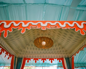
A New Tent Obsession


I love high rise living. I have a doorman; someone is always around to sign for packages; there's a fantastic view out of my windows; and being up high means I have fewer bugs. However, I just learned about something that has made me want to chuck living up high and buy a house with a yard. Why? Because I'm dying to own a tent from Boutique Tents.

Owner Anne Girault started Boutique Tents after being commissioned to design cabanas for a Tara Guerard event. With her background as an interior designer, Girault mines fashion, travel, and textiles for inspiration. Each tent is made to order, and while there are nine different valances from which to choose, Girault welcomes custom design requests. Can't you see one of these tents by a pool or out on your patio? Wouldn't you feel chic lounging or dining in your very own bespoke tent? I know I would.

(For more information, contact Anne Girault at (843) 345-5049 or info@boutiquetents.net)


This tent was designed for an Indian wedding in Charleston. The scalloped trim of the valance and the stenciled design of the ceiling within the tent were inspired by motifs in the wedding correspondence. (Event planner was Blue Moon Event; image courtesy of A. Bryan Photo.)


A tent with tassel trim that now lives sans tassels in a downtown Charleston garden.


The Madeline tent would look smashing as a poolside changing room or cabana. Anne calls this her homage to Palm Beach style.


Love this tent that was used at a wedding.


An entrance tent that led to a lounge tent that led to the dining tent and on to the dancing tent! (Photo by Liz Banfield; event by Tara Guerard)


A tent for a dog. Do you think I should get one for Alfie?

(Image at top: a sketch for a custom tent by Anne)

Friday, August 14, 2009

Jacques Grange Interiors

I've spent the past few nights in bed with Jacques Grange.


Photo by Jérôme Macé, from Jacques Grange Interiors by Pierre Passebon (Paris: Flammarion, 2009).


Can you blame me? He's awfully handsome...and so are his interiors.


Photo by François Halard, from Jacques Grange Interiors by Pierre Passebon (Paris: Flammarion, 2009).

Like this 1920s Park Avenue apartment, above.


Photo by François Halard, from Jacques Grange Interiors by Pierre Passebon (Paris: Flammarion, 2009).


Or this Paris apartment that I fell in love with when I first saw it published a few years ago.


Photo by François Halard, from Jacques Grange Interiors by Pierre Passebon (Paris: Flammarion, 2009).


I wish I could show you more, like this home, above, in Paris...


Photo by Marianne Haas, from Jacques Grange Interiors by Pierre Passebon (Paris: Flammarion, 2009).


...but unfortunately, I can't. But take my word for it, Jacques Grange: Interiors by Pierre Passebon (Paris: Flammarion, 2009) is truly fantastic. If you weren't already a Grange fan, I think you'll become a convert.