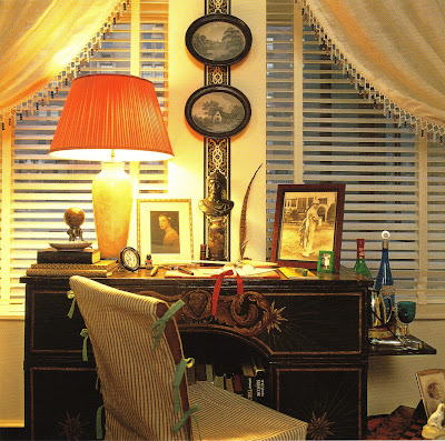


Work! (I know- can you believe it?) Yes, sometimes work can be a joy, while at other times it can be pure drudgery. This is exactly why you should create a work environment that is comfortable, functional, and aesthetically satisfying. After all, don't you want to be inspired to write the next Pulitzer Prize winning book or become the next Billy Baldwin? And how are you supposed to do this while sitting at a faux-woodgrain laminate desk in a drably colored room? Depressing!
The great thing about decorating offices is that you can do it on a restricted budget. OK, so you're stuck with that horror of a laminate desk. No problem- drape it with an inexpensive yet chic fabric such as a solid-colored linen and trim it with decorative tape. How about using a bamboo ballroom chair as your desk chair? Sometimes you can buy used ones from party supply companies. Add a little cushion to the seat and voila- you've just added a little glam to your office. Bookcases, especially for you designers, are critical for organization. I know most of us would give our right arm for some Billy Baldwin/Cole Porter brass bookcases. Until your ship comes in, IKEA makes some decent ones that can be painted or covered in wallpaper. And make sure to paint (or paper if you choose) your walls in a color that makes you happy.
So, with a little creativity and ingenuity, you too can create an office that will have you beaming with pride, much like Ms. Draper below!
Images above: 1) Office in the home of Temple St.Clair Carr, as seen in Elle Decor So Chic, photographer Eric Piasecki
2) Sitting room of the late designer Roger Banks-Pye
3) A Nina Campbell designed study
4) A desk vignette of a room designed by Keith Irvine
Thursday, January 31, 2008
These Photos Make Me Want To.....
Wednesday, January 30, 2008
Of the Young and the Restless- Part 2

I just received my fabric samples from Of the Young and the Restless the other day, and I must say that I was quite pleased. The linen and linen/cotton blend fabrics have been rendered in such vibrant hues: chartreuse, mauve, peach, and blue. And the prints are charming too. I think my favorite combination is "Birdhouse" and "Saffron"- they're gorgeous when placed together. But then again, the "Houndstooth" is nice as well. If you're one who changes out duvet covers, slip covers, and pillows each season, then you really might want to consider this line with Spring and Summer approaching.
I dealt with one of the company's owners when I ordered my samples, and she was a joy to work with. Bottom line- if you're a fan of prints from lines like Lulu DK and Quadrille, then I think you'll really like Y&R fabric.
From top to bottom: "Birdhouse" in Colonial; "Saffron"; and "Thorny Rose" in Honeymoon
Clockwise from top left: "Jellyfish"; "Houndstooth" in Mauve; "Woodgrain" in Old Money"; and "Woodgrain" in New Money
Tuesday, January 29, 2008
Metamorphosis of a Room


A designer's home is his laboratory, so it's not unusual for it to be a constantly changing and evolving thing. I think this is quite evident in the former apartment of the late, great Van Day Truex. In a previous post, I showed you a photo of his apartment that was taken in 1944 (click here to see that post). I'm including it again as the very top image. The apartment is rather soft and subtle with touches of light blue and black against white walls.
Jump ahead to 1946 (image 2) where the apartment is dominated by vibrant green curtains and upholstery and black walls. The gilt framed mirror and chairs adds some shimmery opulence to the room. To me, the apartment has a very European flair. But, Truex must have been restless, because in 1949, the scheme changes yet again. This time, it's all about red. Red walls, red curtains, and red upholstery. The panes of mirror above the fireplace have been removed, and the framed mirror, the side chairs, and the mats around the artwork provide counterpoints of white (also, check out the fluffy white rug in the center of the room). Again, the room is rather formal, much like the green version, but things seemed to be slightly more restrained than its predecessor.
My favorite version, though, is the pared down 1951 scheme (seen below). I think we now see the modern vision that I associate with Truex. Gone are the ornate curtains and upholstery. The background of the room is rich umber, and the furniture is upholstered in browns and yellow (specifically Siamese yellow). Truex has added modern pieces such as Eames chairs (not visible in the images below), and the windows now have bamboo blinds. And there is no rug- we finally see the polished wood floor. The room now has more of a refined, contemporary American aesthetic, and this, to me, was the genius of Truex.

Monday, January 28, 2008
Time to Get Out the Magnifying Glass

Please help me put my mind to ease. Am I the only one who gets out the magnifying glass when I see a particularly inviting bookcase featured in a magazine or book? (Something tells me the answer is no!). I think I do this partly out of curiosity- is the homeowner interested in design? Architecture? Modern American fiction? The other reason is because I'm always looking for new books to add to my library.
The library that still has my keen interest is that of Christopher Spitzmiller, above. What a fabulous library! And how disappointed I am that many of the book titles are too small to read! It's been murder on the eyes trying to catalogue Spitzmiller's library. From what I've been able to make out, Spitzmiller and I have numerous books in common, but his library still beats mine by a long shot.
Here are a few others that gave my magnifying glass (and my eyes) a workout:
First, this Chinoiserie bookcase in the home of designer Alex Papachristidis is divine, but the books within it are pretty stellar too. A few noted titles: Beaton in Vogue, Sister: The Life of Legendary Interior Decorator Mrs. Henry Parish II
, and Waddesdon Manor
(photo by Roger Davies; Elle Decor 11/07)

The one that got away... This shot of Michael Devine's library looks promising. Alas, the books are blurry. But I know that Michael has an interesting library. A few I was able to make out: In The Pink and Cecil Beaton
(Photo from Domino, Dec 07. Photographer Marcus Nilsson)

My neatnik gene prevents me from piling copious amounts of books on the floor as Keith Irvine did here in his Manhattan apartment. Nonetheless, he has some erudite reads: London Perceived and Pleasure and Privilege

The library of the late Timothy Mawson. This bookshelf has numerous books on Beaton as well as Poiret and David Hockney
. You can tell that this was a library of a serious collector- the books are the centerpiece here.

And speak of the devil, after I wrote this post my copy of Elle Decor came in the mail. Time to pull out the magnifying glass again! I don't know if this is Ms. Russell's personal library or that of Elle Decor. Nonetheless, it's a good one. I spy Horst Interiors, At Home with Books
, and David Hicks Living with Design
. (Elle Decor Mar 08)
Image at top: Christopher Spitzmiller's apartment, Elle Decor Dec 06; photographer William Waldron)
Thursday, January 24, 2008
Big 'n Brown

Is anybody else ready to see more brown wood again? After a few years of solid-colored, painted furniture staking its claim on design, I know that I for one am eager for the "return" of rich, dark wood.
Now to be fair, brown wood has never been out of style. It just seems that brightly hued furniture has gotten a lot of our attention lately (this is not a criticism, because I'm a fan too). You can, however, strike a balance between painted finishes and brown wood. You don't want too many brown wood pieces in one room- it will look dark, hard, and heavy (this is where the painted furniture comes in handy). Also, you've got to exercise caution with those big, looming dark wood pieces- what Nancy Lancaster called "Big 'n Brown". And yes, I understand why Dorothy Draper chose to slap a coat of paint on furniture when there was too much brown in one room.
But please, don't banish the brown wood! If my plea hasn't convinced you, then you may want to consider these wood pieces (accessories included) that are mixed with brass, nickel and chrome- now this is truly an easy way to live with wood!
Wooden Pavilion Lantern in Oak and Nickel, from Charles Edwards
Rosewood liquor cabinet with brass inlay, by Paolo Buffa, c. 1938, available at Fred Silberman
1950s French desk, brass and wood, from Visiona
Karl Springer Mahogany and Chrome Dining Table from Assemblage.
Shrimp earrings in wood and gold by Seaman Schepps
Rosewood and brass etagere,from George N Antiques
Image at top: Brass and Mahogany Travelling Writing Box, c. 1830, from Mallett
Wednesday, January 23, 2008
Penchant for Prints- Vol. 1

"Bokhara" fabric in red and cream, by John Stefanidis

"Kipling" by Nobilis

"Lambeth Saracen" wallpaper by Hamilton Weston

"Windfall" fabric by Borderline

"Lindenzweig" wallpaper in Toffee, by Studio Printworks
Tuesday, January 22, 2008
Screen Montage

Screens are one of my favorite pieces of furniture for two simple reasons. First, they provide a dose of elegance and architectural interest to a room. Yes, there are some frightening screens out there, but for the most part, don't you usually see very chic screens? There are screens that are covered in charming fabric or wallpaper, and screens sheathed in glamorous mirror. And the ultimate, to me at least, is a Coromandel screen. Coco Chanel obviously agreed because her lacquered screen was the centerpiece in her iconic Paris apartment.
But aesthetic appeal aside, screens are also quite functional. Mirrored ones reflect light and shimmer in otherwise dark rooms. Some screens can hide that dead space in the corner of a room. Or, they can be used to mask the mundane, such as service doors between dining rooms and kitchens (this is why I call these type of screens "Service Screens", although I know that's not the proper term at all).
Decorative Screens
Designer Marcia Sherrill affixed this Coromandel screen to the wall above her living room daybed. (Photograph by James Weber NY)
Eliza Bolen cleverly used this gorgeous antique screen behind her caned bed- it certainly adds drama to the bedroom.
Mirrored Screens
Albert Hadley added this chevron-etched mirror screen to this Summery showhouse room.
I've always liked this simple mirrored fire screen designed by Kelly Wearstler, and it's certainly one of the easiest screens to make.
Functional Screens
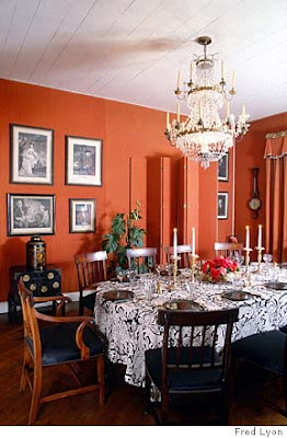
This red dining room designed by Frances Elkins is a favorite of mine. Notice the screen used to hide a door (at least I believe it is hiding a door, but if not then let's just pretend it is). Elkins painted the screen in the same shade of red as the room's walls so that the screen would blend in with its surroundings. Since it's hiding something, why draw attention to it? (Photographer Fred Lyon)
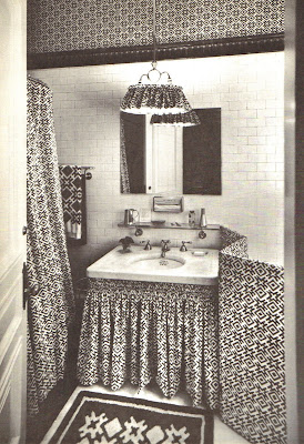
This funny little half screen, in a bathroom designed by David Hicks, was used to hide the toilet. A little unusual I admit.
Half Screens
A half screen, hiding the piano legs, in the legendary living room of Syrie Maugham. You don't see too many of these little screens anymore, although I believe they were used quite frequently in interiors from the first part of the 20th c. Many examples I have seen were used to hide piano legs.
Image at top: A marvelous Vertes screen in the home of writer Amy Fine Collins
