Wednesday, October 31, 2007

An Exciting Style Compass


Yes, I know you're thinking "Here she goes with her weekly 1st dibs post". However, I am thrilled to see that my good friend Clinton Smith, Senior Editor at Southern Accents, is featured in this week's Style Compass. And to think that he didn't even tell me he was going to be featured!

A native Texan, Clinton is a true blue Southerner with a discerning eye and great taste. He is also one of the nicest people you will ever meet. So run on over to 1st dibs and check out his recommendations!

(Image courtesy of 1st dibs; photographer Mali Azima)

Vogue Living: Houses, Gardens, People


OK- the book we've been waiting for (and the one we're all blogging about) has finally arrived, and it certainly does not disappoint. Vogue Living: Houses, Gardens, People is a compilation of homes and gardens that have appeared in Vogue over the past ten years or so. And if it sounds as though it's a rehash of old articles, well, it's not exactly. There are many photos included that did not appear in the original articles.

I think that where this book excels is in its lavish chapters on European and British estates. While American design is more of my style, I can't help but be fascinated by the timeless and slightly ethereal look that many of these homes possess. Some of them even manage to make messiness look chic!

And lest you think that the entire focus of the book is European, the Americans are well represented. The homes of Marina Rust, Samantha Rosen, and Tory Burch are all featured too.


The Provence home of Janet de Botton


18th c. faience displayed in the breakfast room of de Botton's home.


The salon in photographer Francois Halard's home in Arles. The walls are covered in early 19th c. painted canvas.


The lavish Paris bedroom of Carolyne Roehm.


One of the many (and ever changing) homes of Karl Lagerfeld. This home, Le Mée, was photographed in 1990.


Classic American style is represented by Marina Rust and her family home in Maine.


Don't forget the gardens! This pavilion at the Marrakech home of Marella Agnelli was inspired by one at the home of Yves Saint Laurent.

Tuesday, October 30, 2007

Feminine French Eclecticism


I have to admit that I do not usually read Maison Francaise, but after coming across this home in the September issue, I think I'm hooked.

To me, this home represents much of what is going on in design today. It's colorful, sophisticated, has that French flair, looks a bit faded, has bits of the exotic, and most importantly does not look decorated. The female homeowner obviously has an affinity for pink, but she has managed to avoid making it saccharine. Instead, it comes across as a soft, feminine look. I also admire the skillful mix of prints- nothing seems to clash.

And this home has completely made me rethink toile. Look at the charming print the homeowner used both in the dining room (in an ochre color)and in the bedroom (in a raspberry colorway). How charming is that?


A view of the dining room with the ochre toile de Jouy. Using my rusty French skills, I believe the toile (as well as the one in the bedroom) came from Marché St-Pierre, a large fabric shop in Paris.


The bedroom with the gorgeous rapsberry toile de Jouy. I do like how the homeowner only papered the wall from the chair rail up, in some ways toning down the print. I also like her clever use of a fabric covered screen for her headboard.


The serene library. The club chairs are upholstered in a Canovas print. Notice the little touches of leopard on both the throw pillow and on the sconce lampshades.


The living room, which is divided up into a seating area and a formal dining area. The brightly colored fabric and accessories are kept in check by the soft green walls.


The entryway. Notice the cement tile floor. The striped fabric covered walls lend a more masculine tone to this room.


Image to the left: A corner shot of the living room. To the right: Clear shots of color surround the fireplace.

All images from the September issue of Maison Francaise

Monday, October 29, 2007

Some Advice from Charlotte


Attention all of you Charlotte Moss fans- check out the Nov/Dec issue of Southern Accents. The magazine has a great interview with the design legend in which she dishes on designers who have inspired her (Tony Duquette and Renzo Mongiardino), favorite furniture styles, and holiday decoration. Moss also gives the reader great advice on how to live stylishly and graciously (something which in my opinion Moss has more than mastered).

I thought I would share a few of Moss' favorite fabrics, some of which are also favorites of mine. But the part I really love? Check out Moss' skirt in the photo above- it's a custom fabric that incorporates Moss' iconic pagoda motif!


"La Riviere Enchantee" by Pierre Frey


"Jardinieres and Citrus Trees" by de Gournay- a beautiful handpainted silk fabric


"Digby's Tent"- designed by Charlotte Moss for Brunschwig & Fils

Image at top: Charlotte Moss in her Manhattan shop. Photo courtesy of Southern Accents. Photographer: Brooke Slezak

Thursday, October 25, 2007

Empel Collections


I've always felt that lighting is one of the more important design components in a room. For me, it's as important as the furniture, fabric, and window treatments.

So it was with great excitement that I found the Empel Collections, a lighting line manufactured in the Netherlands. The line, designed by former interior designer Ron van Empel, is comprised of floor and table lamps, sconces, and chandeliers as well as chic shades and finials. Have a penchant for 1940s glamour? Perhaps you might like the lamps from the New Elegance Collection. Francophile? Check out the bouillotte lamps in the French Classics line. Have a sense of fun? What about the fuschia tole shade?

What I am so impressed with is the breadth of the collection. Whether the style is traditional or contemporary, the unifying factor of the different lines is that the lamps are chic, stylish, and timeless.

(Although located in the Netherlands, Ron has sold lamps for years to American customers. If you're interested in any of the lamps on the site, or if you are interested in a custom lamp, don't hesitate to contact Ron via his website. He is very friendly and accommodating.)


Murano pearls table lamp, The New Elegance Collection


Yellowstone III table lamp, The New Elegance Collection


Table lamps from the New Elegance Collection


Angelique small bouillotte table lamp, from the French Classics collection


"Francine" bouillotte lamp, French Classics collection


Acanthus flush mount fixture


"Clarckstown" hanging light


"Ancient Dolphin" sconce


A lamp made of marble dog figurines. This lamp is part of the LTD Collection which incorporates antique and vintage items.


Image at top: Set of vintage terracotta horses in malachite green, drip-glazed.

Wednesday, October 24, 2007

Exciting News at Coleen and Company


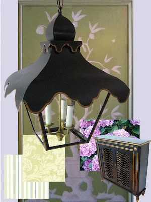
Coleen of Coleen and Company has just announced the debut of her new Tole Tent lighting collection. The tole-tally chic lanterns and sconces come in Moroccan Red, Grey Mist, Lamppost Black, or nickel plate. There are other custom options available, so visit her site for details.

How great would these look in an entryway, a library, a solarium... everywhere!


Pattern Play


For quite some time now, many of us have had a love affair with graphic prints. Perhaps we can blame it on the David Hicks revival, but the clear, strong prints were, at the time, a breath of fresh air. Today, I think we are starting to see some interesting trends develop in the way of prints and pattern.

Exoticism is once again creating a stir as evidenced by the popularity of ikats and suzanis over the last few years. Both are great, and I hope that this might lead to people rediscovering paisley and other prints with deep historical roots. Lately, I've been thinking a lot about The Gallery at The Carlyle, above, which was designed by Renzo Mongiardino. This "Turkish tea room" is exotic, albeit in a Manhattan kind of way!

Boldly mixing pattern (or perhaps mixing bold patterns!) is another trend that can be difficult to execute. The safe bet would be to add one bold piece to the mix like a wild pillow or a patchwork chair. However, look at the way designer Alidad deftly mixed various prints from his collection for Pierre Frey. No one print stands out so the overall look is a cohesive one, but achieving this does take a certain amount of skill!


"Christina" fabric by Clarence House


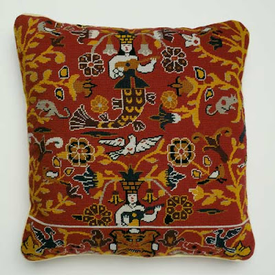
"Red Mermaid" Needlework pillow, inspired by an antique Cretan fabric


"Taika" salad plates by iittala, available at Vivre. The pattern was inspired by Nordic folklore.


A patchwork chaise from J. Roaman, East Hampton. The shop has garnered a lot of press for its colorful and inventive furniture.


Early 20th c. quilt from Suzanna Hamilton Antiques & Art


An elegant window display with a mix of prints and patterns designed by Alidad for Pierre Frey

Tuesday, October 23, 2007

Ultimate Bedrooms


The current issue of House Beautiful is the "Ultimate Bath and Bedroom" issue, which inspired me to think about some of my favorite bedrooms. My list could probably be called a Top Thirty, but for the sake of brevity here are a few that I've been revisiting lately. I'm sure you're familiar with many of them as I've written about them before-when a room is a favorite, how can you not talk about it frequently? I do hope, though, that there are a few that are new to you!


I absolutely love the bedroom of designer Alexa Hampton. You just can't beat the combination of icy blue and white. The room is feminine but restrained.


I've always adored this bedroom designed by Albert Hadley for a 1959 Vogue feature "Summer on a Shoestring". While it's not necessarily the way I would design my bedroom, I think it is such a sweet, light, and airy bedroom.


The bedroom of Ruthie Sommers. I think the reason I like this room is because it's refreshing to see a dark bedroom, and the canopy really creates a cocoon within the room. So cozy! (Image from Cottage Living, Dec. 06)


Yes, I've gone on and on about Mary McDonald's bedroom but I love the crisp, tailored femininity of this room.


The bedroom of the late fashion publicist Eleanor Lambert. Blue and white ticking, purchased from Geoffrey Beene, cover the walls. Lambert was of the school that if you design it right the first time, there's no need to redecorate. This bedroom was designed in 1959. (Image from the New York Times, April 2000)


An exuberant use of fabric in this bedroom designed by Mario Buatta (Architectural Digest)

Image at top: A bedroom designed by David Netto. How clever to use a scenic wallpaper in a bedroom, and the chrome bed looks smashing against this traditional paper.

Monday, October 22, 2007

Maximum Impact


Round Chinese Cabinet at Schonbrunn Palace, Vienna

Nothing creates more impact than displaying a collection, particularly one of porcelain, en masse. In the 18th c., some of the European palaces had porcelain cabinets and chambers- rooms in which the palace's collection of porcelain was displayed. Many of these porcelain rooms were decorated with ornate gilt brackets on which the pieces of porcelain were placed.

Of course, the grandeur of these rooms is not necessarily something to which the modern homeowner aspires. However, the grouping of brackets and objets certainly creates just as much visual impact today as it did centuries ago. Just look at the way this idea was applied in rooms designed by Jansen and Syrie Maugham.

The moral of the story? Sometimes in design it's better to be bold, especially with collections. You can always show restraint in other areas!


Porcelain Chamber from Dubsky Palace,Brno, now located in the MAK Museum, Vienna.


Part of a Porcelain Cabinet from a German palace, c. 1738, now located at Schloss St. Emmeram in Bavaria


Moody drama in a room designed by legend Syrie Maugham


Jayne Wrightsman in her Palm Beach library, designed by Maison Jansen (1959)