
Kemble Interiors

Katie Ridder

Miles Redd

Christopher Maya


One designer whose work I've long admired is Elsa Peretti. Her jewelry and accessories were de rigeur in the 1970s and are still in demand today.
Inspired by nature, Peretti creates objects that are organic in shape and luxurious in material. Working predominately with sterling silver, terracotta, and glass, Peretti elevates such humble things as apples, bones, and even thumb prints into something completely chic and glamorous. Some of her iconic designs include the sterling bone cuff, the bone candlestick, the thumb print bowl, and the glass heart paperweight. While Peretti has designed mainly for Tiffany, she also is also known for her design of the Halston perfume bottle (she and Halston were very close friends).
The great thing about Peretti pieces is that they work in both modern and traditional settings. And while the designs may have been rather cutting edge when they were introduced over 30 years ago, their popularity proves that Peretti's work is truly timeless.
Silver thumbprint bowl, at Tiffany & Co.
Pair of Terracotta candlesticks available at Lost City Arts
Cobalt heart paperweight at Tiffany & Co.
The iconic sterling bone cuff, at Tiffany & Co.
A few Peretti objets in the home of Robert Rufino- mixed in with the Van Day Truex Bamboo flatware (House & Garden 11/04)
Halston perfume- the bottle was designed by Peretti
Image at top: A 1975 Helmut Newton photograph of Peretti

For many centuries, the exoticism of such far-away places as Asia, the Far East, and Russia captivated Westerners. This fascination is quite evident in much of the decorative arts that were produced in the 18th and 19th centuries. Although we now have a more accurate picture of these once distant lands, the traditional pictorials are still charming. So, in that vein I thought I would post some fabrics which capture the spirit of the exotic.
"Diaghilev", linen & cotton, by Clarence House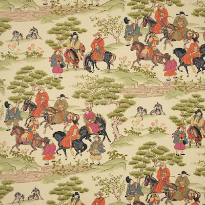
"Manchuria" by Vervain
"Jahangir" cotton by Lee Jofa
"Kipling" linen/cotton in Ebony by Lee Jofa
"Beauport Promenade", glazed chintz, by Brunschwig & Fils

The motif of the three ostrich feathers- actually part of the heraldic badge of the Prince of Wales- has been incorporated into the decorative arts through the ages. Many Hepplewhite chairs, for example, have the three feathers carved into their backs. Wallis Simpson, a.k.a Duchess of Windsor, had a diamond encrusted pin (above) with this emblem (it was later purchased by La Liz at auction).
While the ostrich feather motif may not be as recognizable as that other monarchical symbol of the fleur-de-lis, it is no less distinctive. In fact, it can be downright glamorous. Just look at those Jansen consoles below.
One of a set of 6 Mahogany Hepplewhite chairs, 19th c., from Thomas Jolly Antiques
Maison Jansen console tables, c. 1940s, available at Alan Moss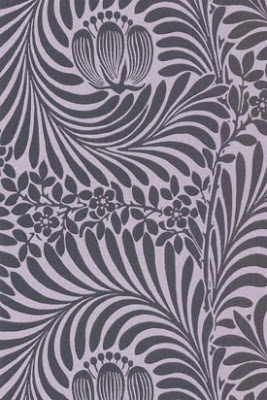
"Cheyney Walk" paper by Cole & Sons. Not technically the three feather motif but the lines are quite similar.
Pair of silver leaf brackets, c. 1850, from O'Sullivan Antiques
Grosfeld House crystal wall brackets, c. 1945, at Florian Papp. They may just have one feather each, but they're beautiful nonetheless.
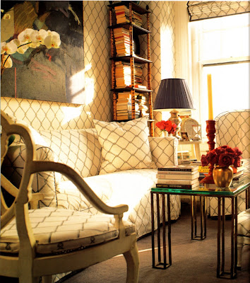
Some designers feel that one of the best ways to create a cohesive look in a small space is to repeat the same print throughout. I recently found these photographs of the late designer Greg Jordan's apartment, and I think he certainly adhered to this tenet.
Jordan's apartment had a living room that was 13' X 16' and a bedroom which was 10' X 15'- rather small. Jordan's solution to making the space seem larger was to use the same fabric on everything- walls, windows, upholstery, bed. By employing this scheme, the boundaries of the room seem to disappear. The fabric he chose was of his own design: a chain-link fence print. Obviously done tongue-in-cheek, Jordan wanted to create an "urban version of those eighteenth-century English trellis patterns."
To me, the effect is not necessarily overwhelming. I think that the other objects in the room- books, antique furniture, and other bibelots- soften the severity of the chain-link pattern. They also seem to take center stage against this unified background. I actually find the whole look rather charming.
That said, I don't think this look is for everyone. You would have to make sure that the print you choose is one that you love (and one that you will love for a long time!). Also, might one feel claustrophobic being surrounded by one print everywhere? In a quest to "eliminate" borders might you feel a bit caged in?
Jordan's living room
Another view of the living room
The bedroom with more of the chain-link print
(All images and quotations taken from "House Beautiful- Decorating for Small Spaces")

My post yesterday made me think about classic color combinations, and in my mind there's nothing more classic than black and white. Think black and white marbled floors, black and white striped awnings, and even black and white silhouettes. This graphic color combination is always crisp, tailored, and elegant. You may not want to design an entire room entirely in black and white, but perhaps these black and white items might inspire you to add a little graphic punch to your home.
"Tess" chair by Chair Couture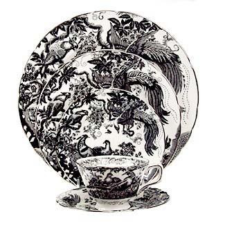
"Black Aves Platinum" by Royal Crown Derby
Black and white striped ottoman, one of a set of 3, at Dragonette Limited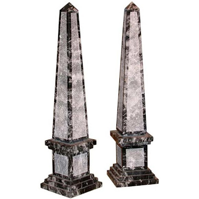
Black and white obelisks at Biggs Powell
Chevron patterned black and white tray by Oscar de la Renta for Lunt
"Black and White Story" stationery from Kate Spade
Image at top: Hampshire House, New York, designed by Dorothy Draper. One of Draper's favorite color combinations was "dull white and shiny black". One of her trademark looks was black and white checkered floors- beautiful and stylish then, still so today!


Albert Hadley has, in my opinion, the best "eye" in the business. I'm sure that from time to time Hadley makes mistakes, but if so I certainly can't tell. He has such a knack for finding those perfect pieces, whether it is a piece of furniture or an accessory. And the items that he does choose are timeless; in fact, many finds have been used by Hadley for years and in various settings. One of the most striking possessions of Hadley is a gold nut/pod (or is it a fruit? a vegetable?) tureen. It has been photographed in Hadley's Southport, Connecticut home and in the 2001 Kips Bay showhouse (see above), just to name a few. I don't know anything about this tureen but I just love it! Here are some other Hadley pieces that I covet:
The fabulous "what is it?" tureen in Hadley's country home.
Is this bookcase not amazing- it's a German piece that commemorates the 1928 Olympics. Also note the drawing by Van Day Truex, one of Hadley's great friends.
Notice this little modern red zig-zag table in the reception room of Parish-Hadley...
Well, here it is again, this time in Hadley's bedroom.


