Friday, March 30, 2007

Maison Jansen Furniture at Malmaison


Malmaison, the appointment-only antiques shop owned by renowned dealer Roger Prigent, is considered to be one of the finest purveyors of early 20th c. French furniture. Much of Malmaison's wares are available on 1st dibs, and this week's new arrivals feature a bevy of Malmaison's Maison Jansen furniture. Some of the pieces are rather simple (as one recent magazine article stated, Jansen also made furniture for maids rooms), but others are quite spectacular. Here are just a few of Malmaison's offerings.


Pair of Louis XVI style chairs, stamped Jansen


Pair of Crystal and Bronze chandeliers by Jansen, 1940s-50s


Pair of Jansen consoles, circa 1940s


Black Lacquer Louis XVI style writing table by Jansen


Mirrored Three-Panel Screen by Jansen, circa 1940s

Image at top: Mirrored Jansen Dressing Table, circa 1940s

Thursday, March 29, 2007

Tony Duquette and Dawnridge


I just received my April issue of Harper's Bazaar yesterday, and all I can say is "Wow"! The cover is, in my opinion, one of the best fashion magazine covers that I have seen in a long time. I was so taken with the exotic setting in which Reese Witherspoon was photographed, and I realized upon closer inspection that the location was Tony Duquette's home "Dawnridge", located in Los Angeles.

Duquette, who died in 1999, was a true design Renaissance man. He was, during the course of his life, a set designer, interior decorator, artist, jewelry designer, and costume designer. Duquette got his start in Los Angeles during the 1930s, where he was fortunate enough to meet Elsie de Wolfe. de Wolfe would act as a mentor to Duquette, and she introduced him to all of the right people. Eventually, Duquette's client list grew to include J. Paul Getty and Elizabeth Arden.

In the late 1940s, Duquette and his wife built their home "Dawnridge". Duquette's love of the exotic and the eccentric is certainly evidenced by the interior decoration of the home. To me, the house is rather like an Orientalist fantasy mixed with a liberal sprinkling of the baroque. The house is now owned by Hutton Wilkinson, Duquette's business partner of many years. The drawing room, featured on the cover of Bazaar, was redecorated by Wilkinson in 2000 and is in the spirit of Duquette. The pictures below, however, were taken in the 1980s and show the house as Duquette had decorated it. If you would like to learn more about Duquette, you should visit his website (Wilkinson still runs the Duquette business) and view the wonderful photos of his work.


(Photos at top courtesy of Harper's Bazaar; photos at bottom courtesy of Tony Duquette)

Wednesday, March 28, 2007

Everything's Coming Up Roses!


Spring is here, the trees are in bloom, and flowers seem to be on my mind. Floral prints are everywhere at this time of year. To some, the floral motif can be a bit saccharine. The good news is that there seems to be a floral print for all tastes- traditional, contemporary, graphic, sophisticated, or casual. Here are a few objects, fabrics, and wallcoverings that just might make you rethink the flower.


Porthault Linens at Sue Fisher King, San Francisco


Floral Swirl Lamp at Gracious Home


"Ravello" wallpaper from Tyler Hall


"Astrid" Chair at Anthropologie


"Japanese Floral" print fabric by Florence Broadhurst at Signature Prints


"Oriental Flowers" china by Meissen at Table Art, Los Angeles


(Image at top-room with floral prints by Mary McDonald)

Tuesday, March 27, 2007

Chic Closets


In the April issue of Domino, there is an article about the chic closet of Vivre founder Eva Jeanbart-Lorenzotti (see above), and I believe that it is every fashionista's dream. Although small, the closet was very cleverly thought out. There are plenty of shelves and drawers for handbags and sweaters, and there is even a closet within the closet in which she stores her evening wear. What I like about this room, though, is that not only is it functional, it is aesthetically pleasing too. Jeanbart-Lorenzotti chose a bluish/gray finish for the wood cabinets, and she used x-front mirrored doors for a glamorous touch. I have to admit, though, that I'm just not envious of her closet, but also of her extensive wardrobe!


I think that closets can be great place to do something daring. They may be small spaces, but it doesn't mean one can't do something fabulous. Kelly Wearstler papered a closet in her home with a bold, graphic wallpaper. And in Tory Burch's closet/dressing room, an island with drawers has a painted top with an orange and white zig-zag print that is similar to the prints she uses in her clothing line.


There are so many great closets that have been featured in various magazines. What are your favorites?


Closet by Kelly Wearstler


Tory Burch's Dressing Room/Closet

Monday, March 26, 2007

Rose Cumming Zebrine Wallpaper


(Photo above of Ashley Whittaker's apartment, courtesy of Domino, Apr 07)

One of my all-time favorite wallpaper prints has resurfaced! "Zebrine", a blue and white zebra print by Rose Cumming, is featured in the April Domino in the home of designer Ashley Whittaker. I first spied this print in the Jan '05 issue of House Beautiful in an article on decorator Robin Bell's apartment. According to Bell, this fabulous print was first used at El Morocco, the legendary New York nightclub.

Glamorous pedigree aside, this print is certainly a stylish but bold statement. I love animal prints, but one has to use them with restraint. All other design elements of a room- furniture, artwork, and accessories- have to be toned down when paired with such a gutsy pattern. I think that both Whittaker and Bell accomplished that in both of their homes.


(Photo of Robin Bell's apartment, courtesy of House Beautiful, Jan '05)

Friday, March 23, 2007

The Bowles Collection of 18th C. Porcelain


On my recent trip to San Francisco I was fortunate to be able to view The Bowles Collection of 18th c. English and French Porcelain at the Legion of Honor. The collection contains magnificent pieces of British and French porcelain from such manufacturers as Chelsea, Bow, and Sevres. The workmanship and skill that went into creating these pieces was truly remarkable; in many ways, it's like a lost art.

In addition to the Bowles Collection, the museum owns porcelain from other manufacturers and periods, including pieces of Chinese Export porcelain and works created at the Meissen and Nymphenburg factories. If you are a porcelain connoisseur, this exhibit is truly a must-see; if you can't make it to San Francisco, you can conveniently view the collection online.


Partridge Tureen, manufacturer Chelsea Factory, England, circa 1754-1755

Lettuce Tureen, Cover, and Stand, manufacturer Longton Hall Factory, England, circa 1756

Apple Box and Cover, manufacturer Bow Factory, England, circa 1756

Bourdaloue (Chamber Pot), manufacturer Chantilly Factory, France, circa 1735-1745


Covered Dish and Fixed Tray in Form of Mouse, Jingdzhen (Ching-te Chen) maker, China, circa 1780
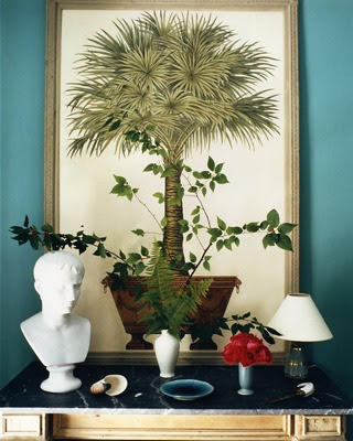
Image at top: Melon Tureen and Cover, manufacturer Chelsea Factory, England, circa 1755-1756

Thursday, March 22, 2007

Winning Wallpaper


Pigtown*Design recently had an interesting post on her blog regarding wallpaper. She had been lucky enough to obtain some pieces of antique wallpaper and was curious how others felt about wallpaper. There are many who avoid wallpaper like the plague- the thought of messily having to take it down someday is just too much to bear. While there are certainly some pitfalls with using wallpaper, I have to admit that I adore it. I love all types of patterns and think that the right wallpaper can add so much flair to a room. That said, I've always felt that wallpaper needs to be used sparingly- perhaps in a foyer or a powder room. You certainly don't want to use clashing wallpapers in adjoining rooms- your house guests might just end up with motion sickness!

I was intrigued, however, by photos of an British Gothic revival school house that was featured in the current issue of British House and Garden. Every room is papered in a different print, but the effect is not at all jarring. In fact, I think the rooms are rather soothing. The house certainly exudes a rather eccentric British look, but perhaps it's a good example of not having too much of a good thing!


Wednesday, March 21, 2007

Striking Tablescapes


Creating the perfect tablescape can be a difficult task. It takes a certain amount of skill to create the "right mix" of objects. There are many things you need to take into consideration when creating a tablescape: Do you have objects of varying height? Do you have a mix of colors that is pleasing to the eye? Is there visual interest in your combination of accessories?

The godfather of tablescapes was of course David Hicks. In fact, it was Hicks who coined the term "tablescape". Hicks was a master of the art of arranging. His tableaux usually included interesting flowers, artifacts, and bits of his collections. Below are a few photos of tablescapes that I find to be pretty close to perfection!


Tablescape by David Hicks

Design by Anne Coyle Interiors

Design by David Netto


Design by Miles Redd

(Tablescape at top by David Hicks)

Tuesday, March 20, 2007

Games Tables


In the current issue of Elle Decor, Emma Jane Pilkington and Juan Montoya extol the virtues of games tables and compare various ones on the market. Games tables are great accent pieces to have around the house. They are of course useful for card games but also as a small dining table (which Pilkington mentions more than once) or as a table on which to display a collection. If your taste is more traditional, there are some beautiful antique tables out there. If you prefer a mid-century look, there are an abundance of 20th c. games tables available- remember, mahjongg and canasta used to be quite popular in the 1950s and 60s. And if space is an issue, the triangular, flip top-style table would be perfect in the corner of a room.


White Leather Games Table at Mecox Gardens

Red Lattice Games Table at Downtown/Joe Nye New York


Louis XV style French walnut games table at Piranesi

Table at top: Late 19th c. English lacquered games table from 1stdibs.com

Monday, March 19, 2007

Quadrille Fabrics


As Spring and its promise of warmer weather is right around the corner, now is the perfect time for you to reevaluate your interior and consider lightening things up. Out with the wools and in with the cotton and linen! Billy Baldwin suggested having two sets of slipcovers made for upholstered furniture- one set for summer and one for winter. While this may seem a bit extravagant, Baldwin had a point- who wants to spend the warm weather months lounging around on a pile of wool pillows?

The most appropriate fabrics for Spring and Summer are, in my opinion, cotton and linen. Why not change out those heavy curtains for some breezy linen panels in a solid color? And to add dash to your room, how about having some pillows made in a graphic- print linen or cotton? Some of the best summery graphic prints around are by Quadrille. Here are a few that would look great in a beach house and a city apartment:


"Saya Gata" in Orange on Linen by Alan Campbell at Quadrille


"Deauville" in French Blue by Alan Campbell at Quadrille


"Textura" in French Blue on Linen, China Seas Collection at Quadrille

Image at top is "Ziggurat" in Brown in Linen/Cotton, China Seas Collection at Quadrille

(All images courtesy of Quadrille Inc.)

Friday, March 16, 2007

Paper Lined Bookshelves

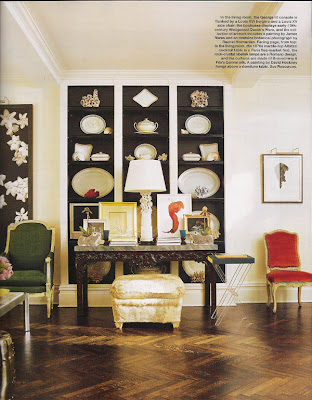
An old designer trick is to paint the backs of bookshelves a contrasting or darker color in order to create depth and interest. This trick definitely comes in handy if you're displaying objects in the bookshelves. Remember how great Todd Romano's antique Queen's Ware looked against the black backs of his bookshelves? Another look that I'm really taken with is the use of decorative paper on the backs of the shelves. I remember seeing a room published in which the decorator (I believe Steven Gambrel, but please correct me if I'm wrong) lined the shelves with marbleized paper. The design on the paper gives such interest to plain shelves and makes them seem more dramatic. I most recently saw the paper trick again in Christopher Spitzmiller's glorious apartment which has convinced me that I should try this someday!


Todd Romano's Manhattan home in Elle Decor, Jan '07


Christopher Spitzmiller's home

Thursday, March 15, 2007

Bookish Dining Rooms


I have longed admired the look of books in a dining room. The library/dining room combination is certainly nothing new, but I think it's a great way to create warmth in a dining room. On the flip side, it gives the book lover an additional room in which to store books. This room multi-functionality is perfect for apartment dwellers and for those with small homes. If you own a large home with a formal dining room, why not take a small den, turn it into a library, and then use it for informal or small dinner parties?


(image at top of Alex and Eliza Bolen's dining room; bottom image is James Andrew's dining room)